(5 years and 3266 days ago)
- 1: source1
- 2: thanks Kandoka
(5 years and 3268 days ago)
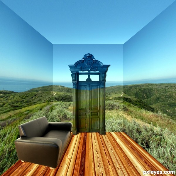
The horizon on the side walls needs to come towards the viewer more. Sofa needs a shadow. Why would the door change color above the horizon?
Thanks for the comments i knew the image wasn't right but couldn't put my finger on it. So thought i would post and see what what constructive comments i would received. Will look at your suggestions tomorrow and repost a revised version.
I like the way the door is painted to match the background. THAT'S why the door changes color!
A shadow underneath the chair, and a bit of toning down the shine on the top would improve this even more.
Well done, author.
OK, I guess I can go along with the paint job theory on the door, but the sofa needs to be reproportioned on the near end, and given a shadow.
Howdie stranger!
If you want to rate this picture or participate in this contest, just:
LOGIN HERE or REGISTER FOR FREE
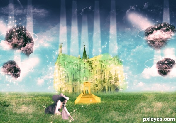
Here is an image which describes the atmosphere of heaven. Thanks to Neonescence for those fairy dust brushes used in my image. Thanks to mjranum-stock for giving us a beautiful fairy's image which is sitting below on those beautiful grass field. Thanks to JavierZhX for those beautiful clouds brushes. Extremely thanks to krallear-stock for that lovely rock image which I used it in my image. Thanks to Alkemya for that beautiful palace, thanks to SimplyBackgrounds for that beautiful grass-field. Thanks to FantasyStock for lovely stairway (5 years and 3393 days ago)
Beautiful work!
Thank you rbs........
Howdie stranger!
If you want to rate this picture or participate in this contest, just:
LOGIN HERE or REGISTER FOR FREE
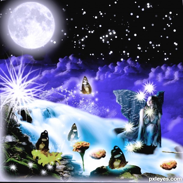
I would like to thank Mjranum of deviantart for providing this lovely girl. Then thanks to Falln-stock for those lovely Moon brushes. Thanks to redheadstock for those beautiful and impressive water and cloud brushes both provided by him. (5 years and 3398 days ago)
I am Back with a bang and brought this entry to life.......................I hope it stays till the end.
cool work...gl
Like the composition.... good luck
Thank you friends..........
Howdie stranger!
If you want to rate this picture or participate in this contest, just:
LOGIN HERE or REGISTER FOR FREE
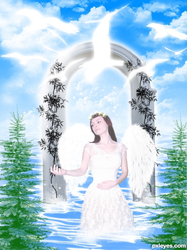
This image has some good and usefull sources and I cant live with out crediting them so firstly I would like to thank CHULLI STOCK, from deviant art for providing us the castle door image. Then I will like to thank Fallin stock the creator of the beautiful tree brushes from Deviantart. Thanks also to Falln-Brushes of Deviant art for nice feather brushes.Then I would like to thank the creator of water brushes from Osidian dawn of which I will provide the source link. Thanks to cyber-stock for providing this lovely angel. Then I would like to thank JavierZhX of Deviantart for providing lovely clouds brushes. Special thanks to Obsidian Dawn for providing beautiful star brushes. I would also like to thank FrozenStarRo of Deviant art for providing superb water brushes which are used in this image. Another thanks to Obsidian Dawn for providing beautiful birds brushes and lat but not the least thanks to Obsidian Dawn again for providing beautiful light beam brushes which are used in my image as rays. (5 years and 3403 days ago)
very good......
Thanks saman.......
very nice
Thanks...
Work is very nice author but i am sure that u cannot use image of this girl...cause this girl is Emma Watson actress, Hermione Granger from Harry Potter saga...So if u don't have legal source link your work will be removed probably...My advice is to change Emma with some other source usable image of the girl...Best of luck
I like the overall look of this, but a few things come to mind. I agree with erathion about the source of the actress not being useable...but you have nearly stark white areas around the arms. There's no shape at all. Hands nearly look to appear from nowhere. Maybe allow some tone back into those areas. 
Thanks pixelkid I appreciate that
I hated to replace Emma Watson, but it is against the rule of Pxeleyes. Thats not a problem I am back again with this image.
The wings are unevenly lit, with the one on the left brighter than the one on the right. The overall values are too high contrast, almost looking washed out with the whites too bright. The birds are losing their shape from it.
U did very good thing author with changing the picture of Emma cause this cool entry stay's in the competition...best of luck author
Thank you Erathion,,,,,,,,,,,,,,,
Author...I know you liked Emma....but this fix is far better in my opinion. Nice chango fixo...you actually improved the whole thing. I also like the way the new figure's positioned with the arm. 
Howdie stranger!
If you want to rate this picture or participate in this contest, just:
LOGIN HERE or REGISTER FOR FREE
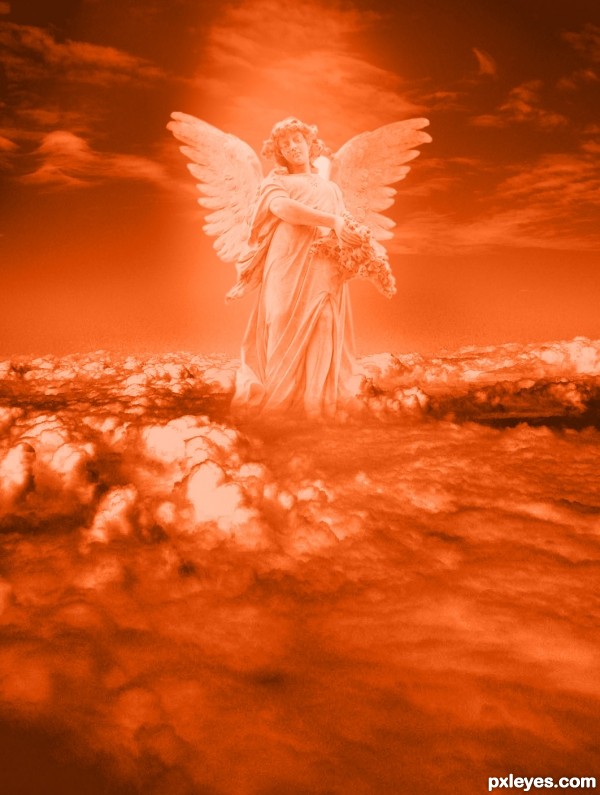
Good image, upper half could use more yellow...right now it's reds & pinks.
somehow the angel's color blend is still not right, it's got to have a combination of the top & bottom colors
Howdie stranger!
If you want to rate this picture or participate in this contest, just:
LOGIN HERE or REGISTER FOR FREE