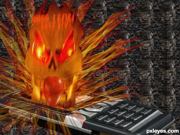
This image shows how mobile raise dangerous for heart ...
(5 years and 3535 days ago)
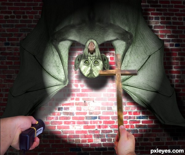
Thanks to Permuted, Fredrik Sandén, Tombre, OrangeNess,
Mzacha, Bigevil600 for the very nice stock images ;-)
The pictures of the arms/hands are my own stock.
I started with the boy screaming and after many hours i ended up with something totally different that i had in mind when i first started is, so i hope it's still on topic ;-) (5 years and 3540 days ago)
I think you meant "scared".  Good entry...finally something creative!
  SBS is missing a few things, though.
Thx CMYK46, meanwhile it's fixed 
Great SBS now...good luck! 
This is a fantastic entry. GL author
Very neat, but it's more bat than vampire, IMO.
gr8 1
Classical vampires can turn into bats, and vice versa...I have no problem with the batlike image.
Thx CMYK 
Howdie stranger!
If you want to rate this picture or participate in this contest, just:
LOGIN HERE or REGISTER FOR FREE
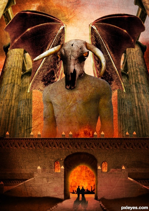
Thanks to Tilemahos Efthimiadis, Joyrex, Dave Hamster, Scallop Holden, Zeusandhera, Night_fate, Thomasje, Iversonic and Mimiliz for the lovely stock images ;-)
I found the inspiration for this work in a photoshop magazine of a friend. The name of the artist who describes a tutorial of something similar to this one is Adam Smith. Thx ;-)
comments are most welcome... (5 years and 3546 days ago)
Dunno why the wings are transparent, but it's a good idea & mood. IMO a bit texture heavy, but that's just me...good luck. 
Thx Cmyk46, i'm going to leave it like that for now  but like i said, comments are welcome. I spend a lot of time on this one
woohoo, love it author  its out there for sure :p
The scale is fantastic.. you can really tell you spent a while working with this one. I personally don;t like using textures much but i think you used them very well on this occasion. The silhouettes are a nice touch, but the building should cast the same strong shadows as they do.
Great overall work  Good luck!
Pretty nice scale on the things. But I would make the wings a lot bigger and work with the edges of the wings, as well as making them non-transparent. Could add some bones/veins or something on them to make them more realistic. They look pretty much cut/copy/paste/too big pencil when cleaning the edges now. Or you could try inner shadow effect for the wings. There are also some bit careless masking of the edges. Work with the windows and there is a major left-over from a colour mask on the right edge of middle part.. some dark trash there. Nice colours and eye sockets, worth working a bit more..
Very nice entry, that reminds me an illustration about mythic creatures. GL!
wow, awesome!
Thx Widiar, i will do something about those problems 
Good job with the wings, looking so much better now..
Thx for the nice comments 
great concept author...good luck
Thx 
Wish nobody to get to that gates 
Yep, it won't be a lot of fun 
Howdie stranger!
If you want to rate this picture or participate in this contest, just:
LOGIN HERE or REGISTER FOR FREE
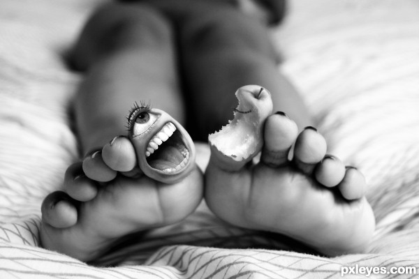
Recycled entry back in the days of P.S.T. given a little love……things I was not a 100% happy with.
Update
Had to re-work my image, As I had used a pre manipulated image, bad me.....let me know what you think of the substitute mouth dose it work
I’m not sure as I've got use to looking at the old one, need a fresh set of eyes. Forgive the dryly humorous pun.
(5 years and 3553 days ago)
Still looks good! 
loved this entry, still love it 
SO cute!!.. even if it makes me pull my toes under the covers
This must be an old PST entry. Definitely twisted. GL!
Jesus, that's scary!  That's why I don't do a pedicure...
Now seriously, blending is perfect, author! GL!... 
whoah... cant think of any thing better to say but whoah.
its really good.... i loved the idea
what an awesoe idea and beautifully executed well done and good luck!
Great job -- detail is super as is the overall use of the DOF
congrats for the 1st....
Congrats for 1st place, excellent.
Congrats for a well deserved 1st
Congrats for 1st place
Congratulations!
Congratulations!! You beat out a very good entry, you know!!
Congratulations for the 1st. place!
Congrats! for the 1st place 
Congrats for the 1st place !
Congrats 
congrats 
Howdie stranger!
If you want to rate this picture or participate in this contest, just:
LOGIN HERE or REGISTER FOR FREE
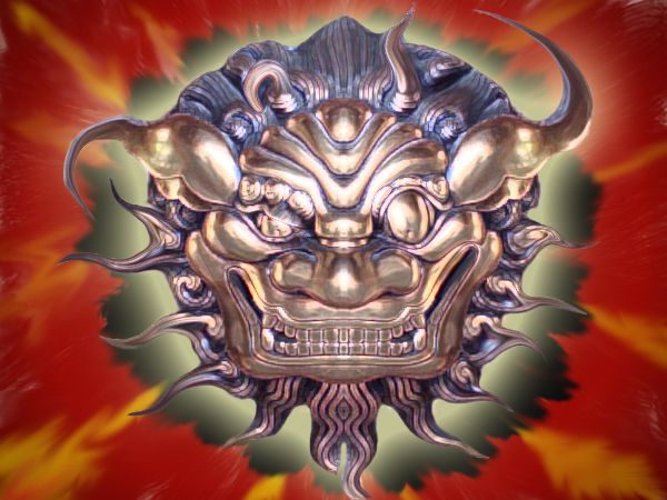
just source image... (5 years and 3578 days ago)

Jesus, it's creepier than before! 
definitely creepy 
Howdie stranger!
If you want to rate this picture or participate in this contest, just:
LOGIN HERE or REGISTER FOR FREE
ahahhahaha cool
And computers too, if you don't know how to make a good use of them...
Howdie stranger!
If you want to rate this picture or participate in this contest, just:
LOGIN HERE or REGISTER FOR FREE