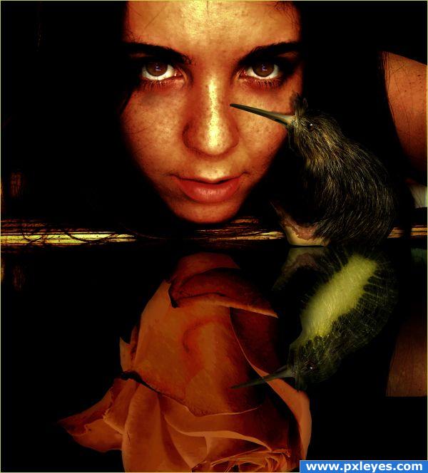
(5 years and 3822 days ago)
- 1: KIWI
- 2: KIWI FRUIT
- 3: ROSE
- 4: source4
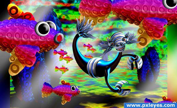
SBS on route (5 years and 3828 days ago)
Sweet creation! The fish look great, but I really like that creature in the middle. Especially the hands  Good luck!
very cute


Howdie stranger!
If you want to rate this picture or participate in this contest, just:
LOGIN HERE or REGISTER FOR FREE
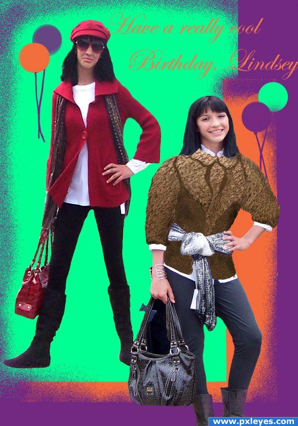
My granddaughter's birthday cake topper that I photoshopped from my photos of a style show she was in. Fun way to use a photoshop entry. (5 years and 3849 days ago)
hehehehe.. oh will you stop.. this is such a personal and fun entry.. thank you for sharing the fun.. no critique... it's suppose to be a fun time.. and that's exactly what you did LOL.. (now tell her to tone it down and behave LOL)
Howdie stranger!
If you want to rate this picture or participate in this contest, just:
LOGIN HERE or REGISTER FOR FREE
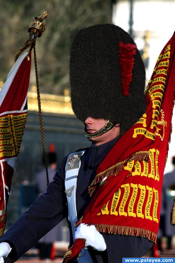
This was just screaming at me to be done. Texture was quite similar and I feel worked very well. Comments/improvements welcomed.
Looking for solid blend here .. . . . (5 years and 3867 days ago)
This looks exactly the same as the first image. You can't tell by looking at it that you changed the hat.
ah, Dear Visba - that is a compliment I believe. Indeed, I tried for an absolutely realistic effect. To say that it looks "exact" is quite and honor. However; the Step-by-Step guide cleary shows the differentiation of the textures and ther steps taken to achive this "exact" effect. Thank you for your comment.
hats not working for me...perhaps you should leave it more the gray color EDIT: Looking better Author
you know Lchappell - it seroiusly considered leaving it grey. It went well with the uniform and left more of that "original source" feel to it  Where were ya an hour ago??
EDIT: When a level 16 gives you some advice, it's probably wise to take it 
There you go, sir. The grey shade works much better. Thanks for the tip.
excellent experiment and Idea... I would suggest that you split apart the SBS into single sections... write a much more detail description of each step and qualify it into a tutorial, this would make all the work you've put into it worth it, and help a lot of beginners out on how to match tones/ textures/ feel... etc..(and just an added cheekiness, I'd of put a bird peeking out of the black fur... but that's just me 
Clever use of source, good luck!
Much better 
wow, I almost thought this wasn't even photoshopped!
aah, indeed K5683 . . . . that may be working against me at this point. If it weren't for vispa and lchappell - this image would be suffering.
I LOVE all the fantasy stuff that is out there, but alas - it is beyond my capabilities. Please review the SBS and you see that the image has in fact been photoshopped. But I would LOVE to see the idea created by some of the members here with some SERIOUS skills (golem, Waz, CMYK, Lchappell . . . . any of you...!)
Howdie stranger!
If you want to rate this picture or participate in this contest, just:
LOGIN HERE or REGISTER FOR FREE
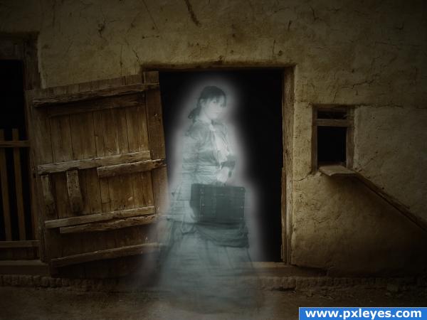
Thanks to Nirelstock for the model. (5 years and 3872 days ago)
Creepy, hehe  Good luck.
she looks kinda nice.. just needs a porter.. hehehe.. good luck
You've created a very nice ghost. Well done!
spooky image. should make a brush out of this one.
Howdie stranger!
If you want to rate this picture or participate in this contest, just:
LOGIN HERE or REGISTER FOR FREE
Very, very nice work.
I love it, good luck
Excellent pic - is the kiwi reflection a bud?
This is another favorite of mine. I love the concept. Great color matching and one has to look to see that the rose is not a reflection. Again.. Very nice
Very cool one!
Oh, great!
Congrats for your third place, Lolu
Congrats....
Congrats!!!!
congrats..
Howdie stranger!
If you want to rate this picture or participate in this contest, just:
LOGIN HERE or REGISTER FOR FREE