![[insert title here]](http://www.pxleyes.com/images/contests/cell-restoration/fullsize/-insert-title-here--4d78265991fef.jpg)
description? [insert contest guidelines here] (5 years and 3310 days ago)

(5 years and 3312 days ago)
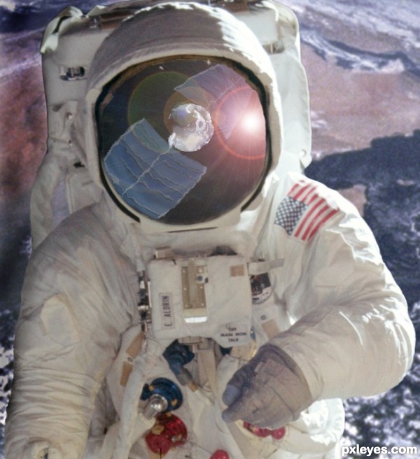
Where's the source? 
Are you kidding me josh?
its the sputnik space craft in the astronauts mask! genius i'd say
The source is so minimal in this image it's almost negligible...A bit too subtle a use of the source.
What a JOKE... I've seen entries in many of these contests with much more minimal use of the source, and people gush over them. The source is there, like it or not!
lens flare is unnecessary
May be bd, what would an incoming comet look like in that perspective?
This is clever usage of the source...ok i agree its not dominant in the image but its clearly visible...best of luck author
Author you are so right....Who cares what is said about usage of source...I've seen some who use NOTHING but a few pixels and it's GENIUS but with others entries it's an issue....I say you do you and it's a great image...Best of Luck 
Clever work and interesting image!
I have to say that I found the source! And very clever usage IMO ... but to paraphrase as famous quote... You can please all the people some of the time, and some of the people all the time, but you cannot please all the people all the time!

arca, I've never known, nor heard of anyone ever pleasing all of the people some of the time, some just can not be pleased... lol. I know what your getting at though, and thank you!
Nice reflection on the glass.... good luck author.
Howdie stranger!
If you want to rate this picture or participate in this contest, just:
LOGIN HERE or REGISTER FOR FREE

(5 years and 3367 days ago)
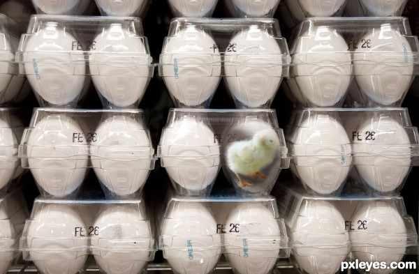
Get him out he's going to suffocate! :O
minimal work but very smart and so effective...well done author
Howdie stranger!
If you want to rate this picture or participate in this contest, just:
LOGIN HERE or REGISTER FOR FREE

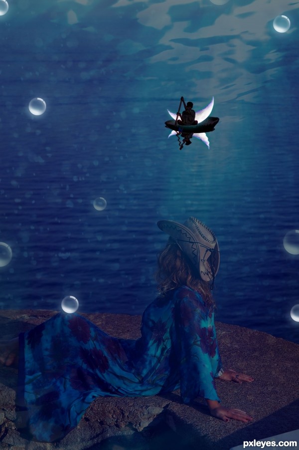
I have worked on it again guys..Thanks for your helpful comments.Does it look better now? (5 years and 3383 days ago)
It's a really neat concept author.. but I have trouble seeing the Female character... (maybe add a little contrast/brightness..to the girl so you can see her clearer..) just my opinion of course.. excellent work and good luck 
EXCELLENT!!! she is much clearer author
Lovely idea. The only thing that bothers me is the reflection on the water. The reflection seems to move in a different way than the movement of the sea's waves. Also, since the moon is bright, its reflection should also be more luminous. You can add some shinning on the female in the foreground for more effect.
Good luck!
There is something odd on he reflection...but can't define exactly what it is.
Nice mood 
Fantastic idea author...Tweaks are top notch...best of luck
Howdie stranger!
If you want to rate this picture or participate in this contest, just:
LOGIN HERE or REGISTER FOR FREE

(5 years and 3387 days ago)
This is cool & unexpected.
Thanks greymval, trying to think outside the box!! 
Lolz... pretty cool!
Howdie stranger!
If you want to rate this picture or participate in this contest, just:
LOGIN HERE or REGISTER FOR FREE
there is no hi-rez cause this is full size (ironically the same as the display size.. i went to check the hi-rez button so that you guys can see for yourself that this is as large as it gets, but it wont let me, prolly cause its no bigger than this)
Hehehehe title could totally be "I pity the fool".
Nice 'hawk.
thanks... i just shaved my head... ill do another. lawl!
Awesome subject, nice image.
well done!
Fantastic restoration author...This is totally HIT in contest target...well done author
Really nice transformation.
Howdie stranger!
If you want to rate this picture or participate in this contest, just:
LOGIN HERE or REGISTER FOR FREE