(5 years and 2553 days ago)
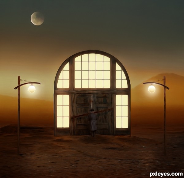
- 1: Moon
- 2: Lamp
- 3: Sky/Mountain
- 4: Desert
- 5: Old man
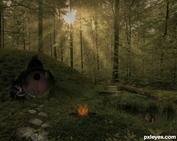
lightrays are made with lasso tool, filled them with white, gaussian blur and lowered opacity (5 years and 2644 days ago)
Good mood...love the little guy bathing in the stream. 
Quite ok, but I wouldnt mind to see the whole image a bit brighter (or at least the area around the sunrays, the colors from source 4 are really nice, I'd say use them!). And perhaps you'd like touse more fire of source 3? Good luck!
thx guys for the comments, i lightened up the image, and make the fire more burn, hope it looks better now 
This looks a lot better than the previous one. Love the Hobbit 
This is brilliant. Love the eerieness. Good luck with it
Congrats!!
Howdie stranger!
If you want to rate this picture or participate in this contest, just:
LOGIN HERE or REGISTER FOR FREE
(5 years and 2723 days ago)
Howdie stranger!
If you want to rate this picture or participate in this contest, just:
LOGIN HERE or REGISTER FOR FREE
(5 years and 2809 days ago)
Great Play!
Thanks friend!..
Good colors and mood! 
Thank u pearlie! 
Congrats Jordy, nicely done!!
Thanks friend!..
congratulations Jordy, nice one
Thanks friend.. 
Howdie stranger!
If you want to rate this picture or participate in this contest, just:
LOGIN HERE or REGISTER FOR FREE
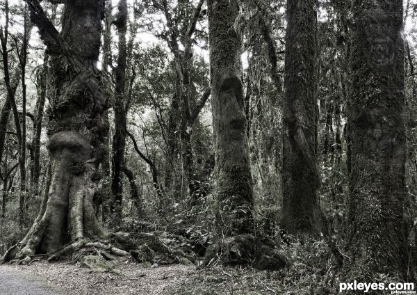
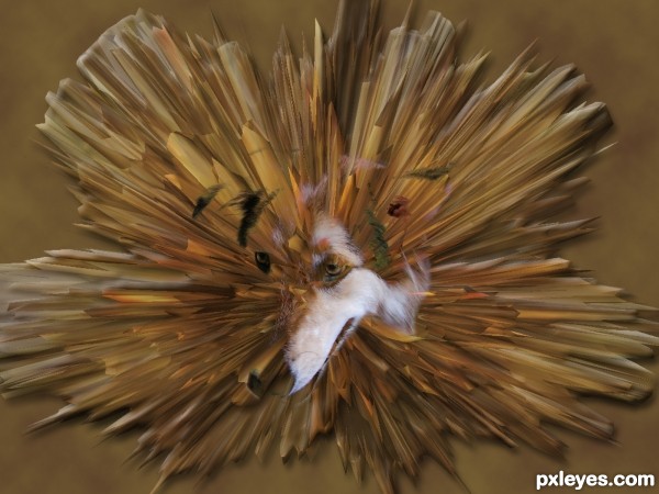
A hidden object image. What do you see? (5 years and 2963 days ago)
face?
Author, without posting a hi-res image it's impossible to see what you have added.
l see at least 3
I see a monkey, Easter island head, lion face,...
I think I see trees with a nose...cool image.
#1 Face
Thank you to Leroy Skalstad for upload his image Homeless John to Stock.xching.
#1 Face
Thank you to Leroy Skalstad for upload his image Homeless John to Stock.xching.
Howdie stranger!
If you want to rate this picture or participate in this contest, just:
LOGIN HERE or REGISTER FOR FREE
It's a good idea, but I don't understand the light source behind the windows. IMO the original darkness is more effective. Your entry might benefit from a SBS so we understand your thinking.
Thank you very much for your comment and your interpretation, CMYK.

There is nothing to understand, buddy, is purely surreal, ie it would be impossible to have light in a place like this, if you check the images used, can realizes that it is a desert. The light behind given source, lamps in the desert... all surreal. You can clearly see that the door itself is not attached to any wall, every idea is surreal, is not to be a realistic scene!
Hope this explanation have helped.
Surreal or not, the perspective is wonky, with the lampposts being about 4 1/2 feet tall in relation to the door behind them... The lighting is not "surreal," it's nonsensical. Perhaps you do not know what the Surrealism Art movement was all about, but trust when I say it is not to excuse poor Composition.
Surrealism focuses on organic shapes, twisting lines, visual textures and lighting specifically angled and shadowed to help convey a mood, not just lights tossed around with no logical illumination or shadows.
Your lighting of the archway provides no illumination of the ground in front of it, and the midget lampposts do not cast proper illumination of the ground directly below them.
CMYK was being kind in requesting an SBS. Whatever your thought processes, buddy, they are far more "surreal" than the lighting in this entry...
It really shows a lot of promise, but it also shows some glaring continuity issues that "surreal" cannot hide or excuse.
Regarding lighting, I would note that Salvador DalÃ, for example, generally depicted realistic shadows which I think contributed to the disturbing nature of his images by giving a sense of reality to the unreal. The glow around the streetlights here (that don't illuminate the pavement below them) make them seem like they're in front of a stage backdrop to me.
Thank you for your opinion MossyB, also, thank you very much Dan for your opinion too.
Always interesting hear all sides.
Maybe a little more contrast between the figure and the door. The person gets a little lost. Other than that I really like this work. I love anything surreal, when done well (As you have done here). Great work author, good luck.
Thanks for pointing out that there's a figure in front of the door. The fact that I hadn't noticed it is clearly telling. I agree that there is a lot to like here, however.
Thank you very much for your comment Tnaylor, much appreciated! You too Dan, many thanks!
nice lighting
Many thanks Rick!!
Download the photo on the left and manipulate it in any way you want. You did your work, it is your idea, and if is surreal or not, this is the way you wanted to present it. It is good to give constructive criticism or suggestions about an entry. But at least tell the author how he / she can improve their work. Negative comments do not work. Good luck author, you have the talent, and you have your ideas!

Thank you so much for your kindness, George, always supporting me, you're lovely!
Dramatic elements and color palette. In addition to tweaks others have mentioned (except I myself like the bright light behind the windows if it were to illuminate the foreground a tad), I wonder if the moon is a bit too small for maximum drama (plus add three or four stars to the sky?) and if eliminating the left-hand street light would create a more compelling diagonal composition.
It just occurred to me that moving the figure to midground with footsteps in the sand behind him might be evocative.
Many, many, many thanks for your attention and comments, Dan, i'll consider your tips to my next entries!
Wonderful work, very creative and original. I loved it so much my favorit good luck!
Thank you so much for your kindness, sweets!
The colors and mood are beautiful, but I feel the streetlights are too small. Maybe if you placed them farther back, behind the door... and that would count for the lighting on the windows... just an idea!!
Thank you very much for your comment, dear!
I think this is a great image. Well thought-out. I love the light behind the doors. It's central to the theme here, I believe. Sort of like the light at the end of the tunnel. It's funny, when I first saw this entry a few days ago, I didn't notice the figure. Whatever, if anything you did, it was the right move. Nice work all around. It's obviously art as you've garnered quite a bit of thought from the PXL audience. S. Dahli would be proud. Art is, after all, quite subjective.
Hey dear, hear these kind words from an artist as you is more than a honor! Thank you so much!
elegant, bravo
Thank you very much!!
Very nice and deserved. Nice week for you!
Thank you so much!!!
Howdie stranger!
If you want to rate this picture or participate in this contest, just:
LOGIN HERE or REGISTER FOR FREE