Photoshop Pictures: High (page 2)


results 6 - 10 of 27

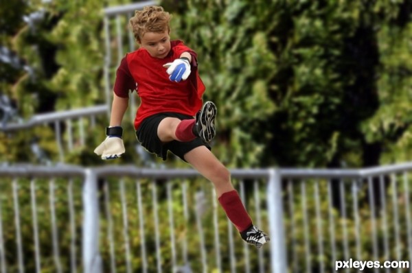
High jump - created by shivkumar menon


High jump
Favs: 0SBS: n/aHi-resRank: 15/17Score: 57.2% (0)6652 views

Step 1: Downloaded the original
Step 2: Duplicated the original
Step 3: Cutout of soccer kid made by pen tool and pasted on a new document
Step 4: Downloaded an image from MorgueFile.com
Step 5: Removed the image of the person by content-aware scale
Step 6: Increased the canvas size and extended the scene by copy paste method to accommodate the soccer kid
Step 7: Joint of both layers cloned using cloning stamp tool
Step 8: Cutout of soccer kid dragged and pasted on background scene
Step 9: Puppet warp used to make kid’s posture
Step 10: Necessary image adjustments such as level, curve, Brightness/contrast made and saved the document.

(5 years and 2838 days ago)

1 Source:

No comments yet... Be the first!High, jump

Howdie stranger!
If you want to rate this picture or participate in this contest, just:

LOGIN HERE or REGISTER FOR FREE


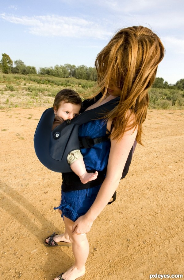
High Impact Baby Sling - created by MossyB


High Impact Baby Sling
Favs: 3SBS: n/aHi-resRank: 6/17Score: 62.2% (20)6750 views

Just the Liquify filter and Eraser, with a bit of Clone Tool and Paintbrush to fill in small bits and edges. (5 years and 2978 days ago)

1 Source:

avatar Mimibeth
Mimibeth says:

I love this! What a great idea!

avatar aheman
aheman says:

confirm safe n sound... lol, I like this

avatar samanway
samanway says:

nice idea!!

avatar bcabilan
bcabilan says:

Wow! Nice concept...

avatar gchiou2008

Perhaps it would be a little uncomfortable for the baby, but great idea!

avatar Geexman
Geexman says:

lol excellent! its like you`ve just placed the source on top of the other source using warp! .... genius!!!

author says:

A good chop needn't be complex. Sometimes "less is more!"

avatar CorneliaMladenova

Great idea

Howdie stranger!
If you want to rate this picture or participate in this contest, just:

LOGIN HERE or REGISTER FOR FREE


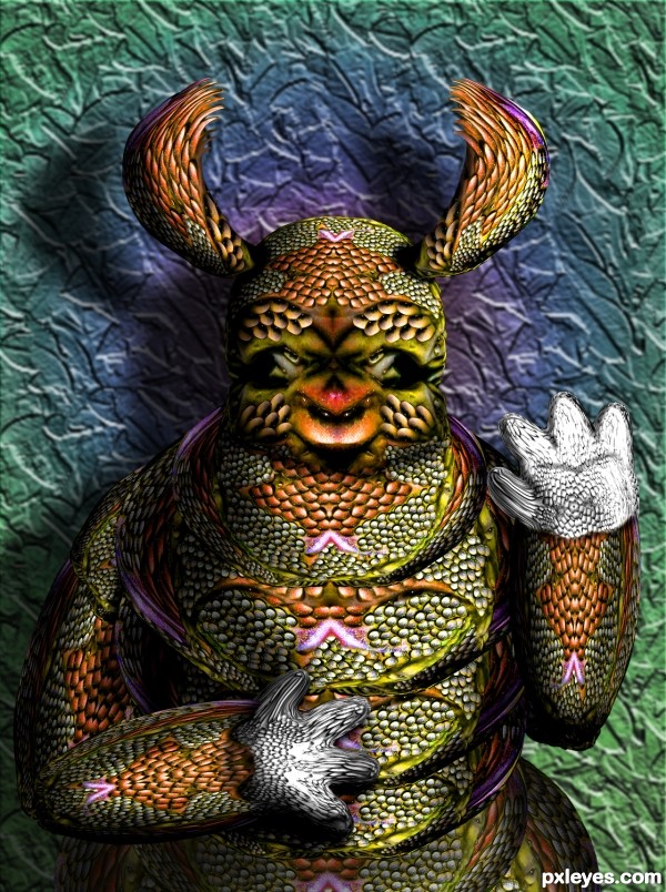
High Four Me - created by Drivenslush


High Four Me
Favs: 3SBS: 18Hi-resRank: 4/17Score: 61.9% (20)6369 views

Source (5 years and 3023 days ago)

avatar aheman
aheman says:

wow... alot of work for this image.... this creature is quite 'complex' already, suggest make the background simpler for better focus

avatar passionboy

nice work gl author..!!

avatar pearlie
pearlie says:

Cool way you made the initial texture. Love the colors, just the head part would make a great mask.

avatar George55
George55 says:

Reminds me of Creature of the black lagoon.....is it?..... Good work... and good luck.

avatar Derivatix
Derivatix says:

love it, lots of work

Howdie stranger!
If you want to rate this picture or participate in this contest, just:

LOGIN HERE or REGISTER FOR FREE


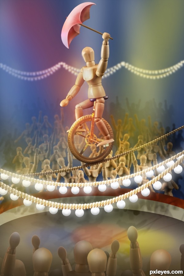
High Wire Act - created by elemare


High Wire Act
Favs: 22SBS: 23Hi-resRank: 1/17Score: 74.5% (45)15537 views

*Update: masking of crowd in the foreground has been refined.

*Update #2: a hint of bevel and emboss added to the foreground light bulbs. (See SBS for settings.) (5 years and 3073 days ago)

1 Source:

avatar Androla
Androla says:

this is so cool!!!!!!!!!!!!!

avatar Chalty669
Chalty669 says:

A few masking fixes on the bottom cutouts and this is top notch. Good luck!

EDIT: Looks Good!

avatar Chuck
Chuck says:

Nice Job well done

author says:

Chalty, after a good night's sleep, I see the MESS that foreground crowd was. Ugh! Sorry to inflict the pain on your eyes, all you early viewers, LOL! I did a complete re-do of the foreground crowd, starting with fresh originals rather than trying to repair the "template" crowd, which had already been made smaller once or twice. (Rule I ignored: You can make an element smaller, but you can't resize it bigger again afterwards without pixelation and lost definition... unless it's a smart object, which, of course, this wasn't.) Whew! Thank you, all!

avatar arca
arca says:

Lovely, stunning work beautifully realized! A definite fav for me!!! Your lighting is exceptional!

author says:

Thank you, arca!

avatar spaceranger

This is great, concept to finish! Love the color choices, gives a softness to the image!

no avatar
nacho124 says:

very very niceeee!!!

avatar marifre
marifre says:

Simply perfect! A show!

avatar Rod13
Rod13 says:

Fantastic job. Very creative.

avatar greymval
greymval says:

Great work!

avatar priyakamble

wow

avatar DanielaOwergoor

Fabulous!!!!

avatar Drivenslush

YIPPEE!

avatar ramesan
ramesan says:

Great entry....GL!!

avatar nishagandhi

wow great imagination!awesome

avatar Alan2641
Alan2641 says:

donot know what changes as this is my first view -- great work on building the figuire and ropes -- both foreground and background are very well done give noce depth to the overall image -- only one thing is the bulbs seem a bit flat -- glow is there but the bulbs need a touch of something to add some extra dimension

avatar Glockman
Glockman says:

very nice !!!!!!!

avatar nasirkhan
nasirkhan says:

Very nice work.

avatar Majkman
Majkman says:

great work and use of DOF.... well done

avatar hereisanoop

brilliant job

avatar enblanco
enblanco says:

Excelent creative entry, GL!

avatar erathion
erathion says:

Awesome piece of work author...Very well done

avatar CorneliaMladenova

Congratulations!

avatar madamemonty

Congrats Elemare, wonderful work

avatar lchappell
lchappell says:

Good One!

avatar bcabilan
bcabilan says:

Congratulation on your 1st place!

avatar DML
DML says:

Amazing!!, great work with lights and DOF!!

avatar spaceranger

Congrats!!

author says:

Thank you, everyone!!

avatar SOLARIS
SOLARIS says:

great image. Congrats

avatar Chuck
Chuck says:

Congrats on first place Win

Howdie stranger!
If you want to rate this picture or participate in this contest, just:

LOGIN HERE or REGISTER FOR FREE


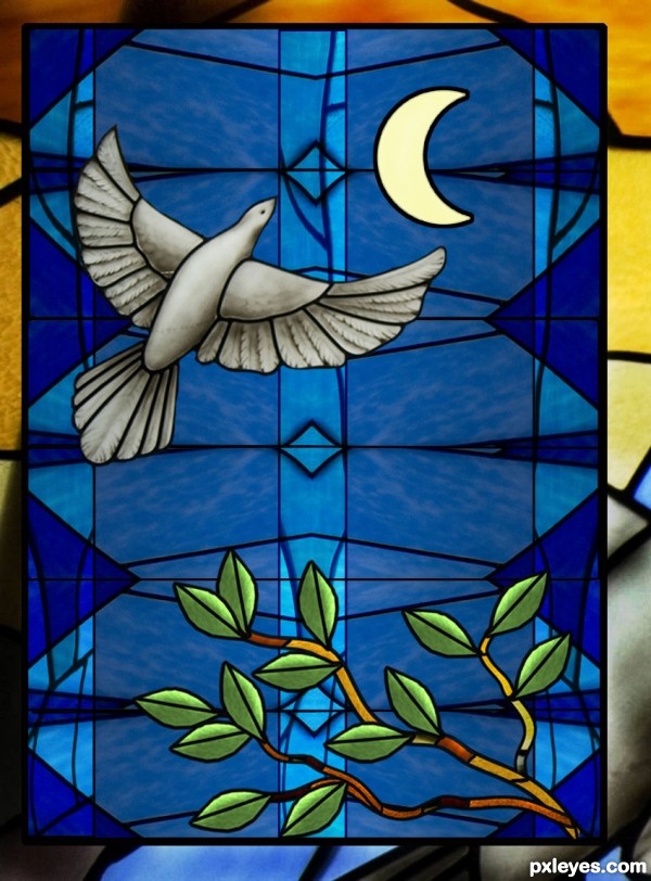
Flying High - created by George55


Flying High
Favs: 3SBS: 9Hi-resRank: 6/17Score: 57% (10)5487 views

Source image used to making this entry. (5 years and 3266 days ago)

avatar jawshoewhah
jawshoewhah [banned] says:

Nice entry! GL!

avatar CMYK46
CMYK46 says:

Looks good. I would have added more color.

avatar DanLundberg

Nice. The crescent moon is an interesting element, but a different color such as pale yellow would give it a greater impact. The crisp, uniform borders of the dove's glass pieces should follow through to all the pieces.

author says:

Thank you for your comments and suggestions..... I appreciate that.
CMYK: Thanks about color. Dan: Thanks about the pale yellow moon.

avatar erathion
erathion says:

very very nice work author...I have one idea for u...u could create branch from the parts of the source image...i know that u have perfect skills for something like that...That will give a bit more effectiveness to the image...and u could place it in any lower corner...just an idea author...

author says:

Thanks Erathion... hope the branch looks good... Good idea!

avatar erathion
erathion says:

Wow author i love...awesome work with the branch...Now is perfect...well done

avatar nishagandhi

very nice work!! so realistic!

avatar DigitalPro

beautiful gl

avatar JPDesigns
JPDesigns says:

oOo pretty! I want this as my window!

Howdie stranger!
If you want to rate this picture or participate in this contest, just:

LOGIN HERE or REGISTER FOR FREE