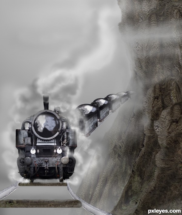
No other sources used. (5 years and 3457 days ago)
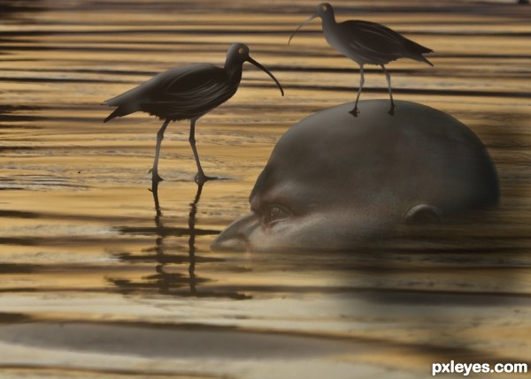
Thanks for the use of the following images: bird by ajagendorf25, shore by mikebaird. (5 years and 3486 days ago)
nice creation...GL
Nice concept, but you need to have more reflection of the statue in the water to match that of the bird.
Howdie stranger!
If you want to rate this picture or participate in this contest, just:
LOGIN HERE or REGISTER FOR FREE
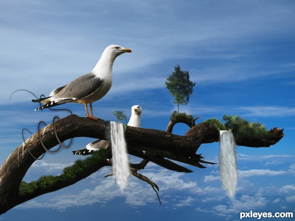
I used some stock images and my fantasy, hope you like it!
Thx to source providers! (5 years and 3488 days ago)
OMG This reminds me of thos floating mountains in Avatar! Great job!
Thank you!
Lovely concept ... a wee suggestion that I think would help; have the waterfalls thin out at the bottom so they don't end as abruptly ... that would give the whole image a more realistic look. A tiny bit of clean up on the tail of the foreground bird.
Great image though really like the whole feel of it!
Thank you for your helpful hint, I adapted it, but as the contest is now closed I cannot show the changes... Thanx alot anyway!
Howdie stranger!
If you want to rate this picture or participate in this contest, just:
LOGIN HERE or REGISTER FOR FREE
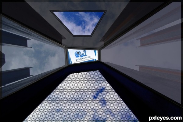
Thanks to pxlleyes.com for use of page logo used on tv. (5 years and 3552 days ago)
interesting...
Cool. 
Howdie stranger!
If you want to rate this picture or participate in this contest, just:
LOGIN HERE or REGISTER FOR FREE
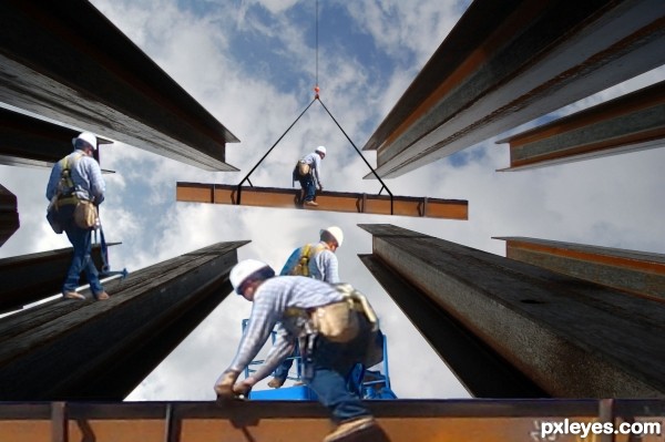
Spec Thanks toBill Jacobus1 for use of these three pictures found on Flickr.com under a Creative Commons license. (5 years and 3555 days ago)
The man in the forward is tad blurry. The man in the middle needs to be flipped 'cause of lighting source and the man on the left needs a shadow.
YESS ! GOOD JOB ! G L
very nice idea!
Very nice idea. I'm not sure if the viewer is supposed to be looking up or not.
Thanks all
Howdie stranger!
If you want to rate this picture or participate in this contest, just:
LOGIN HERE or REGISTER FOR FREE
Really interesting mountain texture! I wish your SBS had shown that technique in more detail.
Mossy I will try to explain it in more detail. I will update the sbs soon.
I think you did a really good job with the train and the mountain. Minor nitpick is the track looks like it's floating and looks like it is traveling into the mountain with no opening. I think it would look better if you expanded the mountain a bit and painted a small opening. Good luck!
I agree with Chalty, but saw it to late. But nice idea
Howdie stranger!
If you want to rate this picture or participate in this contest, just:
LOGIN HERE or REGISTER FOR FREE