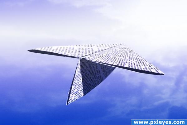
All PS
source newsprint.
sbs soon (5 years and 3804 days ago)
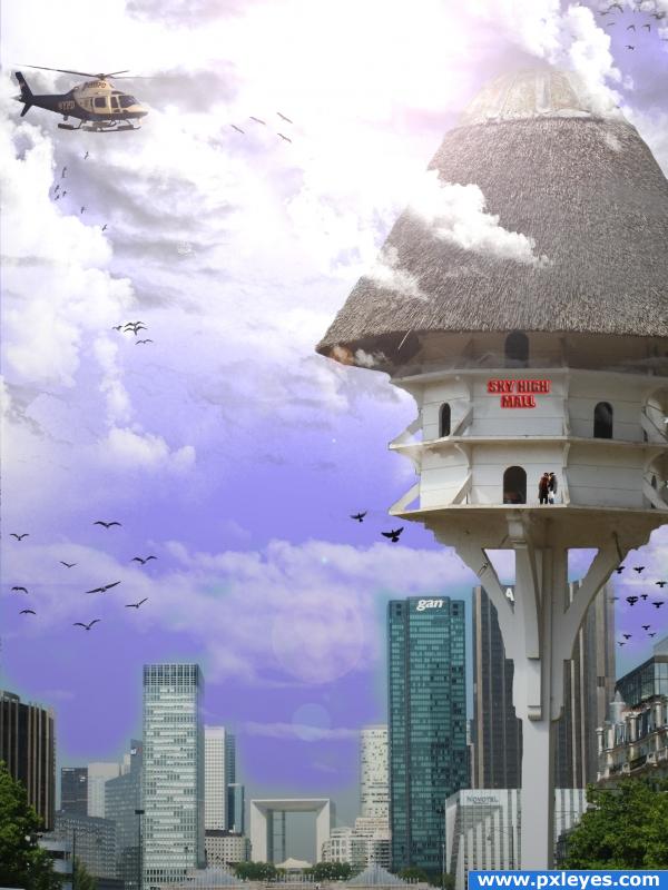
(5 years and 3873 days ago)
It's a nice idea, but i think you should work on the masking of your buildings. Good luck though!
Thanks for comment, i am very new to this and i will be honest have no idea what masking means. stupid huh! If anyone can enlighten me i would appreciate it
it just means you need to get closer to your source image, notice the blue around the buildings in some places and then in other places the building seem to fade out in corners..nice idea for your image though, one thing is the lens flares, they arent so flashy and i wouldn't get stuck into using them... I find these light ray brushes more effective just go to this link to download  http://redheadstock.deviantart.com/art/Light-Beams-Rays-Brushes-72493128
thankyou for the feedback. I will see if i can improve it.
Funny, but the edges of the birdhouse structure are way too sharp in comparrison to everything else.
wow those must be very large birds!  cheers!
Uh, yeah, the birds are large. Look at the bird house! Great image. Work on the masking. Google masking techniques, maybe.
terrorism?
ooooops.....good!
Howdie stranger!
If you want to rate this picture or participate in this contest, just:
LOGIN HERE or REGISTER FOR FREE
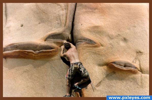
(5 years and 3875 days ago)
Great idea, good luck!!
great image! great job!
Try toning down the shadow, otherwise not bad...
gl
Howdie stranger!
If you want to rate this picture or participate in this contest, just:
LOGIN HERE or REGISTER FOR FREE
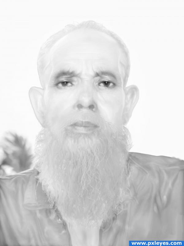
Here is my version.;-)
Only source picture was used.
SBS: Desaturate, Burn, Dodge, Smudge tools.
Different blending options. (5 years and 3907 days ago)
nice!! i tried to make a snow man.. but i cant!! i really like this!! Good Job!!
Nice idea but is a little to much of the same i.e white... need some contrast
its michael jackson in the afterlife... lol
what a creep, nice done!
Thank you guys for comments.  Warlock, it is mean to be white on white.
Howdie stranger!
If you want to rate this picture or participate in this contest, just:
LOGIN HERE or REGISTER FOR FREE
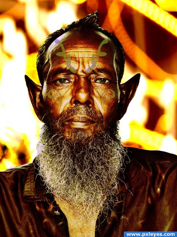
I thought that he was ancient when I saw this photo, but it seems like there's some kind of magic that slows his aging. So that, although he looks to be 65, 70 years old, he's really 527. So he must be an elf. You just have to believe it to see it. Like any magical creature. (5 years and 3913 days ago)
I think your horns need a lot more depth, they look completely two-dimensional. Just add some shadows and it would already start to look much better. Good luck!
Not sure about the tattoo/swirl brushes.. I think if you shaded them better or used a different opacity filter to make them blend more..they seem to be floating off his face and not really part of it..but the overall work is quite nice.. good luck
The tatoos on his face look fake, you should work better on them ^^
The swirl things look really fake, you might want to adjust the blending
cooooooool
For the tatoos try the blending options bevel and emboss with inner glow and a sfot stroke. Also they should be darker by a little bit. altogether (with that fix) it's good work.
Thanks Sparklen for the idea for the tats. I really couldn't think of anything else to do with them. I will try that next time.
Howdie stranger!
If you want to rate this picture or participate in this contest, just:
LOGIN HERE or REGISTER FOR FREE
sometimes, simple is best.........
great job
Howdie stranger!
If you want to rate this picture or participate in this contest, just:
LOGIN HERE or REGISTER FOR FREE