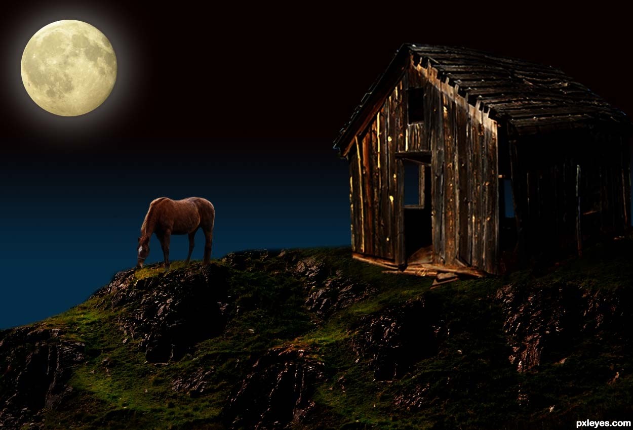
Thanks to mqtrf, for the pic of the horse, to mymy, for the pic of the moon and to Lelaina, for the pic of the hills. The rest is PS. (5 years and 3428 days ago)
3 Sources:
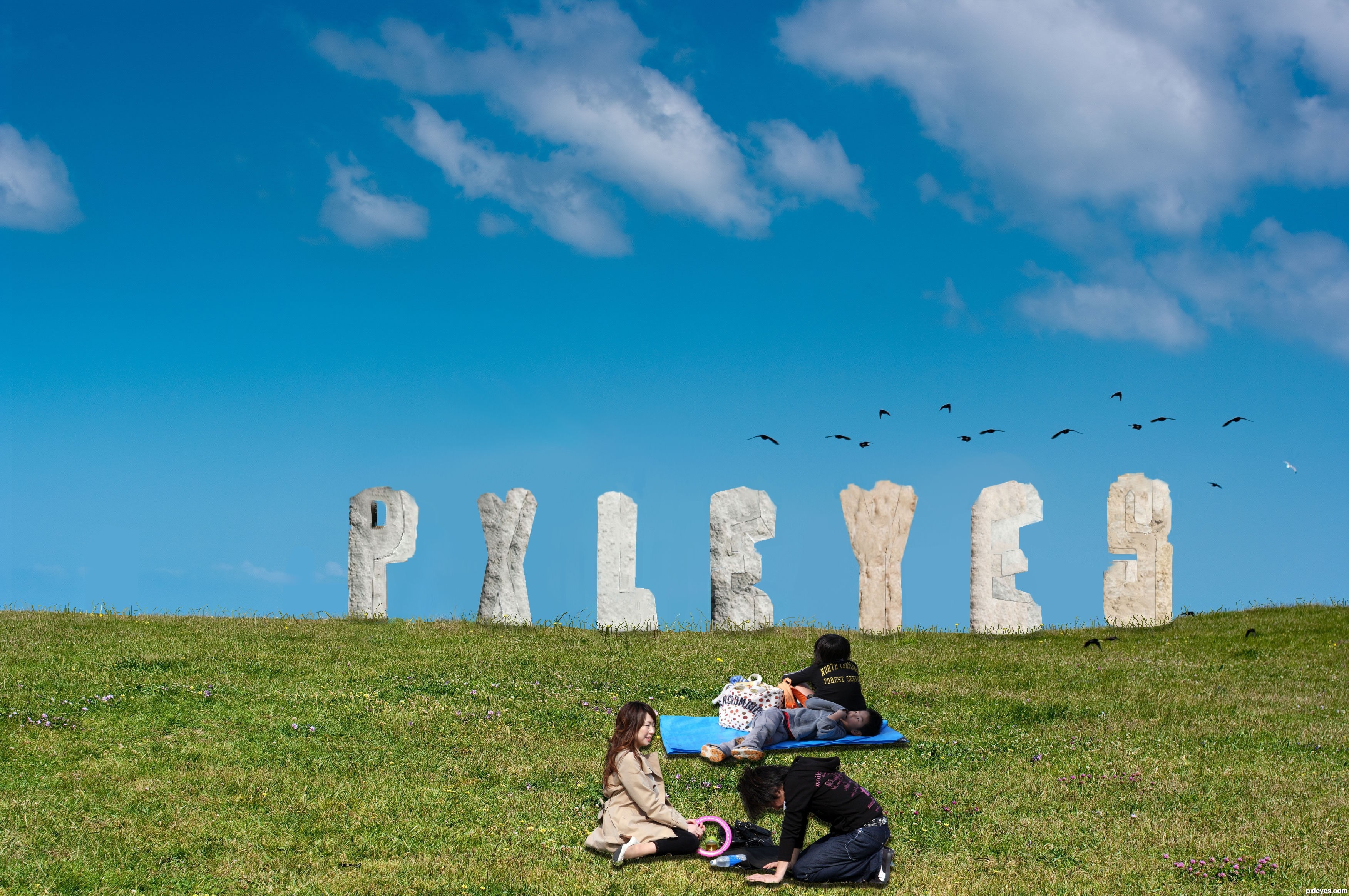
Spec Thanks to MShades for use of two of his pictures
found on Flickr photo sharing.com in the park album (5 years and 3482 days ago)
idea is fine -- execution needs some touch up -- all the holes need to have depth as was done in the "P" -- edges should not be straight lines as I doubt that stone would weather to a straight edge
Hey Thanks Alan2641 I did some touch up on what you said any better?
Author the touch-ups are still not quite right IMO, the edges are still too sharp and/or straight. You can try using the eraser with less opacity and fill adjustments. I would use it set at 10% and 10% so you can control it better. Good luck author
good thinking
Creative idea, but the letters need a lot more shadows on their under [ground-facing] sides. I would also consider moving the young adults to the left edge (with probably a horizontal flip and maybe having the kids in front slightly overlapping so the people form a single element) for a more-diagonal composition instead of having all the elements on the right-hand side.
Thanks all I did some readjustments but I maybe should have stayed away from the stone letters
cool idea...gl
Howdie stranger!
If you want to rate this picture or participate in this contest, just:
LOGIN HERE or REGISTER FOR FREE
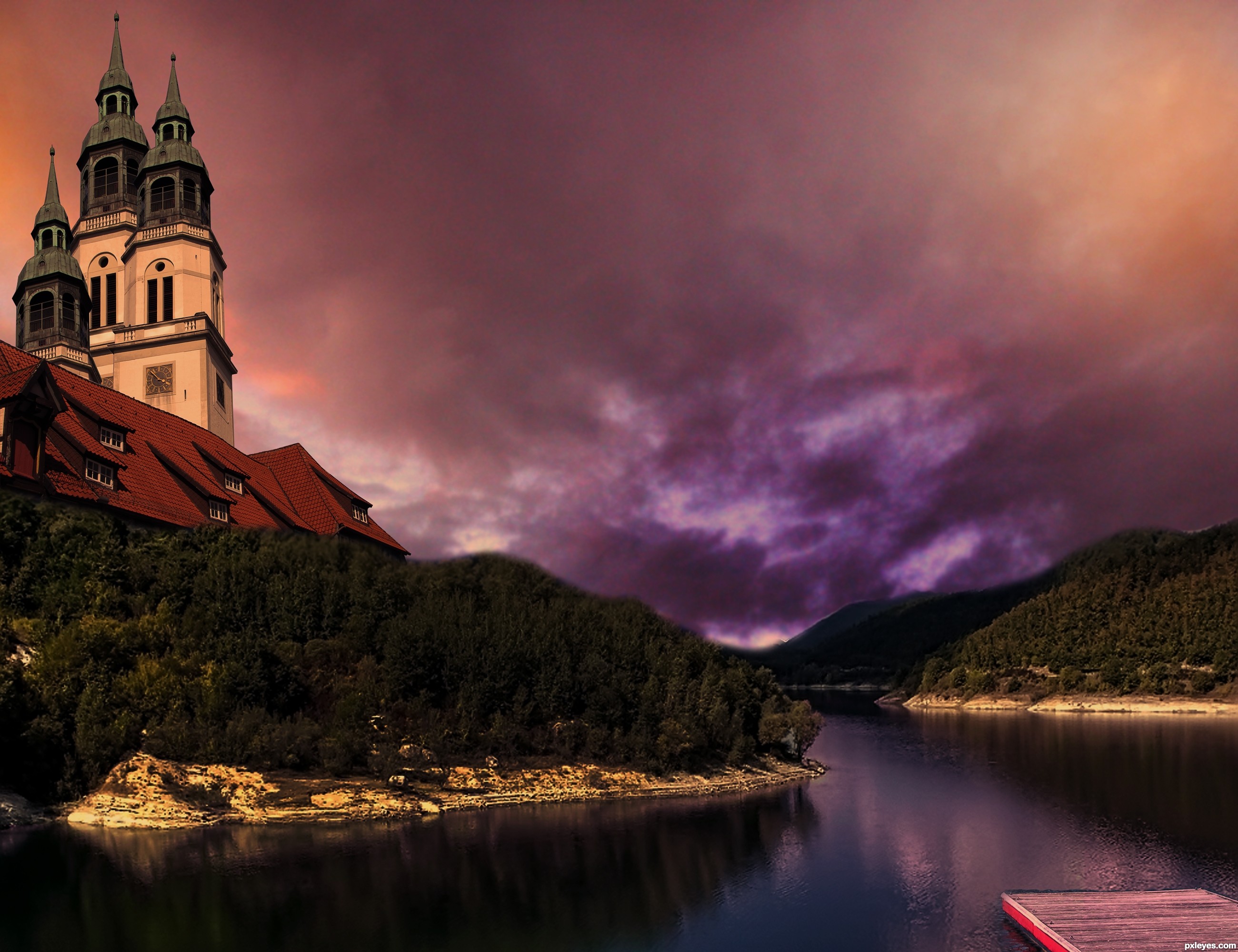
thanks to michaelaw from sxc for footbridge (5 years and 3507 days ago)
You should add some purple pink filter to the forest/church itself >.
Moody, but either the building and dock are are gigantic or the trees are tiny.
I have to agree that trees look like bush near the building. And pine trees are very tall...
Nice color scheme! I think you should have a bit of the building reflecting also in the water to match the tree line that is reflecting. Best of Luck
nice job.., Gl 
very very cool looking!
Thanks for the compliments and criticism
Howdie stranger!
If you want to rate this picture or participate in this contest, just:
LOGIN HERE or REGISTER FOR FREE
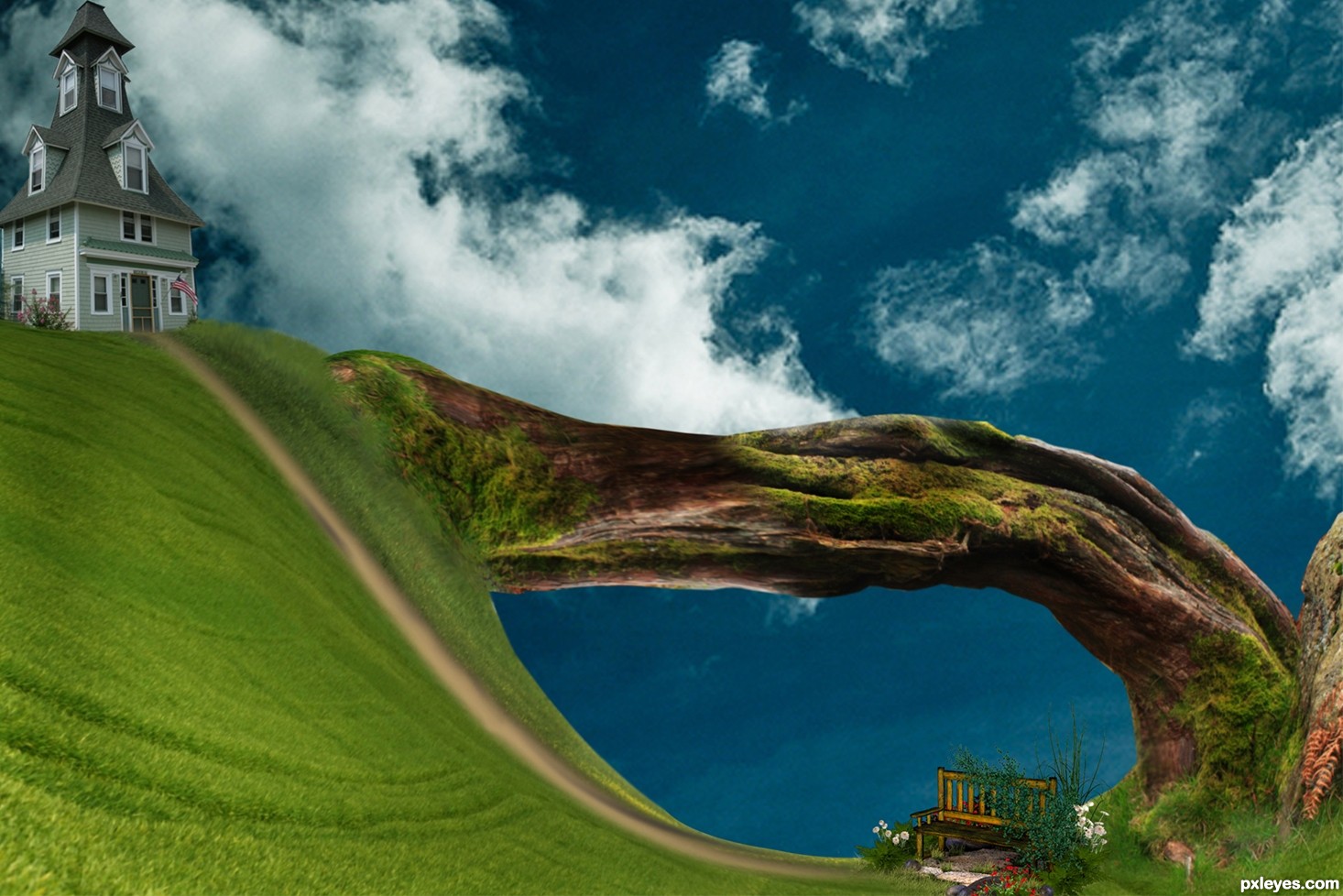
Thanks to Country Bench PSD by ~briarmoon-stock and Circa 1873 House 5 by =Fairiegoodmother (5 years and 3576 days ago)
Nice landscape! Good Luck
nice blending good luck
very cool work author...good luck
Great mood and amazing landscape. Want to live in that house
Thanks very much for the comments all
Howdie stranger!
If you want to rate this picture or participate in this contest, just:
LOGIN HERE or REGISTER FOR FREE
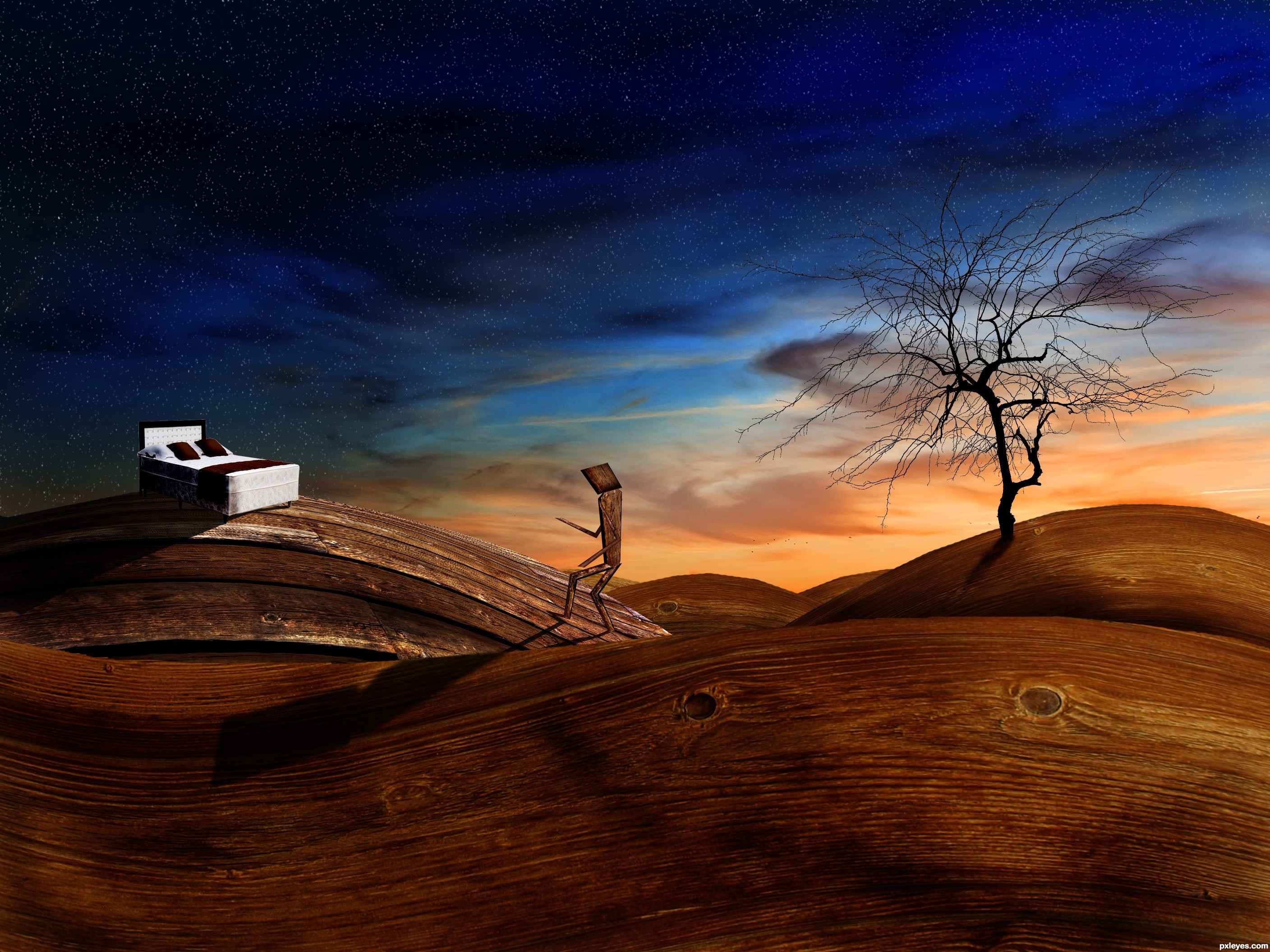
Up the wooden hill -
When you go up the wooden hill, you go up the stairs to bed.
Thanks to michelsick for the bed.
Thanks to Chemtec for the sky.
Thanks to dlritter for the tree.
Thanks to somadjinn for the wood 1.
Thanks to kovic for the wood 2. (5 years and 3592 days ago)
Very surrealistic approach and a lovely representation of the idiom... great job!
i agree!! great job!!... somethin bout the bottom of that tree looks a little off to me... could just be me though.. Great Work!!
I don't often mark things as my favourites unless they keep me coming back to see it.. and every 30 minutes or so i find myself staring at this again and again... Wow.
Thank you very much! I touched up the base of the tree westfall.
much better!.. and i agree... this one draws me back as well
I'm unfamiliar with the idiom, so I appreciated the explanation. The wooden landscape is lovely, but I don't get why the figure is also made of wood.
It just seemed to be fitting in the world of wood that I created. The figures being made of wood has no significance towards the idiom, only to the piece.
Funny image the sky looks very nice. I would suggest to change the shadows. The shadow of the man is way to big and comes to far to the front, while the shadow of the tree isn't getting any close to that and it's even higher. Removing the shadow on the front hill and sharpening the edge of the tree shadow (also stretch the shadow more downwards without fading it out) would finish the job  Good luck!
it is very nice work ,good luck
I am glad so many people like this entry
Ressiv, I know the shadows are off a bit, I retweaked them but I am going to let this entry ride like it is. Once the contest is over I will upload my adjusted to my profile.
I think I kind of like how the shadows don't totally match the logic of the lighting.
good luck
Congrats 
Congrats for your first place, Phubar!
Holy crap I actually won a contest! Awessome, thanks for the votes everyone!
Congratulations for 1st, really nice pic.
congrats!!
Congrats, a lovely piece of work
Congrats for the 1st place . . . .
Congrats sweetie!
Congrats! for 1st place
Great work! CONGRATS!!!
congrats!
congrats on 1st place....
Congrats phubar! Well deserved win
Howdie stranger!
If you want to rate this picture or participate in this contest, just:
LOGIN HERE or REGISTER FOR FREE
Photography and photoshop contests
We are a community of people with
a passion for photography, graphics and art in general.
Every day new photoshop
and photography contests are posted to compete in. We also have one weekly drawing contest
and one weekly 3D contest!
Participation is 100% free!
Just
register and get
started!
Good luck!
© 2015 Pxleyes.com. All rights reserved.


Hey, I like this. Very nice job here. Congrats
very nice! I love the tones in this and the lighting. Works really well!!!
Thanks for your comments.....
props are well chosen and set author...

but i feel, the night makes the objects more
desaturated and moves towards blueshish tones...
that is if you are tending towards reality....
Thanks closedeyes, you are right, I thought of using blue tones at the beginning, but then, I decided to leave it as it is. It is late for changes, but I will do something similar in the future, using your advise.
nice result author...best of luck
Howdie stranger!
If you want to rate this picture or participate in this contest, just:
LOGIN HERE or REGISTER FOR FREE