(5 years and 3537 days ago)
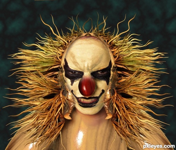
Thanks to Hanratty-stock at DA for the great evil clown face. (5 years and 3649 days ago)
Oh atlast... I knew you would be coming here joker and looks like you were with scarecrow... now I will put you back in Arkham.. and you know y I'm going to take you there.. because.. I AM BATMAN.. :P hehe..
a hybrid scarejokercrow!!! beware iqurabat! 
Pretty freaky, the hair looks a little high on the sides, maybe if he had ears ? great job anyway, good luck 
His head's inside the shell, hence no ears...
great find of the evil clown, really makes the whole picture, great as the main focus of the work
I'm agree with Barnacle
looks like a cross between penny wise and beetlejuice.. nice work author , maybe try and soften the hair lineabove the eyes thats my thoughts. 
Hehe neat idea, good chop
@ Reap: It's not a hairline, it's the edge of the shell his head is in.
ah !! how i get ya !! my bad !! i understand it moe now ! 
nice work !
so even you started wearing masks.. joker.. a nutshell mask.. competition.. very funny.. :P hehe.. sorry author I couldn't resist speaking all this..  @ricky: thanks.. I like the name iqurabat.. sounds to me like a relative of annabat..
  lolz..
Very nice -- I can see why some are afraid of clowns LOL
could use lots of blending work in the head area, and the lack of work on the body takes away from the image , maybe try to remove her body alltogether
http://www.pxleyes.com/profile/RAZ0R/&view=tips
i hold my vote
Hold it between your legs, pal.
Author, you came to rock us! 
Many things come in my mind: Freaky Show, It, Saw, The Funhouse... Batman... Kiss... 
muy bien 


woot!!! Beetle Juice  love it
Great work author 

I am exited.... 
you mean 'excited' hereisanoop?
Great job author...he is fabulously scary...good luck
Nice 1! 
very well done author , like this a lot
Nice blend.
of course this is a top list entry.. congrats in advance from me.. even if it misses, which I don't want it to, its still going to be in MY top list.. or 'wanted' list 
congrats! 
Congrats 
Congrats
well done bob
Congrats Bob. Very nicely done. 

congrats 
congrats man
Congrats! 
Howdie stranger!
If you want to rate this picture or participate in this contest, just:
LOGIN HERE or REGISTER FOR FREE
This is my best friend :-)
Photo my own, see SBS. (5 years and 3837 days ago)
he is soooooooooooooooooooooooooooooooooooo cute.. and slobbery I'm sure .. hehehe
Howdie stranger!
If you want to rate this picture or participate in this contest, just:
LOGIN HERE or REGISTER FOR FREE
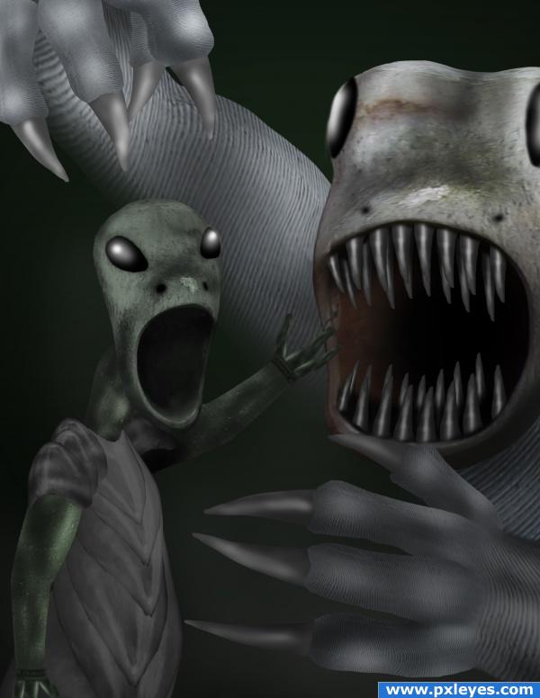
used nothing but source, lots of warp and liquify and dodge and burn...for some odd reason this is what i thought of when i saw the picture...LOL... (5 years and 3881 days ago)
Edges could be better, otherwise it's great! 
 Waiting for the SBS...
It should be absolutely terrifying but I actually like it.. sorta like in return of the Jedi and they Kill that thing in the pit and everyone starts crying.. hehehe.. very great job!!!
thanks guys...ill do some more fine tuning later tonight, then finish up my sbs...and for once i might sort of know what golem is talking about...a little...hehe
coolios
Looks good!
this is very disturbing but very cool also!
overall is cool but I didnt like the hands, good luck
Very nice, lots of imagination!
Make sure you use an IRON LEASH! Very creative!
Howdie stranger!
If you want to rate this picture or participate in this contest, just:
LOGIN HERE or REGISTER FOR FREE
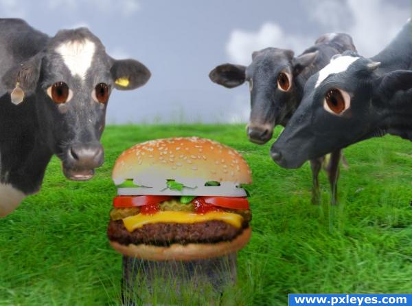
1st , add cloud layer, add grass layer, add cows, blur edges of cow, add grass overlay and use grass brush to add extra strands. blur some for the distance. hue/sat overlay for shadows,
gaussian blur clouds
thanks for the advice, amended entry. i like the stump idea i think it looks better. (5 years and 3919 days ago)
interesting
nice idea.
 this is just weird!
just a thought author.. but if you upped the color/contrast on the burger to make it pop.. and then try to get rid of the orange around the cows eyes it would make the message much more powerful.. but that's a definate IMHO because this piece is just marvelously surreal (Placing the burger on a cut off stump would be a cool idea as well.. would give the message more power)
humor and kinda a message that we should all be veggies. nice work 
hhhha!!!!!!

good
Funny! I love the expressions in the cows' eyes. Didn't see the picture pre-alterations but I do like the changes you made (and the stump definitely works). Only thing I can really critique is the burger looks VERY large compared to the cows. Might want to take it down a tad. Also, the sky seems a bit dark and gloomy. If you brighten it up it would juxtapose the shocking material (for a cow, anyway) and further the humor even more. Nice job!
 family...
Howdie stranger!
If you want to rate this picture or participate in this contest, just:
LOGIN HERE or REGISTER FOR FREE
um... nice idea
Extra points for humor =)
very cool idea...best of luck
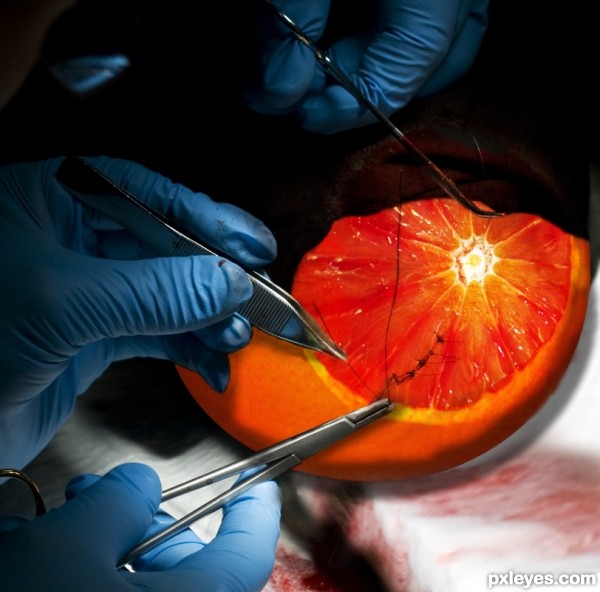
Interesting idea. Now thats what I call a blood orange haha...no?
Very clever! GL
clever and appropriate use of the blood orange! lol
Howdie stranger!
If you want to rate this picture or participate in this contest, just:
LOGIN HERE or REGISTER FOR FREE