
(5 years and 3390 days ago)
- 1: mandolin davis'
- 2: L Lemos
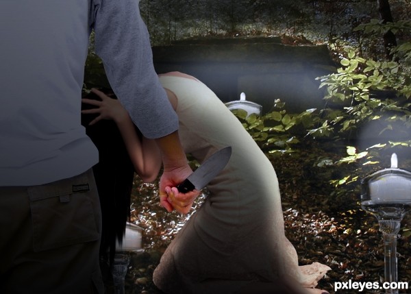
Thanks to usonian for the image of the cemetery, man with knife from mmagallan, and girl kneeling from Elisa Fox. (5 years and 3443 days ago)
Not bad except for the giant candle in background.
(Ooooh - "not bad" did you say? praise indeed  ) Well.....it's a big candle (light) under a bridge.It simply fits the alloted space.....
Ok, I bow to your superior know how, and have reduced the size of the far candle. Thanks for the tip though...  Yes...many thanks!
Howdie stranger!
If you want to rate this picture or participate in this contest, just:
LOGIN HERE or REGISTER FOR FREE
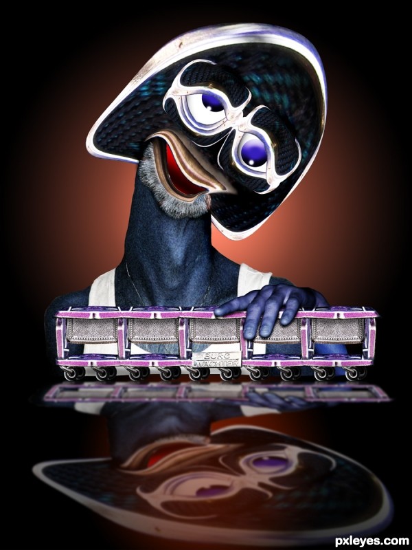
I became insane, with long intervals of horrible sanity.
Author: Edgar Allan Poe
source and personal photos (5 years and 3514 days ago)
He has a bit of madness in his face... duhh!  It's a expression of someone who is in his own world, nothing matters. I like the colors. Just one thing: you could fix the beard, making it cover all under lower lip (is it right?)
nice and well done
erikuri .. gave him more whiskers but still crazy
hahhaha Erica is right,he have madness in his face...i like it author,colors are very nice,eyes are adorable...best of luck
Nice chop! One of your better ones, IMO. 
Amusing and kind of cute in a creepy sort of way. While the reflection shape is appropriate for a shadow, true reflections in flat mirroring surfaces do not change size or shape, i.e., they are simple vertical flips. (At this close range with a very deep 3D object, I would vertically flip the trolley-front plane where it touches the surface and separately vertically flip the guy-front plane back where it touches the surface.)
Ha-ha, Mr Mushroomhead is here 
Wheels should be part of the reflection.
very cool! i like it
very nice work
Howdie stranger!
If you want to rate this picture or participate in this contest, just:
LOGIN HERE or REGISTER FOR FREE
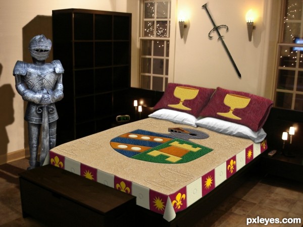
(See SBS for specific leather textures used.)
UPDATE: new knight (5 years and 3613 days ago)
This room is so Male I can smell the testosterone from here.. LOL
great job!!!
would help to center chest with bed

You know, I never noticed the chest wasn't centered on the bed! I just left it where it was in my bedroom source while my attention was concentrated on the bed itself. Unfortunately, my knight doesn't have any feet, so it's critical that the chest not be moved.  I suppose it could be stretched to be as wide as the bed, but that would yield an oddly proportioned chest IMO.
very nice...... all the best......... 
very nice work and great idea author...good luck
GL
chest could go the width of the bed np. it would look better imo 
good luck 
This time I completely disagree with Drivenslush  This abode has nothing to do with males, this is the right bedroom for me. I adore armours, swords, shields, crests, chalices and more heavy metal, please


really nice
congartulations!!!... for for 5th place...
Howdie stranger!
If you want to rate this picture or participate in this contest, just:
LOGIN HERE or REGISTER FOR FREE
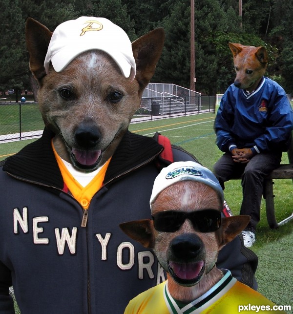
all my photos (5 years and 3622 days ago)
lol
Haahahahahahhahahaaha, really good! Awesome work, I admire it! 


I'm a little of a head-replacer myself... But I suck. 
few minor lighting issues here but overall look is great.Play a bit with levels and maybe with photo filter on this 2 nearest dog heads.Or better,add maybe 2 or 3 adjustment layers.My advice for sure is one of them be dark brown color layer with low opacity,this will made blending better.
Gave the two front dogs some more brown, I have a tendency to go to colorful (look at the back dogs hands) so I better stop before they end up looking like a rainbow threw up on them (the front one still cracks me up LOL)
woof woof
They are so crazy...ll...Mad dog team...if u cannot beat them,join them...Great result author...they are so funny...good luck
Very creative and funny and nice 

Poor Jimmy,whahaha,very good 
this is funny stuff. i love the look on poor jimmy.

 Good one. Good luck
 .
.
very nice work....  ... gud luck..........
Funny entry author.good work.
This is great....Good Luck.
 DD those guys r really funny... gl author
wooooooooooooow
Howdie stranger!
If you want to rate this picture or participate in this contest, just:
LOGIN HERE or REGISTER FOR FREE
Because of u,....................!!!!!!!!!!!!!!!!
Wha...? Quote: "Because of u,..." oh, we're playing that 3 words story game again

-What is it?
-Tell us please!!
You can add some info in the description, and you could also add a high-res. ( my stuff-my contest- edit entry)
Yes, PLEASE tell us what it is...........
At first I couldn't see the mage
Nice use of the fire.
first thing of all, its name of the song which inspired me to make this one
secondary, someone laughed at me, so i have to reenter in attempt to prove something
im not sure if u guys can see the lion head or not............
Honestly i can't see anything that would make sense, man ( please don't feel offended) but it's kind of chaotic in here. I had to check the sources to guess what happened.
Wouldn't it be easier to cut out the guy with the fire and outline him, make some fire-ish contours, add some burning cracks as well etc, BUT without loosing his shape? GL
Agrees with greymval. There's too much going on.
Howdie stranger!
If you want to rate this picture or participate in this contest, just:
LOGIN HERE or REGISTER FOR FREE