Thanks getwired,robby_m ,brenda-starr,mymy,wikimedia. (5 years and 3160 days ago)

hope someone gets a good guffaw out of this. i just kept it simple (5 years and 3837 days ago)
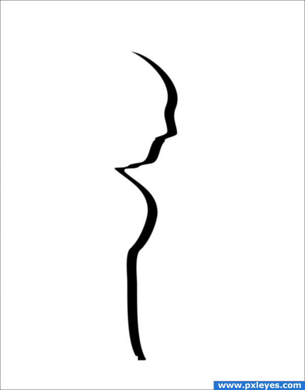
Love the minimalism, but IMHO it would have been better to keep to the outline of the statue, this looks too jagged. Remember how rounded the graphic for Alfred Hitchcock Presents was...
thank you, i re did it
Yes, better now...good luck! 
The simplicity is rather captivating...wonder if Churchill was...!?! 
You could add the cigar like the two stroke lip representation in the Original A.Hitchcock silhouette... that was a GREAT SHOW... and I recognized this IMMEDIATELY 


dont know what to think about this one.. however, it is good , artistic and creative and this is what the site is all about ..it is good in its simplicity.
Yes Alfred  Bauhaus "less is more" good luck with this Author
Howdie stranger!
If you want to rate this picture or participate in this contest, just:
LOGIN HERE or REGISTER FOR FREE

My picture and PS (5 years and 3919 days ago)
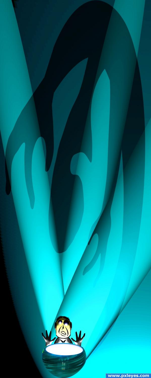
i like the image, its interesting. tho i think you should had put shadows and perspective as votes as well. i like the shadows and the perspective on your image... high marks for that
Superb image  Only thing that puts me down is the brown "lightsource". It drops out of style and color to me. On the other hand the games the shadows play, the blueish color... gourgeous!
very nice
robvdn, I was trying for three steps.. (perfect real (the lamp)/semi realistic (cartoon figure with 3d effect)/ to faded surreal (the shadow and light)) (I'll admit, the lamp is super realistic (one of the versions I was working on had about 5 of them but it didn't look like Alfred Hitchcock.. more like star wars  .. thank you very much for your comment robvdn.. (of course everyone else as well
(light bulb coating color change as per robvdn
Cool! Good job, really creative entry and i like the fact that all the work is yours. Good luck!
good job i like the colors
awesome
Creative and original work
really good! reminds me totaly to the tapes of 

 honestly! really good


Howdie stranger!
If you want to rate this picture or participate in this contest, just:
LOGIN HERE or REGISTER FOR FREE
great capture of the master GOOD LUCK!!!
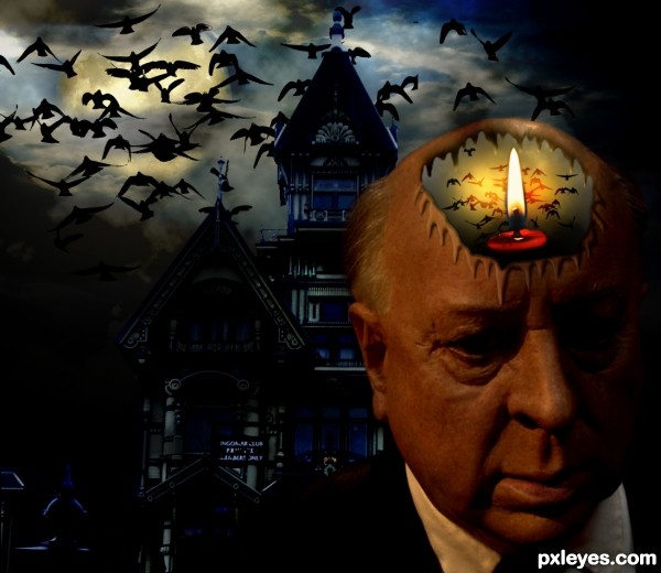
The background is a bit too dark, you can't really make out much of the house, and Alfred is terribly oversaturated - he's almost lobster red. But it's still a very interesting image.
Somebody adjust his display.
Howdie stranger!
If you want to rate this picture or participate in this contest, just:
LOGIN HERE or REGISTER FOR FREE