
Only source image and PS. (5 years and 3522 days ago)
(5 years and 3598 days ago)
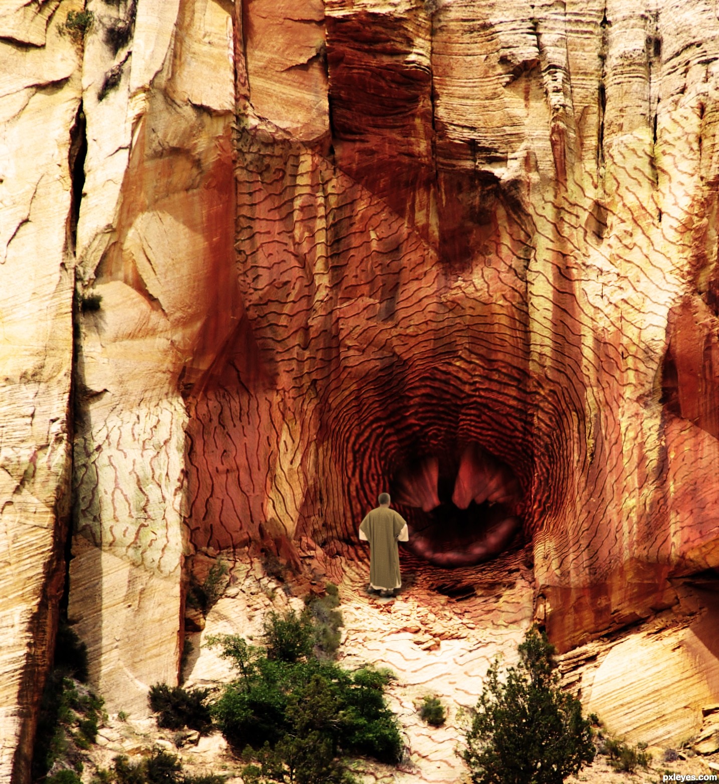
Very nice apply-ing of the texture at the some parts,left part needs a bit more color adjustment because sun is brightest there.But the guy looks too copy paste-ed.U could use some color adjustment layers or blur the edges and brown photo filter maybe.My advice with the original color is to create one dark brown color layer,with maybe 40-50% opacity,and one dark gold color or soft color layer...Good luck author
Thanks erathion, I had applied some blur to the man, but I've now blurred his edges a little more and applied a brown photo filter to him, I think he looks better. I'll fiddle a bit more with the texture too. 
Nice , I like it ... Good job =)
omg, that triggerfish makes a great center for this! 
nice work ................. ..............he looks like a warlock to me, and he is saying some mantra to open the door ................. how is that ......... ha ha ....... all the best to u ...........  :
:
Howdie stranger!
If you want to rate this picture or participate in this contest, just:
LOGIN HERE or REGISTER FOR FREE
Wrong landing place? ;p
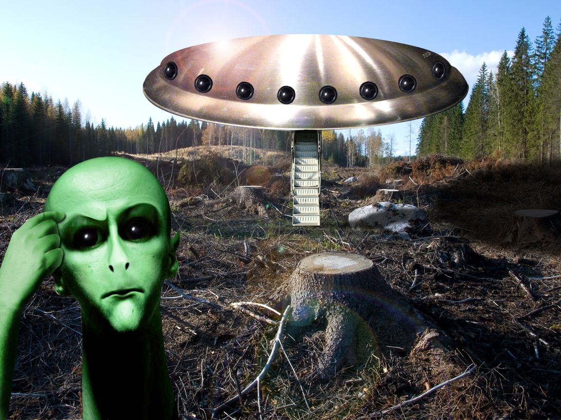
I'm not so good in sci-fi stuff but I tried...
Thanks to Sami Taipale, Vidiot and Susanvg at Flickr.
(5 years and 3672 days ago)
lol i like his expression good job !
If the notion is that the UFO caused the destruction, then the neatly cut tree stump doesn't fit. The shadows on the alien aren't consistent with those on the stump. The UFO seems tilted downward (vanishing point much too high for this Earthling's predisposition). The top edge of the UFO doesn't seem realistic because it's so strong.
cute concept
Dan, simply those aliens are moron because they landed on a wrong place, without humans around... 
DanLundberg made some good points.
Howdie stranger!
If you want to rate this picture or participate in this contest, just:
LOGIN HERE or REGISTER FOR FREE
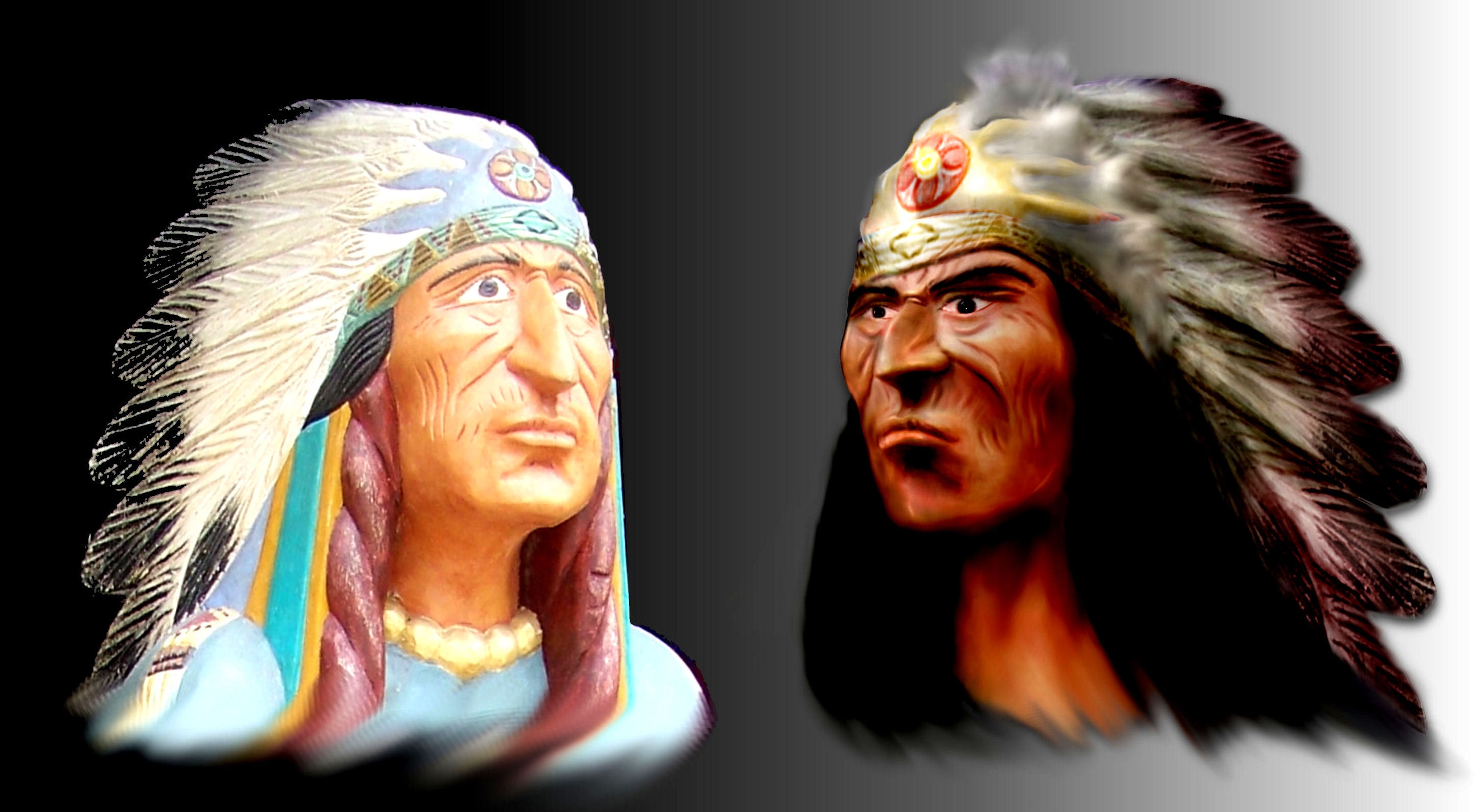
...hate those statues... (5 years and 3929 days ago)
If you hate them, why make another one?
well cmyk , i dont like the way the statues are made so i made a comparative one
very good result
nice job, shame you didnt do the rest of the body. Cool job on the face, poor job on the layout 
Author I hear ya!!! I worked right next to a reservation and those things were everywhere.. you can solve the whole layout deally bopper by just cropping them as if you were zooming in on them.. but only if you want to.. EXCELLENT WORK!!! (though I would put them before after, not after before.. just for the natural travel of the eye.. but that of course is for the left to right reading audience)
pity you didnt do the whole image of the Indian...
ok changed a bit , as for the whole body rekonstruction i'm just not fast enough ... yet
pretty good
really coool
Yours is more natural
love yours it looks much more real!
Howdie stranger!
If you want to rate this picture or participate in this contest, just:
LOGIN HERE or REGISTER FOR FREE
Thanks for the ideas I will try.
(5 years and 3941 days ago)
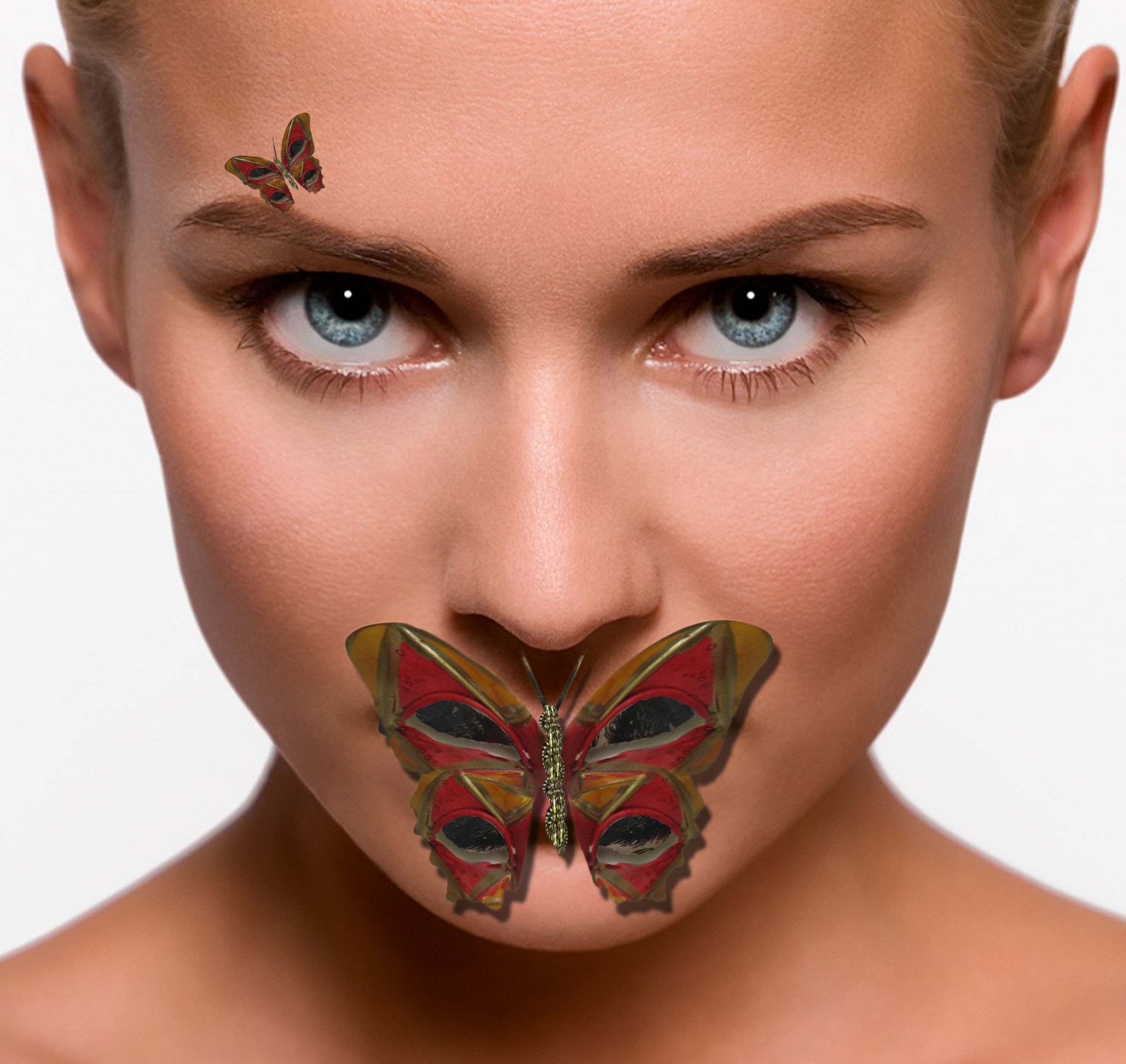
this is strong and powerfull image but i think she dt need this small buterfly, this is up to u, no metter what good work and good luck
Author: if you have a lot to upload you are normally better off ticking the 'publish entries later' box and then it should appear all at once I think. I would like to see your source image for this..
EDIT: link up.. 
Needs shadows, and needs source link...
EDIT: Has source link, also has wrong shadows...
This is interesting. I thought I was going to be the only one doing butterflies. At least I could inspire someone to do something like me
very silence of the lambs
Do tell me when the lambs stop screaming clairic
very nice
good butterfly, but the small one can be avoid, and the shadow is not ok(check the nose shadow)
good
This si a nice image, but the shadow( I know this has been said here too often) are acting up... Polish it up and you will a better chop...
I would lose the girl to focus more on the beautiful butterfly,nice chop
looks good
reminds me of silence of the lambs... cool.
very nice
Nice idea, Good Luck
Nice butterfly good luck author
nice job on the butterfly
:!!
Nice name and nice image!!
Howdie stranger!
If you want to rate this picture or participate in this contest, just:
LOGIN HERE or REGISTER FOR FREE
Photography and photoshop contests
We are a community of people with
a passion for photography, graphics and art in general.
Every day new photoshop
and photography contests are posted to compete in. We also have one weekly drawing contest
and one weekly 3D contest!
Participation is 100% free!
Just
register and get
started!
Good luck!
© 2015 Pxleyes.com. All rights reserved.


cool work my friend
Funny!
cool creature...
very very interesting!
Howdie stranger!
If you want to rate this picture or participate in this contest, just:
LOGIN HERE or REGISTER FOR FREE