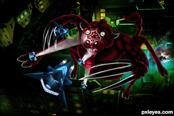
Only source used. (5 years and 3615 days ago)

(5 years and 3617 days ago)
 MAO
MAO  Extra points for humor.
hey, that's MY mortgage company you're talkin' about there! You can find them at www.we'vegotbigones.com
also LMAO!!!!! it's a lot of script (a company like that doesn't deserve a fancy font), but good idea.

HEHEHEHEHEHE... What they said! LOLOLOL
interesting................. 
nice idea
Thanks for the funny comments people


Howdie stranger!
If you want to rate this picture or participate in this contest, just:
LOGIN HERE or REGISTER FOR FREE
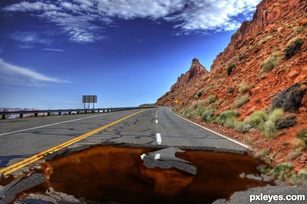
1 source and CS3 (5 years and 3655 days ago)
 ! Author, you painted the hole... so, YOU are the pavement artist!
so it looks really good

Good job, looks great.
This is always my nightmare...... very good job... (I think, removing the brown color over the rod and broken edges (near the yellow devider mark) will clarify the depth. Its only my opinion).... GL
hehehe.. at first I was like.. Hey.. this looks like it just drawn on the road.. and then I realized.. THAT's THE WHOLE POINT..hehehe.. great job author
I wasn't too sure about the color on the edges but I actually like it this way!
I wasn't too sure about the color on the edges but I actually like it this way!
the lines around the edge need to be sharpened to make it look realistic and the middle of it needs to be a little darker...otherwise good entry
nice paint job 
We have these in Colorado hehe. Nice job and good luck

great idea!
Good idea and best of luck!
congrats Chappy! 
Great Job and Congrats on 3rd 
congrats =)
Congratulations! 
congrats 
congrats, Poppa! 
congrats chappy 
Congrats!!
Howdie stranger!
If you want to rate this picture or participate in this contest, just:
LOGIN HERE or REGISTER FOR FREE
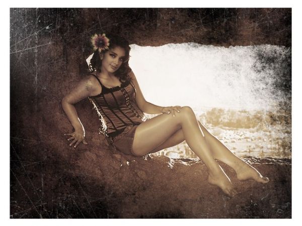
Model: Bobbi
Location: Hole in a Rock Arizona.
Flower is in models hair. Used smudge tool to blend it into the photo. Also used brushes for the dirty look. (5 years and 3669 days ago)
Nice image, but would have liked to have seen the source image used more.
Very interesting. (And not just the model  )
)
Nice work...very good color...good luck
lovely editing of the photograph ... well done, ...but imo - poor use of source
Thank you all. And yes, I probably could have made the source more the focal point, but I just thought it was really ugly and wanted to hide it in a picture somewhere lol. At least I didn't *only* copy and paste it.
haha so you hide it beside a very very beautiful lady 
agrees with the source used.
Howdie stranger!
If you want to rate this picture or participate in this contest, just:
LOGIN HERE or REGISTER FOR FREE
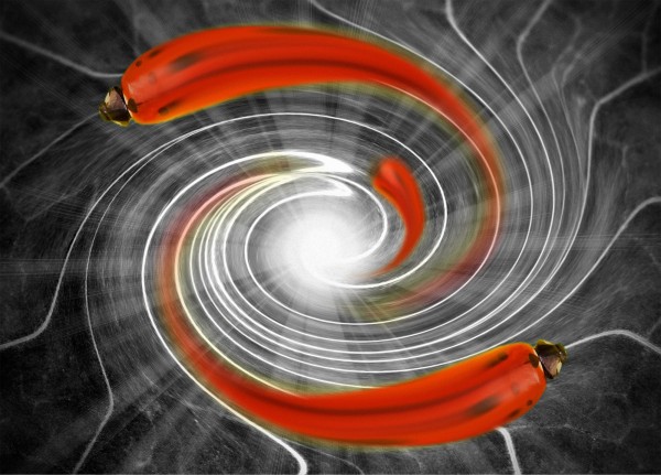
Lady birds caught in a wormhole (5 years and 3768 days ago)
ehm, what exactly is this?
Great...lady bug's race...
Trippy!!! It's the most psycadelic one I've seen so far.
Howdie stranger!
If you want to rate this picture or participate in this contest, just:
LOGIN HERE or REGISTER FOR FREE
great work author
Incredible work of art, as always!
Great work...gl
super chop
awesome, but your lighting and rendering is off on the creature. I like the dual light source set-up that you have, but seriously take advantage of the light sources reflected on to the creature coming from the windows and the spotlights (spotlights do have a color).
Thank you all for commenting . @jackaloftrades: I know that the lighting on the creature is not very good due to the time constraint but what do you mean about the light from the windows? I wanna show this creature jumping, so actually it's not near the windows to get the reflection. I try to make the light from the spotlight on the creature but you are right, looks not good now. Thank you again for your feedback
  .
.
good job.... all the best to u............
Howdie stranger!
If you want to rate this picture or participate in this contest, just:
LOGIN HERE or REGISTER FOR FREE