(5 years and 2893 days ago)
- 1: source1

SBS is animated (5 years and 3258 days ago)
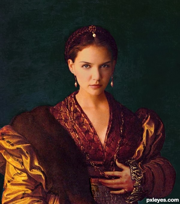
Great blending, but the difference in noise between the face and the clothes and hand is disconcerting.
Needs more matching texture on the face, but good color match.
agree with cmyk46 , then you will have a good one.
All in all pretty decent work . Perhaps tone down the brightness of her face a little.
Good call, Chappy. She does seem to have a bit of facial shine going on...The texture is a harder fix. I added a bit of film grain and canvas texture, but recreating 15th Century cracks is harder than it would seem...
Nice improvement author  , may I suggest trying a little Filter>Noise>Add Noise. Play with the settings; amount, Gaussian/monochromatic and such. Maybe it will help. That is on the layer with her face on it of course.
Beautiful work author...also one of the top 3 IMO...GL
Thank you all for the kind words. This was a fun contest!
Congrats! 
Congrats!!
Congrats!!!
Howdie stranger!
If you want to rate this picture or participate in this contest, just:
LOGIN HERE or REGISTER FOR FREE
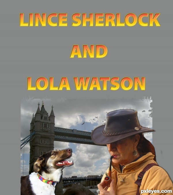
the drop shadow is a bit weird, and erasing the background off the back of the hair might be helpful, (soft smudge to shape the edge is what I would do, I can see where you were going with this.

Don't be afraid to use a Texting Tools like Word Art or the bending text tools in Photoshop to shape your title. You can also just rasterize the text and use the WARP or DISTORT text to shape it better. (Using Bevel emboss can be fun too)
Great fun idea, good luck
but because you want to cut my beautiful hair? Can you explain me again? for the rest, I feel .. and many, many thanks
there is some background from the Original Photograph still on your hair you can see it in the high res LOL, don't remove your hair, just the image from the original photo still on the hair
I followed your advice as I could I also lit a pipe
thanks, you're a big help
There should be no shadows against the sky, only on objects.
I wanted to give a little depth, but you're right, I have raised. thanks
See....following the advise of Driven and CMYK46, helped you a lot. Your image looks real nice. It takes me to the Olympic Games. Good luck!
very true to the welcome aid, thank you friends. the hat is the famous Australian Bharma, rolled up and put in your pocket poor kangaroo!
Howdie stranger!
If you want to rate this picture or participate in this contest, just:
LOGIN HERE or REGISTER FOR FREE