(5 years and 3516 days ago)

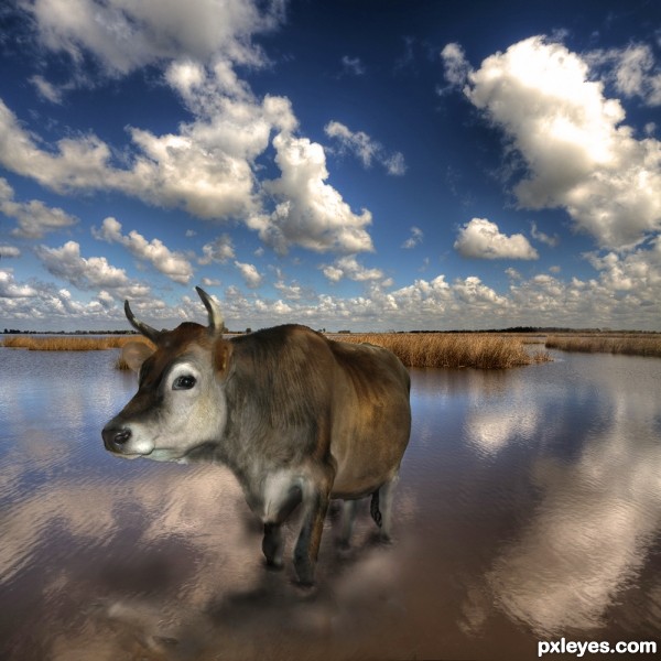
Took this picture of this cow in my friends parents living room,
it's allowed in the house once in a while.:(
(5 years and 3584 days ago)
The reflection should be a lot clearer than that, for as calm as the water is.
gud luck to u....... 
Did anyone else see that part where the picture of the cow was taken in the living room? ...and nobody has comments about that? ROFLMAO lol.
I like the picture and the cow is adorable but the lighting isn't quite right. You can tell there was a flash on the cow and there isn't enough base shadow to illustrate the fact that the cow is outside. I also agree with Jawshoe, the cows reflection would be just a little bit clearer and possibly darker due to the light source.  best of luck!!
nice idea, but I do agree with Jawshoewhah about the reflection. Kind of hard to imagine what a cow was doing in the living room, I wouldn't want to clean up after him, lol. gl
I agree with dollmommy! Imagine if after one of these visits you find a "great surprise" (read manure)... Oh my hahaha!... 
Well, author, I agree with Jaw too; and in a sunny landscape, cow needs some lighting - its pic was taken indoor, right? 
Howdie stranger!
If you want to rate this picture or participate in this contest, just:
LOGIN HERE or REGISTER FOR FREE

and good fun :)
OKAY PONTI... RAZOR... and JELLOPUDDING... I'VE GIVEN YOU TONS MORE CR@P
(peer pressure)
Now I think I'll lay down a bit as I try to keep down my breakfast (Picture for the POOP is in the SBS) (5 years and 3666 days ago)
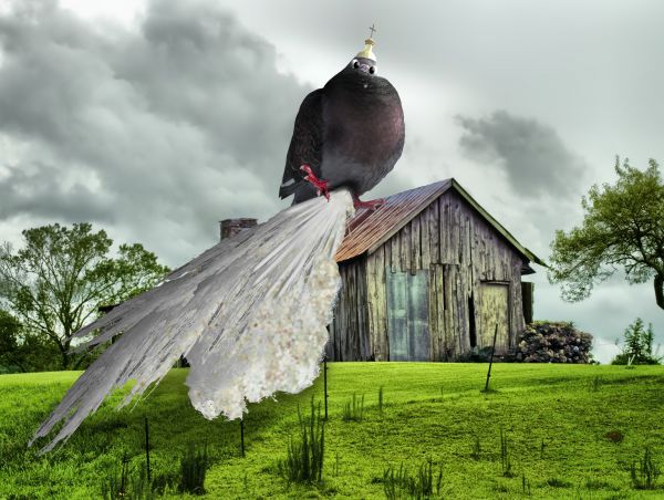
BWAHAHAHAHA ..... thats a big pigeon ... the first thing I though when I seen this is wow thats gonna be a lot of @!#% to clean up :P
 MAO now thats a real turdbird
D'aww excellent work on the pigeon! The.. ermm.. leavings lack a bit of depth i think, but other than that... hahahaha!!
puffed up the poop for ponti..hehe
lol 
 nice idea
still it looks flat, maybe a chunk or 2 of berry will help

I'm not going to make the poop any more gross... I don't want to throw up... thanks guys (I really didn't know there were experts on bird poop) LOL
Looks like that pigeon found the sour berries
Haha this one is really funny xP
I think nobody here is an expert on bird poop... Have you never got bird poop (specially from pigeon or crow) on your head? Unfortunatelly, I have... And I can say: it's really a HOLY CR@P!!! 
really funny 
A lot of cr@p, all right.
chuckle 
lol at 1st glance i thought that was his tail 
lol ... me too , humerous entry...WELL DONE !! 
OHHH no!! dude that piegon is totally cocking his leg BWAHAHAHAHAHHAHAHAHAA that epic... I think he ate your friend...
Very very crazy...great job author
absoluttttteeeee .... CrAzY......... GL.....
nice edit 
I'm glad cows don't fly. 
roflmao good one, and me too chappy  good luck Author
Looks like this pigeon has screaming diarrhea 
GL
Howdie stranger!
If you want to rate this picture or participate in this contest, just:
LOGIN HERE or REGISTER FOR FREE

When I was young, I always wondered what a Holy Cow looked like. (5 years and 3897 days ago)
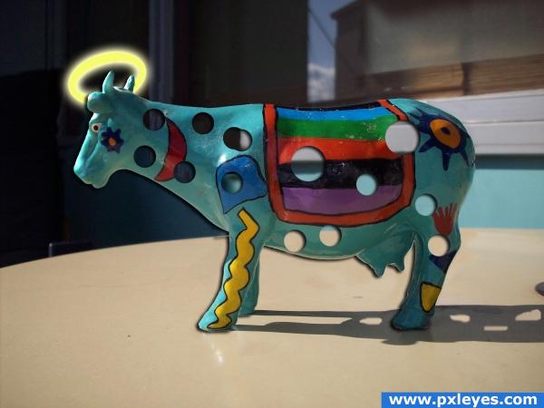
Very funny idea, i think it's a bit simple though.. maybe, really make it obvious he's holy, put it in a magical place, give it wings and a bunch of people bowing down, but just a halo is a little simple. Good luck!!
i'm gonna have to agree with ponti this time
I wanted it to be simple and easy on the eyes, it seems like everyone likes putting animals in magical places.I want people to notice things like the holes in the shadow or anything in this simplistic image that makes it great!
holy cow's got holes LOLOL
I'd like to change background with something other so holes stand out from image. IMO holes should not be visible in shadow as light is coming from left.
Try using a displacement map on the holes, that way they'll look more natural. If you pentool the cow and duplicate that layer several times with some nudge on each layer (when done merge those underlying layers and blur them) you'll get a better idea off depth. Just some pointers 
thnx!
The shadow isn't so godlike...
Glad you remembered to put holes in the shadow. I double checked because I was wondering!
lol, funny one. the shadow is not perfect, but only for a very formed eye  good job!
Howdie stranger!
If you want to rate this picture or participate in this contest, just:
LOGIN HERE or REGISTER FOR FREE

Thanks to kansheera-stock for the feathers. (5 years and 3910 days ago)
Really nice colors. I like the contrast and the dark & orange background. Well done!  (btw you didn't have to make that frame..)
There's only one Holy Father, and a stone statue isn't it!! It's a nice image though, with big bright colours. Good luck!
Pixelkid - maybe the title was changed but still.. i'm a little embarassed here xD
ponti55: Look at the title a little closer. Author: I like the saturation on this...perhaps brighten the feather more to bring it more of a focus. 
ponti55: Didn't mean to embarrass. Keep up the great commenting!
nice colorization and blending.. good luck on this author
awesome!
grt color................grt feel...............xcept the frame...
Cool.. 
like the feather
Howdie stranger!
If you want to rate this picture or participate in this contest, just:
LOGIN HERE or REGISTER FOR FREE
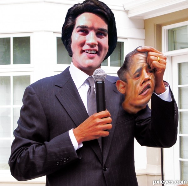
the mask is not that original anymore isn't it
yeah learn to live with it or don't enter a contest if u don't want comments
Thats funny
Howdie stranger!
If you want to rate this picture or participate in this contest, just:
LOGIN HERE or REGISTER FOR FREE