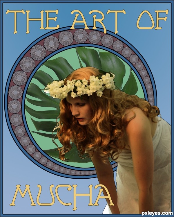
https://en.wikipedia.org/wiki/Alphonse_Mucha
The reluctant father of Art Nouveau. (5 years and 2647 days ago)
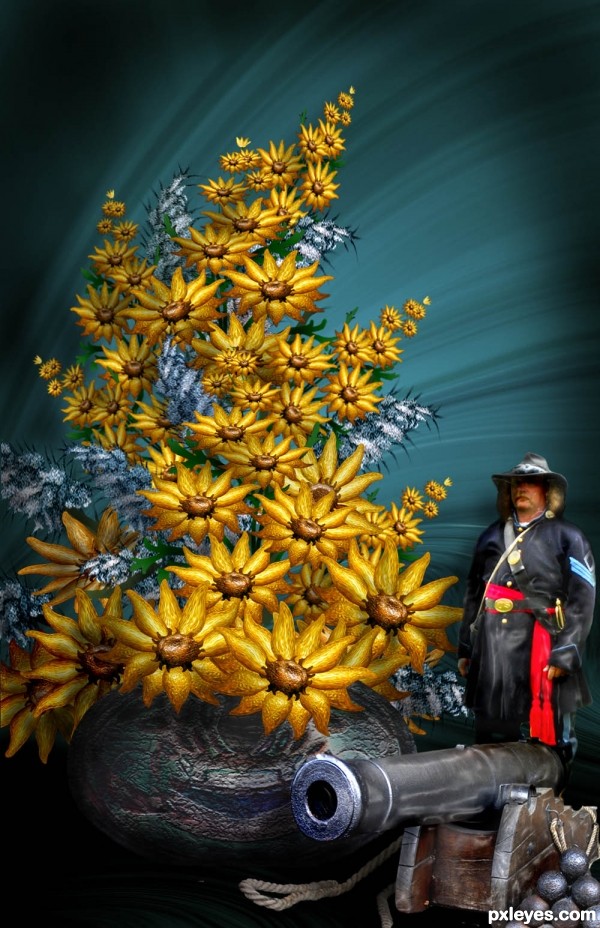
Thanks to brandijordon at flickr.com for the Civil War soldier source; Everything else is made from the source photo. Please see SBS for details. FOR THOSE WHO MIGHT BE CONFUSED , STATUES AND OBJECTS ARE OFTEN USED AS ACCESSORIES TO A FLORAL ARRANGEMENT. The soldier and cannon are accessories - in other words, HE"S NOT REAL (5 years and 3083 days ago)
I love the flowers but the cutout of the man on that background really doesnt go well, i think it looks better on the light blueish background on step 10.
Thanks for your input Eladine. Decided to get rid of the purple and go toward the blue gray again.
This is confusing. I see it as either a gigantic bouquet of flowers that don't exist in the real world next to a life size person & object, or tiny replicas next to some sort of bouquet of flowers that don't exist in the real world.
Love your description! and color choices.
Howdie stranger!
If you want to rate this picture or participate in this contest, just:
LOGIN HERE or REGISTER FOR FREE
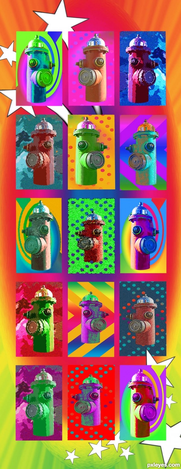
Just the source used on this take-off on Peter Max's colorful art works. To see some of his delightful creations go to: http://www.google.com/images?as_q="Peter%20Max"&safe=active&as_st=yo to: (5 years and 3448 days ago)
Nice! GL! 
my fave is the one in third row all the way on the right =)
super cool colorful work...gl author
Amazing!
Howdie stranger!
If you want to rate this picture or participate in this contest, just:
LOGIN HERE or REGISTER FOR FREE

(5 years and 3461 days ago)
Love it! The contrast between the the original surreal source and your stylized use of it is wonderful.
Cheers
I don't care for Miro, but you did a nice job making me think of him. 
A fun piece = )
Howdie stranger!
If you want to rate this picture or participate in this contest, just:
LOGIN HERE or REGISTER FOR FREE
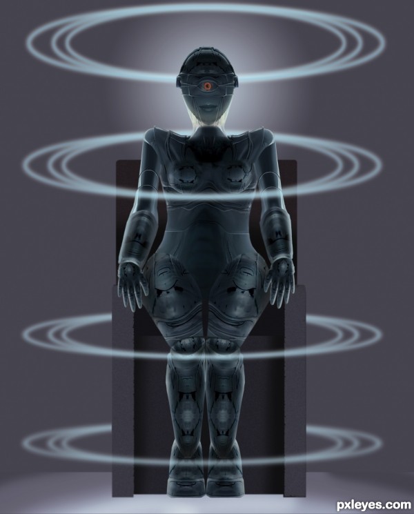
Maria is the name of both the heroine and her robot duplicate in the classic Fritz Lang film METROPOLIS. http://en.wikipedia.org/wiki/Metropolis_(film)
There are many versions & at least one remake. If you haven't seen any of them, please do. The film techniques were amazing for the time, even if the heavy handed social commentary isn't. In a way, it's still a message for our times, given the shrinking middle class and the growth of poverty while the rich continue to control more of the planet's wealth. (5 years and 3464 days ago)
Cool movie info, author. Reminds me of one or two other early scifi films.
In this Metropolis film, was there only a single eye on the robot? (The image at wiki shows two.)
I went with the one eye because it was the first thing the egg suggested, and after trying two eyes, I went with my first idea. I didn't want to be a slave to the film image.
(And Gort, in THE DAY THE EARTH STOOD STILL, was a very cool one eyed robot! 
I've heard of the film but never actually seen it, so I searched on youtube and found several clips including the full 118 minute version. This one is my favorite as is your INCREDIBLE chop!!!
http://www.youtube.com/watch?v=GzINI3au9q0&feature=related
Also..fantastic special effects for a film made in 1927!!!
Thank you, JCF! 
(I totally agree about the awesomeness of the special effects for the time period.).
Still one of my favourite movies.. and this is a fantastic inspired image 
I can't get over how ya'll can take one image and create something so different! Great work author! 
Is that a mouth on her stomach? Anyway, it's creepy and cool. Good luck!
LOL Pingenvy! Nah, that was just some stuff that was on the part I warped for her torso...I guess it was kinda distracting, so it's gone now. Thanks! 
I've seen the film, so I knew it was from it the minute I saw your entry.
Great work!
Im thinking this is my fav of the contest
Definintely my fav ... really nice work Author ... and great imagination in the creation of her! High point for the work and high point for the conception!
Terrific creativity and technique here. GL
Awesome! Very cool! Nice work my friend! GL! 
Interesting stylized rendering! I like the strategic placement of the eye color, very nice! A brilliant must see film! BTW Maria was the inspiration for C3PO.
Great construction author....Every part of the body is very well made...Hands are always the hardest part for robots, but u made them very very good...best of luck
hey nice work here, really cannot see this unless you go to the hi res., well done.
Congrats Bob!! 
hehehehe
Congrats Bob!! 
Congrats, nice work 
Congrats Bob...this is not surprise for me...well deserved...
Congrats for 1st
Congratulations on first place!
Howdie stranger!
If you want to rate this picture or participate in this contest, just:
LOGIN HERE or REGISTER FOR FREE
Definitely captures the Art Nouveau flavor, nicely done!
love it! thats what i was going for when i took the photo
Good association, the girl certainly fits well for a Mucha theme. Perhaps I'd make the outline a bit thicker so there's a better link with the circle in the background (and if you'd like also add a few thinner lines on her arms, hair, etc). And if you réally want, you may want to change the position of the words a bit: instead of overlapping them, let them fit in the leftover space (blue background) of the image, so that text and image all become one. Up to you. Good luck!

Mmm, some more about the text: I see in original Mucha posters that the text is also behind women and other images, so that may be an option too
I've chosen to place the text where it is to create depth. Placing the type in the empty spaces would flatten the image. I didn't want to over emphasize the outline on the figure...I tried it, and it looked phony. It's only there to simulate the edges of a drawing.
Nice poster, great blend of contrasting colors, good stuff.
this is great !!! nice work
Congrats Bob!!
Congratulation ! Well done and deserved! Wish you a nice week!
Congrats Bob. Good work!
Howdie stranger!
If you want to rate this picture or participate in this contest, just:
LOGIN HERE or REGISTER FOR FREE