The cloud filter can be found
in source link Mura's Meister is the one you want There are different filters and plug in's there. (5 years and 3663 days ago)
- 1: source1

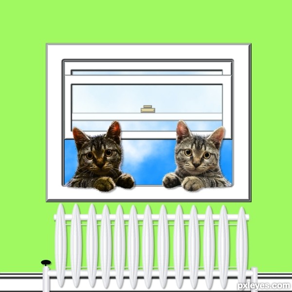
Kids on a ride home to their City in the clouds.
Please take a look in high res. (5 years and 3681 days ago)
Very NICE! Great work and gl
Great job!
decent work but where those birds are actually..?..above the clouds or beneath ?.
Wow! This is simply awesome!!! You should place for sure author. Great imagination and use of external sources. Very surreal and imaginative. GL to you!!!
That's so cool, very nice work, author.
Great job author...good luck
Excellent... but with the light coming from overhead, wouldn't the birds be less shillouetted?...
very playful and fun!!!
What a way to travel
Thanks all for the comments. The birds are above the clouds and underneath the clouds that carry the city, so between them. Birds could indeed be a little brighter JamesD, since its a surrealistic image I think its ok this way 
I'm liking this one a lot! I like the integrity of only one light source and it's consistent! One small suggestion...perhaps lighten the right sides of the balloons a bit more. The extremely strong highlights on the gals tops makes me think this could be a good thing. 
wow that is wonderful ................. can i get those balloons .............. 
Thanks pixelkid, brightened the right parts a little bit 
Swordfish, they'll cost you a lot, these are really special and take you anywhere you want 
ha ha ...........thats nice ............... 
excellent and very nice
Very cute! 
Very good composition.
Happy little angels 
Love the overall composition.......G/L Author.
congrats for the 2nd .......... 
Congrats for your second place, Ressiv!
Congrats...
Oh so happy to see this one place so high! It was definitely my favorite. Congrats! 
Congrats Ressiv!!!
Congratulations! 
Congratulations! for 2nd place 
Thanks a lot all 
congratulations!!! 
Congratulations!!!
Congrats!
congratulations for the second
Thanks 
Howdie stranger!
If you want to rate this picture or participate in this contest, just:
LOGIN HERE or REGISTER FOR FREE
(5 years and 3693 days ago)
Very clever!
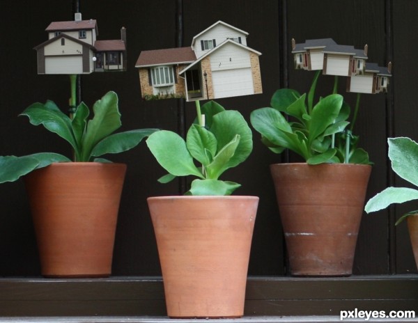
Very creative. I think there should be some shadow where stem meets house, and the center house might also cast some shadow on its leaves. The three-house thing seems odd. If it's three blooms, then having the front bloom cast a shadow on the back blooms would make it seem less flat (although the stems kind of seem like they're all on the same plane). [I'd go back to your flower-pot source for inspiration and make it two blooms: big house in back, smaller (still growing) house in front on right.]
Oh, I'd like to cultivate one of that for me... 
Ya me too, Erikuri. Along with a Toyota Tundra and an a Hasselblad HD2-39 the most expensive camera that is commercially available. 39 mega-pixels and roughly 40,000 dollars, and hell why one a million bucks on top of that.  Only on photoshop for now.
nice idea
Howdie stranger!
If you want to rate this picture or participate in this contest, just:
LOGIN HERE or REGISTER FOR FREE
(5 years and 3705 days ago)
way up there in the cuteness factor
Nice one
cute work...
nice entry ......... GL ..........
So cute...good luck
nice
Good luck with this entry.....
Howdie stranger!
If you want to rate this picture or participate in this contest, just:
LOGIN HERE or REGISTER FOR FREE
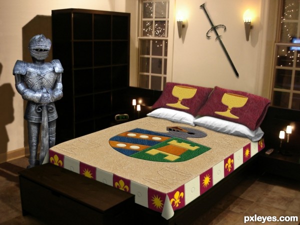
(See SBS for specific leather textures used.)
UPDATE: new knight (5 years and 3713 days ago)
This room is so Male I can smell the testosterone from here.. LOL
great job!!!
would help to center chest with bed

You know, I never noticed the chest wasn't centered on the bed! I just left it where it was in my bedroom source while my attention was concentrated on the bed itself. Unfortunately, my knight doesn't have any feet, so it's critical that the chest not be moved.  I suppose it could be stretched to be as wide as the bed, but that would yield an oddly proportioned chest IMO.
very nice...... all the best......... 
very nice work and great idea author...good luck
GL
chest could go the width of the bed np. it would look better imo 
good luck 
This time I completely disagree with Drivenslush  This abode has nothing to do with males, this is the right bedroom for me. I adore armours, swords, shields, crests, chalices and more heavy metal, please


really nice
congartulations!!!... for for 5th place...
Howdie stranger!
If you want to rate this picture or participate in this contest, just:
LOGIN HERE or REGISTER FOR FREE
Howdie stranger!
If you want to rate this picture or participate in this contest, just:
LOGIN HERE or REGISTER FOR FREE