(5 years and 3692 days ago)
(5 years and 3695 days ago)
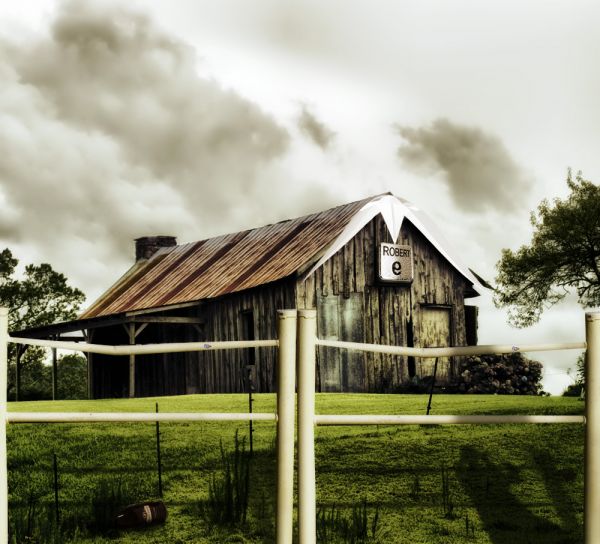
What is the white thing on top of the "Robert"?
It is paper boat source, which is used for decoration purpose. 
Well... nobody can deny you got using all the sources!!! Nicely done!... 
Great job.. very subtle work.
Image is really awesome author...
well done author.. just a small tip.. the shadow of the man shows on the ground alongwith the shadow of the fence.. as if he is standing before the fence but not in pic.. so because of the perspective there should be a part of the shadow on the fence in front.. IMO.. let me know if you got my point.. it'll look more realistic..
Thanks iquraishi, you are right, updated 
Great idea, well done!
looks better.. thanks for taking my point..  hope you don't mind giving me a thumbs up..
iquraishi, I always give Gold thumbs for great suggesstion, silver which help improve my entry and bronze for just comment. Cheer! you have gold thumb.
thanks.. 
nice but is there a reason why the #9 is mirrored? really nice execution ... WELL DONE  !!
!!
thanks, PixelWhisperer, I flipped it to match perspective with the house. 
nice one...gl
Beautiful work.....good one....
Nice job. GL
Howdie stranger!
If you want to rate this picture or participate in this contest, just:
LOGIN HERE or REGISTER FOR FREE
(5 years and 3696 days ago)
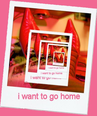
The photos should really be set inside each other, rather than on top of one another.
i think the place is not important but it should be consistent. In your case, different layers you put to different position and there are limited repetition
Agreed with the other lads.
agrees
Howdie stranger!
If you want to rate this picture or participate in this contest, just:
LOGIN HERE or REGISTER FOR FREE
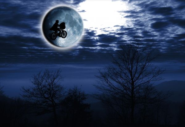
Love this movie! (5 years and 3705 days ago)
I do too... I think I've watched 5 times at least when I was a child, and other twice later!... Beautiful! 
You were happy choosing this scene! 
Very very nice work...good luck author
Thank you for the nice comments. 
awesome work
Our moon is out in space beyond the clouds, not in front of them as you show here. Eliminate the glow around the moon and the clouds in the top half of the image, replacing them with a starry night sky. The possibility that one of those stars is ET's home makes for a more evocative image than these claustrophobic clouds.
the size of the moon n kid was look weird to the background
DanL: I like how you refere the clouds to be claustrophobic (in a place where space is all and the only thing you´ve got  I will expriment a little with your idea, and see what I prefer in the end. Thanks for the tips.
Nice blue mood! 
nice but i think dropping the opacity of the 'outer glow' halo on your moon might give a more realistic effect, and the moon is falling to earth aaarrrgghgh(in front of clouds!). (IMO)
Congrats!! 
Howdie stranger!
If you want to rate this picture or participate in this contest, just:
LOGIN HERE or REGISTER FOR FREE
(5 years and 3706 days ago)
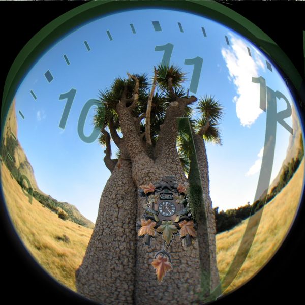
Where's the source? That coo coo clock has a different face than the source. SBS really needed.
make me dizzy GL Author
Ok, that's better.
very nice work...good luck author
good job! i would work on the chop on the watch a little.
halo and shadow issues on leaves and pendulum
GL
Howdie stranger!
If you want to rate this picture or participate in this contest, just:
LOGIN HERE or REGISTER FOR FREE
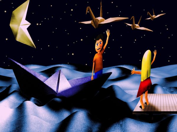
Very cute! Everything is made of paper...
hehehe.. the thumbnail looks all distorted but the HIGH RES is super duper hehehe.. very clever use of source
lol i love this ... especially the wood of the jetty being note paper ... WELL DONE !!
!!
Thanks for the comments and you have to see the high res for the best view indeed
definitely better in high res. GL!
Howdie stranger!
If you want to rate this picture or participate in this contest, just:
LOGIN HERE or REGISTER FOR FREE