(5 years and 3870 days ago)
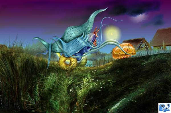
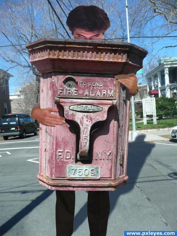
A strange bug returns home on a foggy night.
No external sources used. (5 years and 3874 days ago)
Very nice work,selection of colors is fabulous...great work author....
Beautiful colors and nice work 

Too colorful for a night scene, but nice image...
Fantsatic! The strange colorful bug looks amazing! 
best of the bunch in my opinion, well done.
Congrats! Marina08...fine job indeed!!
Congrats, nice work 
Congrats
Congrats!
Congrats!!
Howdie stranger!
If you want to rate this picture or participate in this contest, just:
LOGIN HERE or REGISTER FOR FREE
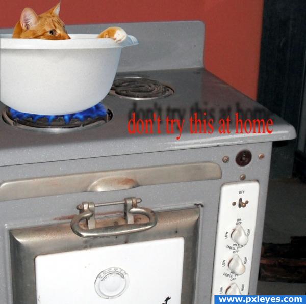
don't try this at home (5 years and 3904 days ago)
It's an electric stove...and you don't need the floating type.
You may have done better putting him in a pot?
poor kittie..........................................put him down........................
Ditto CMYK...
definitely get rid of the type. and maybe change the material of the bowl to metal or replace it with a pot.
YES! so good
nice 
Howdie stranger!
If you want to rate this picture or participate in this contest, just:
LOGIN HERE or REGISTER FOR FREE
(5 years and 3907 days ago)
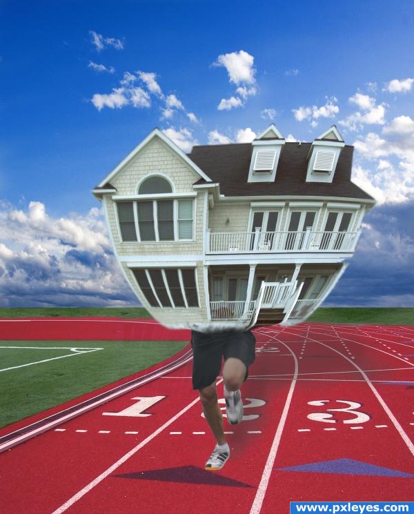
Nice Idea but shouldn't there be some shadowing in there?
oops, yes ... thanks chuck!: ))
))
maybe more warp at bottom of the house make it perfect....just a suggest.. 
very nice 
Howdie stranger!
If you want to rate this picture or participate in this contest, just:
LOGIN HERE or REGISTER FOR FREE
(5 years and 3910 days ago)
Howdie stranger!
If you want to rate this picture or participate in this contest, just:
LOGIN HERE or REGISTER FOR FREE
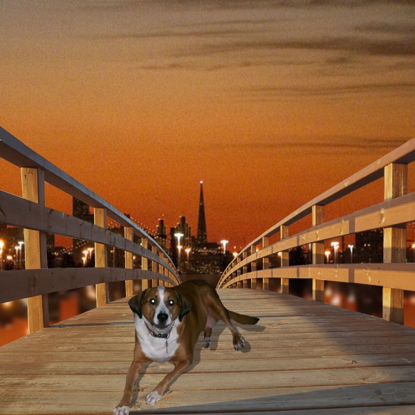
Change the shadow...light source is from left. Foreground edges of railings are cut off...
top of the handrail abruptly ends too. great concept
Hey thanks CMYK46 you say shadow is wrong? I thought if shadow was reflected on left from rail that it would be same on dog? no?and thanks forgot the rails let me know on shadow
Don't you see the cast shadows from the railing at left??? Where is the wood lightest? On the LEFT side...shadows are on the RIGHT side...the light source is on the LEFT for cryin' out loud.
Yea I had them like this but thought I was wrong because even with a sunset the railing shadow was coming down on left my wife was saying shadows were always on same side so I wasn't sure hope this is better again Thanks
Yeah, i agree with CMYK46 there... The shadow is definitely wrong
numbsock are you saying shadow is still wrong?
nice idea but i thinnk you need to work on the shadow of the dog.. instead of useing the drop shadow. make a duplicate copy of the dog layer select the 1st layer by pressing ctrl+click then go to select modify and feather and fill with black ctrl+D to deselect and then work on that layer as your shadow .. its one of the main ways i do it . g/l
I'm just wondering why you picked a background that's so gritty and pixelated? Even in low res you can tell.
nice sentiment work author.
Howdie stranger!
If you want to rate this picture or participate in this contest, just:
LOGIN HERE or REGISTER FOR FREE