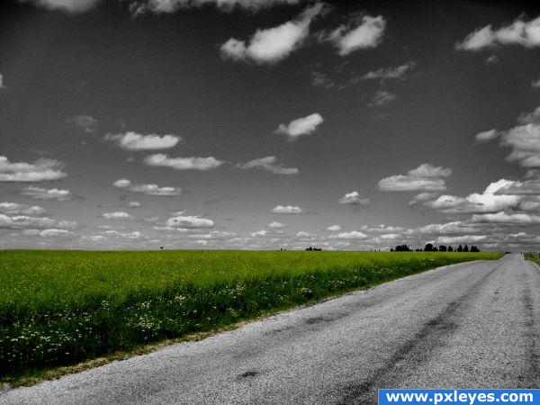
Thank you to Mairissa for the original image (5 years and 3936 days ago)
- 1: source1
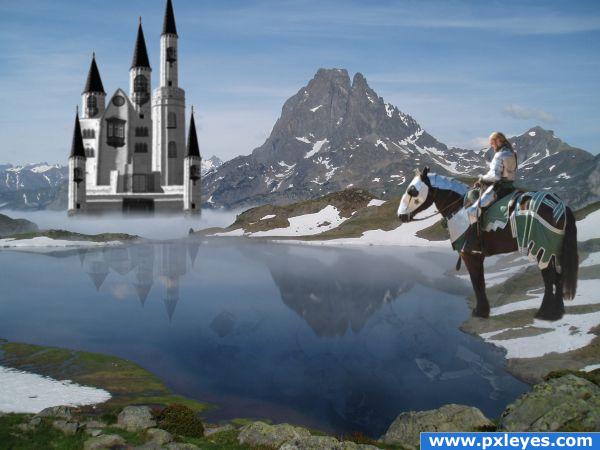
Knight coming home from battle stops to reflect on the violence and killing.
Thanks:
http://commons.wikimedia.org/wiki/File:Pic-du-midi-dossau.jpg
mountain lake
Ian Grant
http://gumbo-alokoi.deviantart.com/art/Knight-1-2-58413988
knight
Gumbo-Alokoi
http://synthexstock.deviantart.com/art/Skull-brushes-42384638
http://rotfuchs.deviantart.com/art/Window-Brushes-31620054 (5 years and 3946 days ago)
I like your idea. The horse looks a little big to me. Also it has a funny looking shadow as well as looking a littl cut and pasted(look athe the horses feet)
Good work. The knight is very sharp compared to his surroundings and should be blurred a little to match. The masking is also a little off around the horse's feet and at the tips of the towers on the castle. The shadow could also probably be a bit darker. Cool idea and image though!
Nice work - great job with the reflection, but yes, i think the horse is way too big. Good luck!
Very cool! The only thing is the fog where the castle is. It's too straight. It should be more cloud-like. Great job anyway  GL
GL 
well done !! I think the caste is a bit to detailed (you can blur it a LITTLE bit) but anyway, great work  !!
!!
Nice pick of sources. Castle is not bad, but if you can play a bit with liquify for the lower towers you can fix its perspective a bit more (make the lower roofs less round, because you dont look as much against it as the taller towers). Good luck!
The haze should slightly fade the entire castle to make it look like it's far away.
well put together combination of images
no the horse is not too big...look at the source image, however in the over picture the mounted knight and horse do seem large, author I like the way you have the reflction of horse and knight in the water, overall not bad 
like the idea... nice image.. needs a little work to be a great image. GL
wow nice .very nice idea.i feel the castle is too blurred,may be to create a far awaz effect.overall good work
Too bad I saw that too late. Love it! Wonderful concept and idea.
Howdie stranger!
If you want to rate this picture or participate in this contest, just:
LOGIN HERE or REGISTER FOR FREE
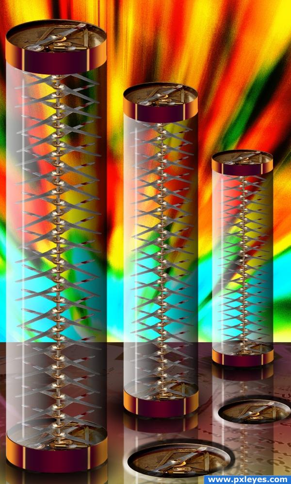
source only (5 years and 3977 days ago)
very nice!
qool composition! sad story.  cheers!
this just has something about it that just works... best part for me is the variety of colours! well done!
Nice Creattive Work...! Keep it Up..! 
High marks for Bob Dylan in the title.
wow, that is really cool! Love your colorful ideas. Good luck author.
good use of colour. nice reflections and creative use of source, well done.
great job
good job!! nice effect, i liked!
This could be me... I never find the way. Sometimes I'm even happy, that I still remember in which town I live  Very good idea. Good luck
Howdie stranger!
If you want to rate this picture or participate in this contest, just:
LOGIN HERE or REGISTER FOR FREE
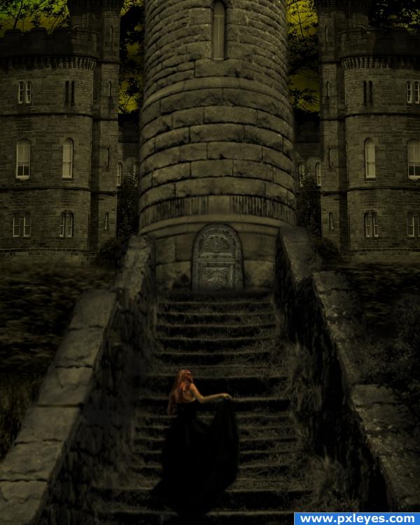
i got a gothicy feel from the source pic, so i went with it. Sources used:
"Bells Falls9" by *faestock at deviantart.com: http://faestock.deviantart.com/art/Bells-Falls9-89940375
"Little Castle" by =liitle-stock at deviantart.com: http://little-stock.deviantart.com/art/Little-castle-57195356
and...I changed the door, it's now "Cathedral Gate Door 2" by ~jdbartlett at deviantart.com: http://jdbartlett.deviantart.com/art/Cathedral-gate-door-2-75772050
(5 years and 3980 days ago)
Building perspectives are different, but good mood & color...
ahh, can fix that. much thanks!
i like it
wowowwowwow love it
hollywood style.... welldone
awesome!
Howdie stranger!
If you want to rate this picture or participate in this contest, just:
LOGIN HERE or REGISTER FOR FREE
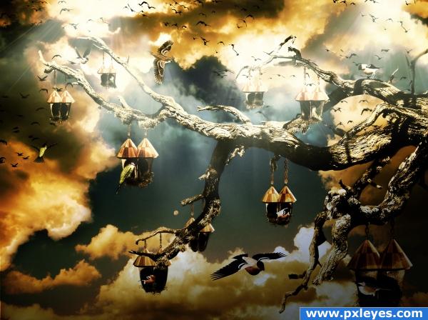
I selected the tree from an image offered by "pkv" on Deviantart.
I added the sky and clouds.
I selected the roof of an actual birds house and all the pairs of shoes in the source image.
I added the shoes and the roofs onto the branches.
Added different birds in different positions. Added chains to connect the little bird houses to the tree.
Colored, added shadows, added light beams, some adjustment layers (gradient map and brightness and contrast).
Credits to:
1. "Pkvstock"on Deviantart for the perfect tree with branches that I was looking for. Please visit account at: http://pkvstock.deviantart.com/.
2. "Shoofly-stock" for some great PNG files (birds and nests). Main account at: http://shoofly-stock.deviantart.com/.
3. "Mouritsada-stock" also on Deviantart for a very useful chains PNG file. Mian account at: http://mouritsada-stock.deviantart.com/.
I hope you're not going to find it too dark for your taste as I kind of like it this way...bit extreme in colors...I guess this is my first time when I'm being so daring with the tones....hope it's just a phaze...! (5 years and 3981 days ago)
nice image, buti dont really see much use of source here...wish you could find a way to include the source a little bit more..
Wow, very nice mood... good job!
Not bad, but the light beams make it look like there are 3 different light sources...
Very nice idea and performance! This scene looks like at the sunset/semi night but the sky looks a little from a day time that was darkened, maybe you should work a little on that.
yep...this image has one of those feelings where ya know its gonna be in the top three 
grt image..........................gr mood...............
cooooooolllllll...........awesome lighting effects......welldone author...
great!!
very stormy weather.. 
lovely use of the "surreal" style.
Looks like bird heaven! Very nice.
Howdie stranger!
If you want to rate this picture or participate in this contest, just:
LOGIN HERE or REGISTER FOR FREE
its nice and all but not very original. S/c can be very easy or very creative, its easy to make an image b/w then erase one peice, but you could create a whole scene here and still have the grass. Maybe put people riding or running down the road on a marathon, anything really.
Although it's simple, I like this composition.
Howdie stranger!
If you want to rate this picture or participate in this contest, just:
LOGIN HERE or REGISTER FOR FREE