(5 years and 2725 days ago)
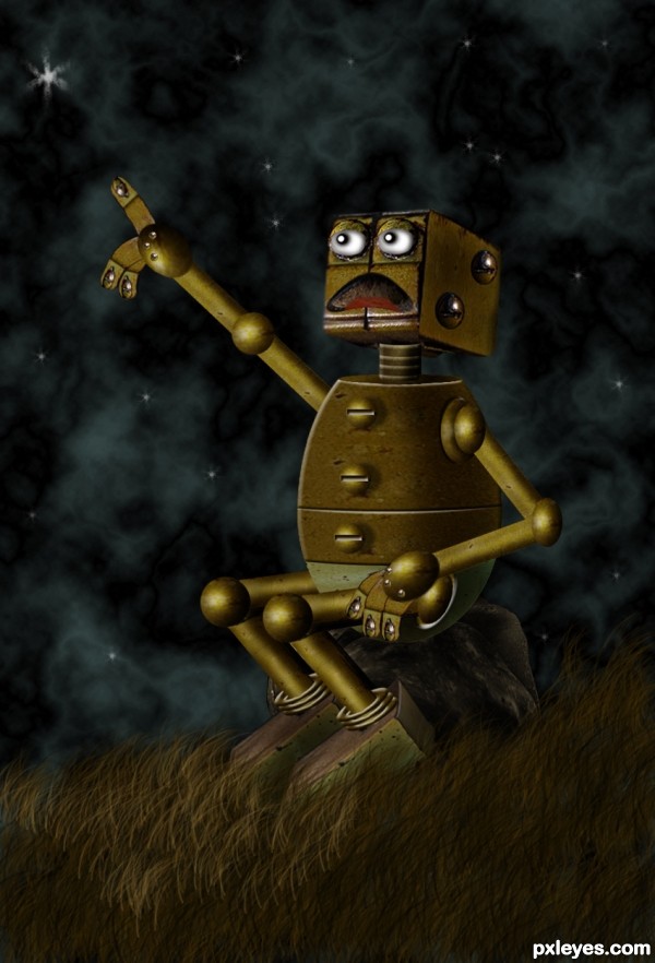
Just source image used in the making of this entry. sorry I did not go into details of shading and light, I was in a hurry, just to make it on time. I will keep your suggestions in mind. (5 years and 2746 days ago)
He's great...good use of the source! 
Thanks Bob, I was a brain killing...lol. My first robot! Thanks to all the Sci-Fi artists, I have learned a lot from you.
fun 
Yeah...it was fun....!
Very cute little guy, nicely done!
Thanks Rein...I've learned a lot from your Robot entries...Your SBS are inspiring, thanks. Am I getting closer to become a Sci-Fi artist?
Nicely put together, well done. 
Thanks Solkee
Author, you're good enough to do Sci-Fi or whatever, so don't make me come over there. 
Thanks a lot Bob.. I try my best. Yes, I think so.. but still learning. (Smiling)
I agree with Bob, Sci-Fi is just another genre and obviously a personal favorite of mine. Creativity isn't limited to one kind of art it applies to any kind of artistic endeavor. Every good artist is constantly learning, that's what helps us improve and grow.
Congrats George,  very well done
Thanks Madamemonty.....
Congrats, another fine job! 
Congrats George for a really good work and your own personal best!!
Thank you guys....I learned something different for me.
Congrats !
Thanks lolu....
Howdie stranger!
If you want to rate this picture or participate in this contest, just:
LOGIN HERE or REGISTER FOR FREE
my photos (5 years and 2755 days ago)
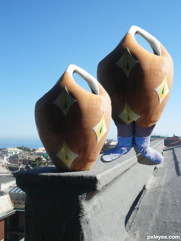
nice idea -- the shadow makes the foot look a bit floating maybe bring it in closer to the foot -- should give the impression the foo is closer to the edge of the building. Also a bit of cleanup or blur on the edges of the legs and feet
than alan..always kindly. smack 
Yes, shadows. Using a regular Photoshop drop shadow effect is a good place to start, but does not work well to cast realistic shadows on different level surfaces. :\
The shadow under the left foot would "fall off" the edge of the wall and bend downward and curve a little to conform to the shape of the surface. That particular shadow would be darker and "sharper" at the foot and be a little blurrier or softer toward the toe because of the distance from the source/foot.
For the right foot, see how the original jug's shadow starts underneath the jug itself before stretching left. The right foot, too, needs a very close/narrow shadow under the boot itself, then stretch left, like the jug's shadow. Be careful not to make the shadow too "tall" or too far under the bottom of the boot or it will look like it's floating.
Hope this helps.
certain that you are helping me, and I thank you very much
a hug
Howdie stranger!
If you want to rate this picture or participate in this contest, just:
LOGIN HERE or REGISTER FOR FREE
(5 years and 2764 days ago)
Congrats!!
Howdie stranger!
If you want to rate this picture or participate in this contest, just:
LOGIN HERE or REGISTER FOR FREE
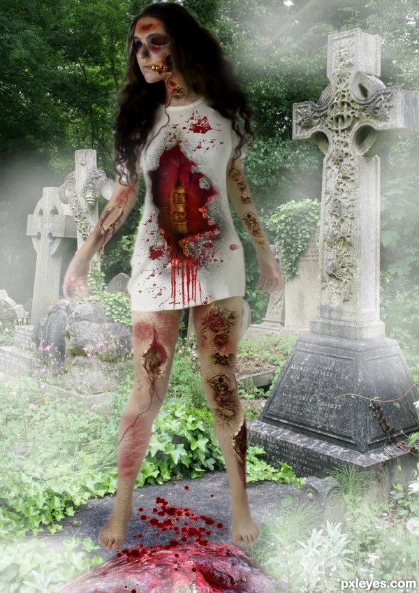
http://trisste-brushes.deviantart.com/art/wounds-25145474 thanks to trisste-brushes (5 years and 2768 days ago)
She looks too cut and paste, like she is floating above the walk path. The head is also anatomically off, with the face looking too large and far away from the rest of the head and neck.
An interesting concept, but the technical execution needs a bit more attention to detail.
thanks mossy but i didn't touch the head and neck , take a look at the original picture of the model
You have so many sources, hard to find which one. It will help in the future if you title them such as "head and neck," "lungs," "wound," etc. instead of "Source 1," "Source 2," etc...
You're right, the body is unaltered from your source. It then becomes your overall composition that makes it seem too large and poorly placed within the image. This is a visual "illusion" created by the eye's movement from your other elements, colors, and value choices. But since your focus was a zombie effect, more than an optical illusion of distortion, I still stand by my last statement that your technical execution needs work to create a more visually believable balance of the elements used.
ok thanks
Howdie stranger!
If you want to rate this picture or participate in this contest, just:
LOGIN HERE or REGISTER FOR FREE
nice work
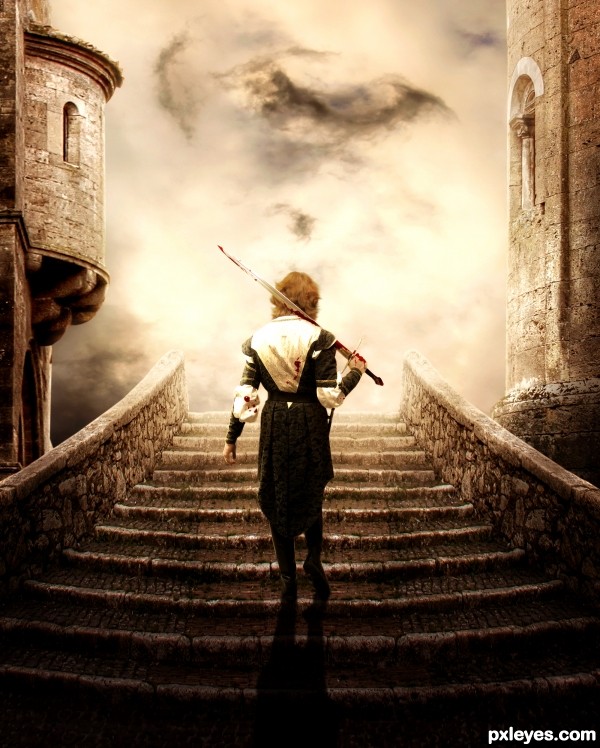
Very cool. Might have extended the wall from the staircase to the left and the right so it looks more like they're climbing onto a rampart or something instead of into the air.
Thanks for the feedback but that was not my intent, i wanted to give an impression of a bridge or a path between both structures.
I like the brown color in contrast with the light. It is a good idea and good use of the source, good luck!
great atmosphere, fine work, bravo
amazing job , great mood , nice work
and also
good luck
Love the mood and colors
Howdie stranger!
If you want to rate this picture or participate in this contest, just:
LOGIN HERE or REGISTER FOR FREE