credits and thanks:
http://montague.deviantart.com
http://mourge-stawk.deviantart.com
http://night-fate-stock.deviantart.com
http://intergalacticstock.deviantart.com (5 years and 3196 days ago)
(5 years and 3251 days ago)
Howdie stranger!
If you want to rate this picture or participate in this contest, just:
LOGIN HERE or REGISTER FOR FREE
Hi,
hope you like this entry...
I will be posting a speed art video of the progress some time later today or if not then tomorrow.
Meanwhile bare with me and all comments are welcome and especially tips and critique... (5 years and 3263 days ago)
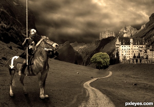
The light on the knight is from upper left...might want to adjust the shadow. 
Thanks CMYK46.. I think your observation was correct  I changed it now hope it's better
  Thank you!
Hi people! 
I've made a time lapse video of the makign of this entry! Hope you like it you can find it here:
http://www.youtube.com/watch?v=ChU6TmWtNXw
Ye did a nice job on this! I like the tonality!
I like how the tree is struggling to represent color in the sepia looking image. Nice job author!
Very cool work and nice sepia mood...Good luck author
Howdie stranger!
If you want to rate this picture or participate in this contest, just:
LOGIN HERE or REGISTER FOR FREE
Thanks to
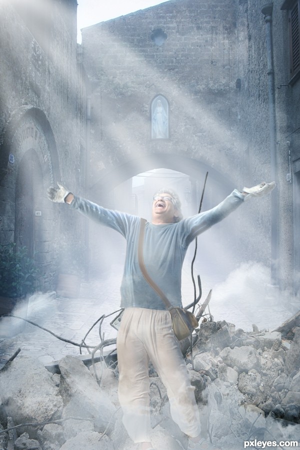
suik8 - street pic
petr0 - demolition pic
amptone stock - grunge texture
centb - clouds brush
zatrokz - legs pic (5 years and 3274 days ago)
cool misty work...gl author
quite enjoy the arm spread, well done!!!
Howdie stranger!
If you want to rate this picture or participate in this contest, just:
LOGIN HERE or REGISTER FOR FREE
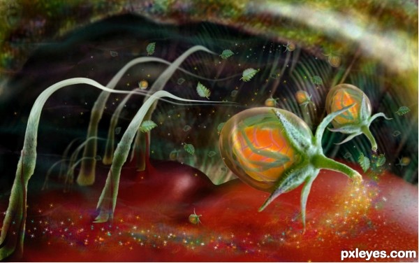
(5 years and 3294 days ago)
very gooey sticky feel... gives me the feeling of jolly ranchers making my teeth stick together.. good LUCK!!!
beautiful work author...well done
Looking good!
The fund is a little incomprehensible, but the treatment was very good depth of field that you did, congratulations!
Wonderful image!
The mixture of blur an opacity works well, nice job author 
I agrree with drivenslush! haha excellent entry author! best of luck to you! 
Howdie stranger!
If you want to rate this picture or participate in this contest, just:
LOGIN HERE or REGISTER FOR FREE
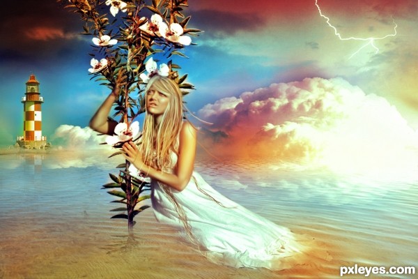
No source for the woman? No land under the lighthouse? Do flowering plants grow out of the ocean? No reflection for the woman?
The reflecftions in this entry need a LOT of work.
The water is choppy, yet the reflections in the background are smooth, and the woman and plant have no reflections at all...
The light house is supposedly some distance from the vampire woman with no reflection, yet the reflection from it extends forwards all the way to the woman and her free-floating (yet unreflective) plant, which she is leaning on far too hard, considering it is not secure in the ground. She'll be falling over at any moment.
Maybe that's where the hope comes into play, she's hoping to get some support from that plant. :P
well, 1st of all there's no vampire woman in there, however, the lighthouse and the plant have just a little reflection, cause I didn't want them to be so realistic. On the other hand the lower part of the woman's dress it is supposed to melt in the water, as there is a a hot athmoshpere shown as well by the red and yellow hues around the clouds. Thanks all the way for the tips and I'll try to work harder on the reflections.
Your explanation helps, but it also points out how ineffective the image is in conveying your concept...
"...the lighthouse and the plant have just a little reflection, cause I didn't want them to be so realistic." - It's very difficult to have portions of a photographic image not look realistic, while other portions in the foreground and background do...Consistency is important.
"...the lower part of the woman's dress it is supposed to melt in the water" - this would have her dress either "dissolving," by increasing the translucence until it totally fades away, or "melting," by distorting the shape that is in the water.
"there is a a hot athmoshpere shown as well by the red and yellow hues around the clouds" - If that is so, the "glow would thoroughly permeate the clouds. Just a small spot of "heat" such as you have illustrated, does not give the atmosphere a sense of heat, so much as it looks like a bright light shining from within the cloud. Again, consistency is important, and "hot atmosphere" on top of cool water, and beneath cool sky does convey an unrealistic scene, but again, it is in contrast with too many other visual elements that oppose it.
suggestions:
1) move the horizon further (rules of the third) to the top one-third
2) smaller clouds n light house
3) bring the girl and plant closer to the scene (bigger)
Thanks, aheman! I'll try as soon as possible!
After all is said and done ... lovely concept!
Howdie stranger!
If you want to rate this picture or participate in this contest, just:
LOGIN HERE or REGISTER FOR FREE