(5 years and 3062 days ago)
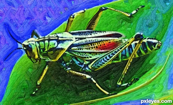
just a little "art" work.
no external sources. (5 years and 3369 days ago)
very nice work author...look like realistic canvas painting....GL
It's a really nice render.. gallery piece.. but in a photoshop contest you are going to need to add some razzle dazzle... ( I like it personally.. but reality bites..) GOOD LUCK
Howdie stranger!
If you want to rate this picture or participate in this contest, just:
LOGIN HERE or REGISTER FOR FREE
Thanks to jvverde, straymuse (5 years and 3626 days ago)
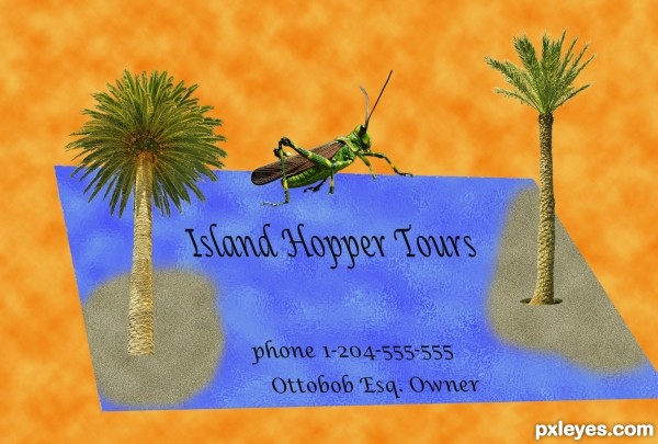
Sorry, author, but the perspective of the leafy palm doesn't match the card... 
very neat Idea.. I'd use 'em..hehehe
I agree with Erica,left palm is totally off...but the idea is very good...best of luck
i agree with guys ................ gud luck for the idea........... 
gud luck
Howdie stranger!
If you want to rate this picture or participate in this contest, just:
LOGIN HERE or REGISTER FOR FREE
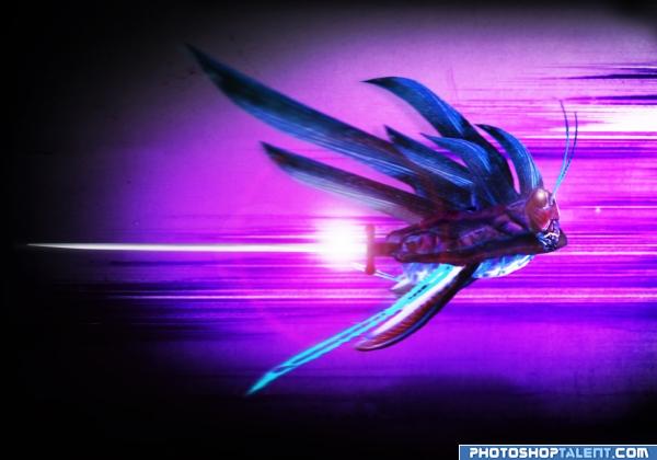
Fight or die!
only sources used... (5 years and 3952 days ago)
It's a bit on the blurry side.. but I like the light play with the white fire/plasma.. good luck author
good effect. creature shape is not clear
THIS IS PRETTY BADD A$$ IF I MUST SAY..
cool image. good job author. like the color. 
Well done athor. U change a dump hopper to a strong heroe...VERY NICE...I like the flys
oooooooh assassin hopper.......looks scary......good job author.....
oooooooh assassin hopper.......looks scary......good job author.....
neat
Try duplicating the racer layer, putting a gausian blur on the one on top and then adding a layer mask and using a black to white gradient you can blurr the racer from front to back. I think that will be a better effect.
well imagined....but a bit blurred image....anyways GL
Howdie stranger!
If you want to rate this picture or participate in this contest, just:
LOGIN HERE or REGISTER FOR FREE
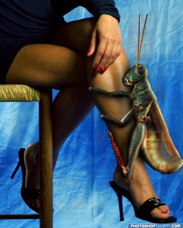
(5 years and 3954 days ago)
LOL. Perhaps it would be funnier if...No it can't be funnier. That is awesome! Work the shadows.
Really funny, but she sure wouldn't just be sitting there, she'd be whacking the bejeezus out of it! 
I know I would be whacking the bejesus out of it I am scared to death of grasshoppers! I don't know why, they just creep me out!
imagine the fish you could catch if you used that thing as bait.. LOL
haha, very funny. shadows need work. i know this isnt your fault but isnt that hand a tad bit manly? good luck
Really great work ! Really good shadows and blending... 
Nice work really funny stuff humor of the scale!!
Minimonst, I don't mean to pick on your comment, but there's only a bit of shadow I have a problem with, and that's the one at the top of the head which shouldn't be there (Pay attention, author!  ) If you want to comment that something like shadows need improvement, please be specific so the author can improve. Thank you, my friend.
High Vote for the funny factor...LOL Good Luck 
getting him some leg...great job in the humor and the PS skills departments
Ohh man.... they don't have a creepy bar-cuz that just creeping me out----GL
very neat
lol!!! really well done and funny! hahaha!!!
nice work
LOL!!good luck
@ Nator: Motion blur!! Hahahaha.. It would be too noisy? Arent they like a cricket? Plus at that size would be deafening!! Very funny Author: my only thing is that is a touch blurry - but thats probably from the source?
Nice, work a little bit on the shadow just above the hoppers head, and the little piece between his body and wings. When you use multiply tool(with color same as object but more towards black/gray or blue) for the shadow instead of the black brush you get a more realistic effect.
haha!! 
A leg-humping hopper for a pet?  She doesn't seem to mind... Good luck...


lol good luck
ololo )))) nice idea! gl
Yuck, i would faint with that for sure lool funny idea!
Howdie stranger!
If you want to rate this picture or participate in this contest, just:
LOGIN HERE or REGISTER FOR FREE
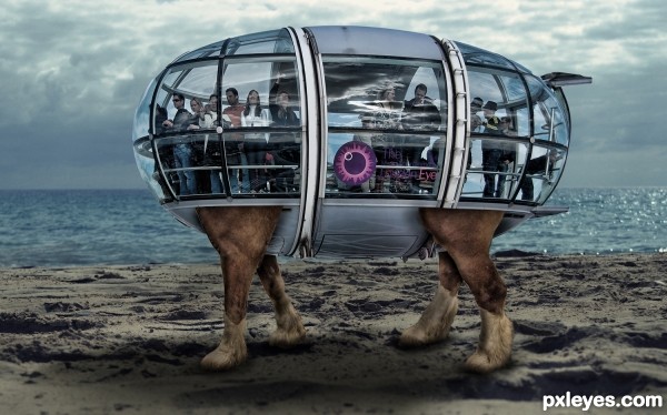
This is awesome. Great concept! Just a little nit pick, maybe blur the foot of the animal to blend it with the sand a bit more. It seems very crisp compared to the sand. Great job author, good luck.
**EDIT** The feet look great now. much better author!
Imm juts a tat worried what would happe when he really starts hopping... im not so sure I wanna travel this way LOL nice image though author
Don't worry Eladine, the inside is like the Tardus from Dr. Who

And thanks tnaylor for the help
Good one.
Imaginative and funny. Perhaps one suggestion...if casts such a strong shadow below...maybe dodge the top half of the people compartment thing a bit to give it a bit more depth. Nice work.
Hilarious, perfect for coastal travel!
Really romantic
Howdie stranger!
If you want to rate this picture or participate in this contest, just:
LOGIN HERE or REGISTER FOR FREE