Thanks and credits
Thanks to tilt-stock and germanstock from deviantart . (5 years and 3644 days ago)
2 Sources:
The source is from the tutorial :
http://www.pxleyes.com/tutorial/photoshop/1157/The-Making-Of-A-Line-Horse.html (5 years and 3652 days ago)
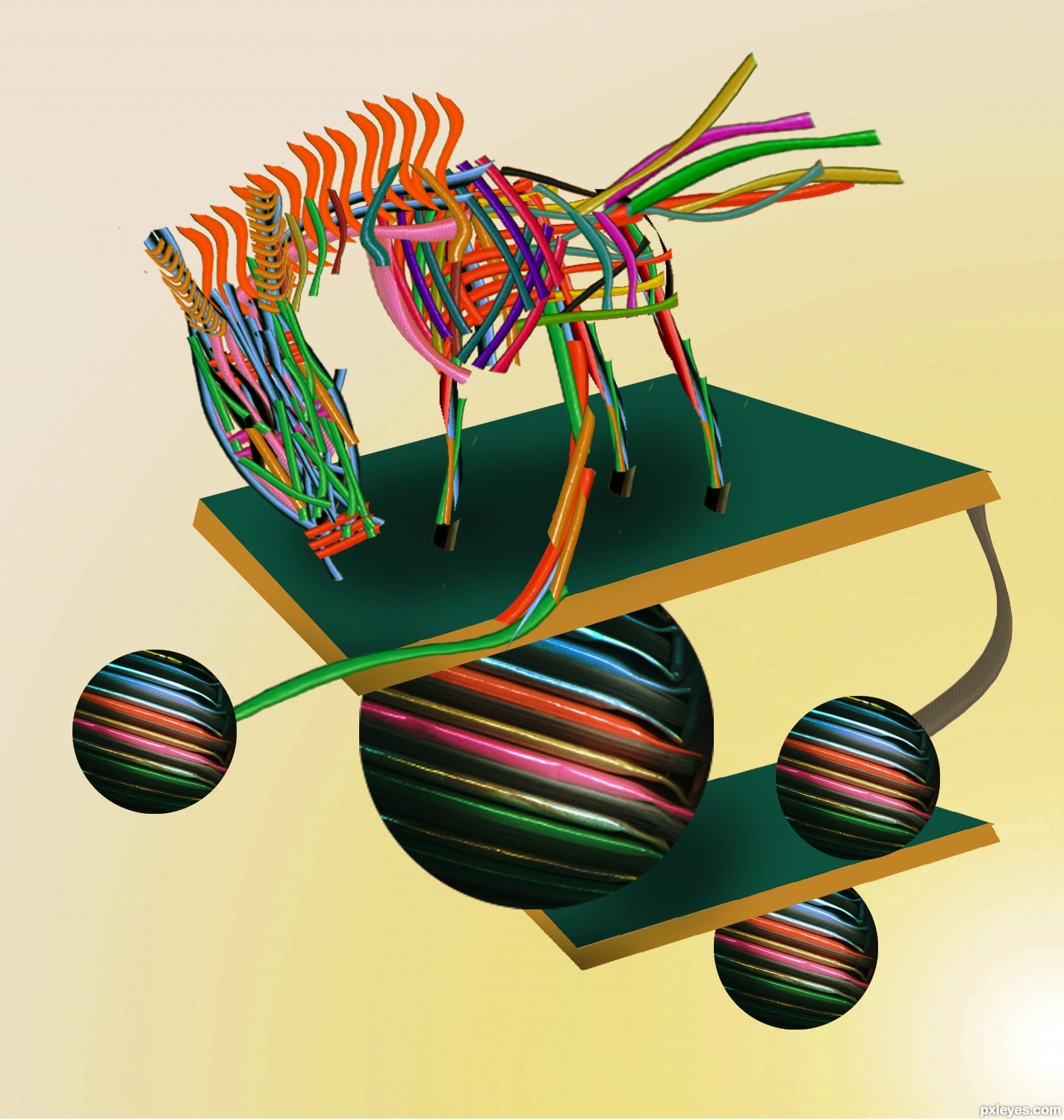
I think the part that lets this image down a little is the spheres, they still look a bit flat, try using the spherize filter. The horse itself looks great though! Good luck 
I think the horse could use stronger shadows on it (Step 8) given the strength of the shadows on the spheres and the shadow the horse is casting on the platform it's standing on. The top platform does not seem to be casting a shadow on the big sphere and the adjacent little sphere does not seem to be casting a shadow on the lower platform. The horse looks like it's floating because there's no strong shadow at the point where the hooves touch the platform.
you are going to need to upload the sbs for this...
amazing entry ! 

very good work
Nice entry.......GL
Howdie stranger!
If you want to rate this picture or participate in this contest, just:
LOGIN HERE or REGISTER FOR FREE
I was desperate for time, had family down and didn't have time to do what I wanted to do.
Hope it's ok. I was doing this for some fun.
thanks to kitty kitty 5150 on deviantart for the horse capture.
http://kittykitty5150.deviantart.com/art/HORSE-STOCK-NSH-Colt-18-114584511 (5 years and 3657 days ago)
Very nice!
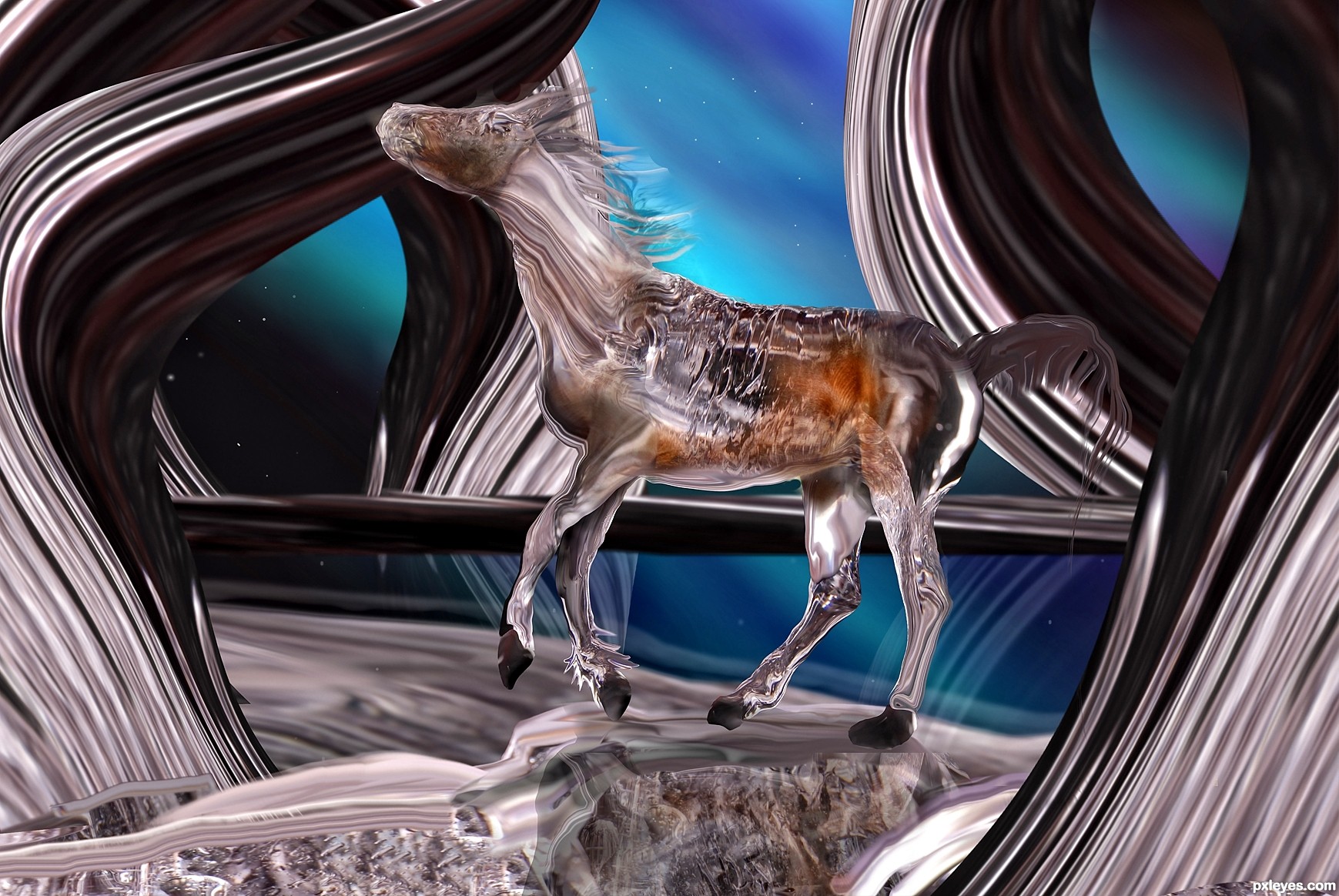
its cool.. very well use of source.. but y the fore legs are crossed? was it deliberate or it happened..? I see in the source image that the horse is running but in your entry its still and that's y the legs are distracting.. or you can lift that leg a bit up like in this pic.. http://www.flickr.com/photos/mmmchoco/63394549/ then it'll be perfect..
just use warp and lift it backwards..
Looks quite nice! The horse is a little distorted (neck too short, butt a little big maybe) edges could use a little clean up. Of course that's MHO.
I forgot to add the shadowing of the leg, before I merged the horse together >< I'll see if I can't redo the horse, it took me a little while so I'll try to get it as best as I can before the contest ends. Thanks for all your nice comments
made some changes
A beautiful fun, you mean! It's wonderful... I like horses, that's amazing... 
lovely image, high marks, but imo i like to actualy SEE the source ... VERY clever though well done
Wow, nice work!
great piece good choppin
Good image.
Thanks everyone
congrats
well done digital
Congrats
congrats =)
Congrats.. for the 2nd place... 
Congrats!
Howdie stranger!
If you want to rate this picture or participate in this contest, just:
LOGIN HERE or REGISTER FOR FREE
The call of mother nature....
Great thanks to the stock images of authors I listed in the source links
Another authors are also credited:
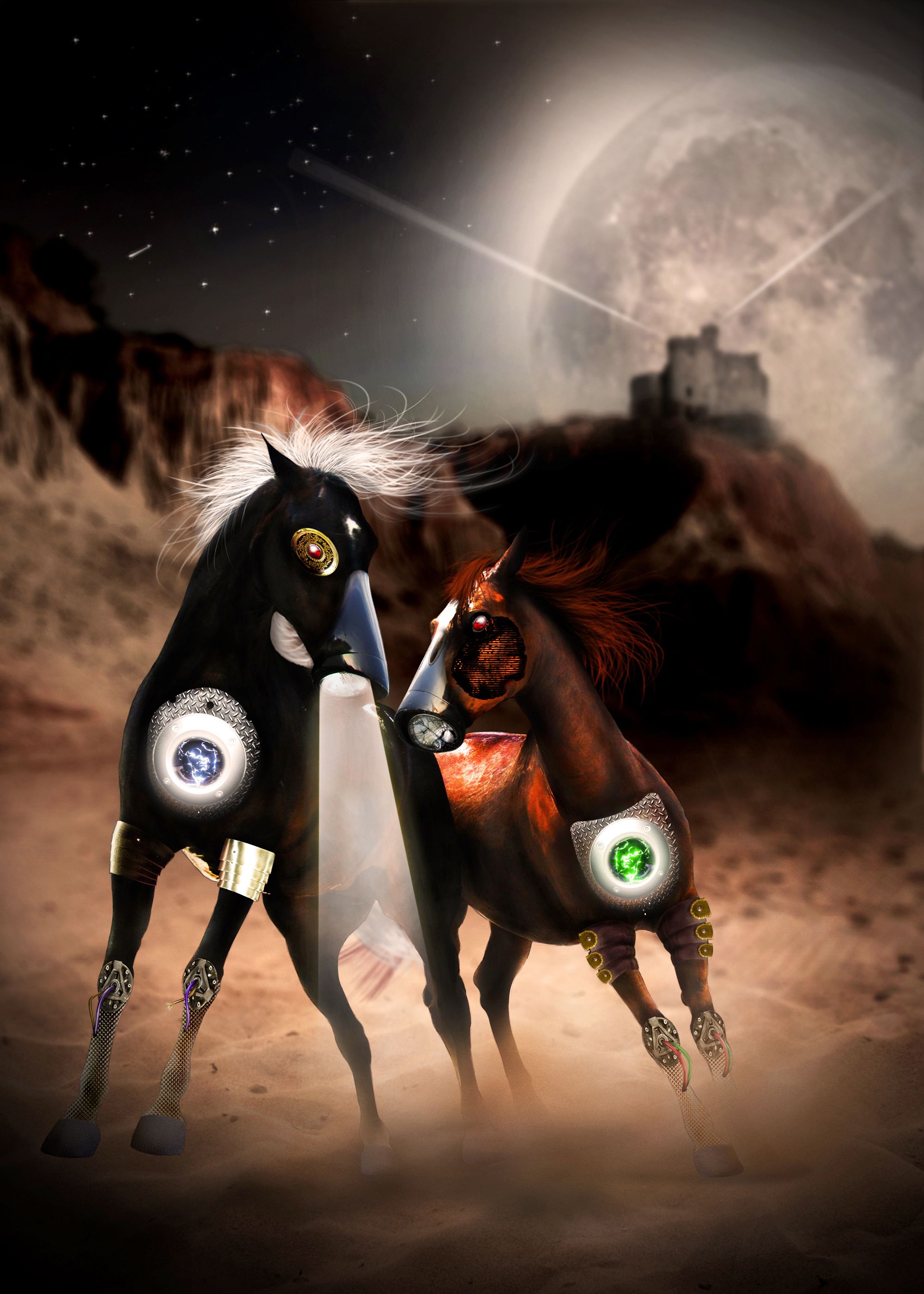
tigg-stock (DA) for the armor (http://tigg-stock.deviantart.com/art/Arms-and-Armour-stock-4-101817769)
cosmos-resources (DA) for the castle brush
(http://cosmos-resources.deviantart.com/art/Castle-Brushes-30869372) (5 years and 3694 days ago)
really strange.. in a very wonderful way.. good job!!!!
love the play with the imagery
Thank you very much Drivenslush 
very unique entry...this one is one of my favorite in this contest...good luck author for the ideand and for the execution...
nice
i agree with nator. Aslo, imo i think the other horse should have its light on to....
thank you all for comments. I will reduce the brightness of the light, but the horse on the right I intentionally turned off the light. I didn't mention about the story in the description. These horses are war horses and they were modified to server the war. One day they try to escape and two of them help each other. If you notice in the High-Res, you will see the right one has some injures and there are some cracks, indicating the lightbulb was damaged. Half of the face was damaged, too, so you can see something underneath the natural skin.
Unique! Great imagination
Howdie stranger!
If you want to rate this picture or participate in this contest, just:
LOGIN HERE or REGISTER FOR FREE
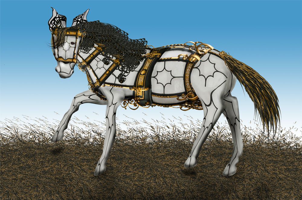
Festive Horse all made with source only (5 years and 3703 days ago)
like the idea -- details are nicely done
nice work, sort of looks like 3D stained glass.
Great idea, love the details
Very nice
Very very nice...lots of work here.I like head and body very much.Front legs demands a bit more shading to create better perspective.SBS is very nice,Good luck author i like this entry very much.
Awsome!!! still i think you should shade the legs upwards from the heels... that will give more depth... now it looks a little flotting.. the reason is back right leg is longer than left back leg... try to fix the perspective... this will an awesome entry... goodluck!!
Good thinking
welldone author.... I want to ride this royal horse.... Good luck
I do agree that this is a royal horse.. Only the face needs a little more touch.. try to add some details over the face! Still this is my favorite...
Now this is my favourite.. u had done it.... Exellent work Good luck once again... (one more suggetion.. do some thing with the face as 'shaadow' pointing up, I thind using the burn/ dodge tools is best to do that)
Very creative use of source, nice imagination
hehe nice.
Nice horse. Look like made of gold and ivory
Nice work and good luck author !
Howdie stranger!
If you want to rate this picture or participate in this contest, just:
LOGIN HERE or REGISTER FOR FREE
Photography and photoshop contests
We are a community of people with
a passion for photography, graphics and art in general.
Every day new photoshop
and photography contests are posted to compete in. We also have one weekly drawing contest
and one weekly 3D contest!
Participation is 100% free!
Just
register and get
started!
Good luck!
© 2015 Pxleyes.com. All rights reserved.


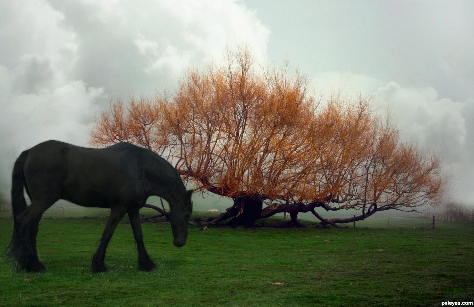
Kevin, it's because the distance between horse and tree; horse is in the foreground, tree is in the background of the scene. That's why it seems big to you...

Author, very beautiful scene!
Nice
Howdie stranger!
If you want to rate this picture or participate in this contest, just:
LOGIN HERE or REGISTER FOR FREE