Just little displacement and work (5 years and 3944 days ago)
1 Source:
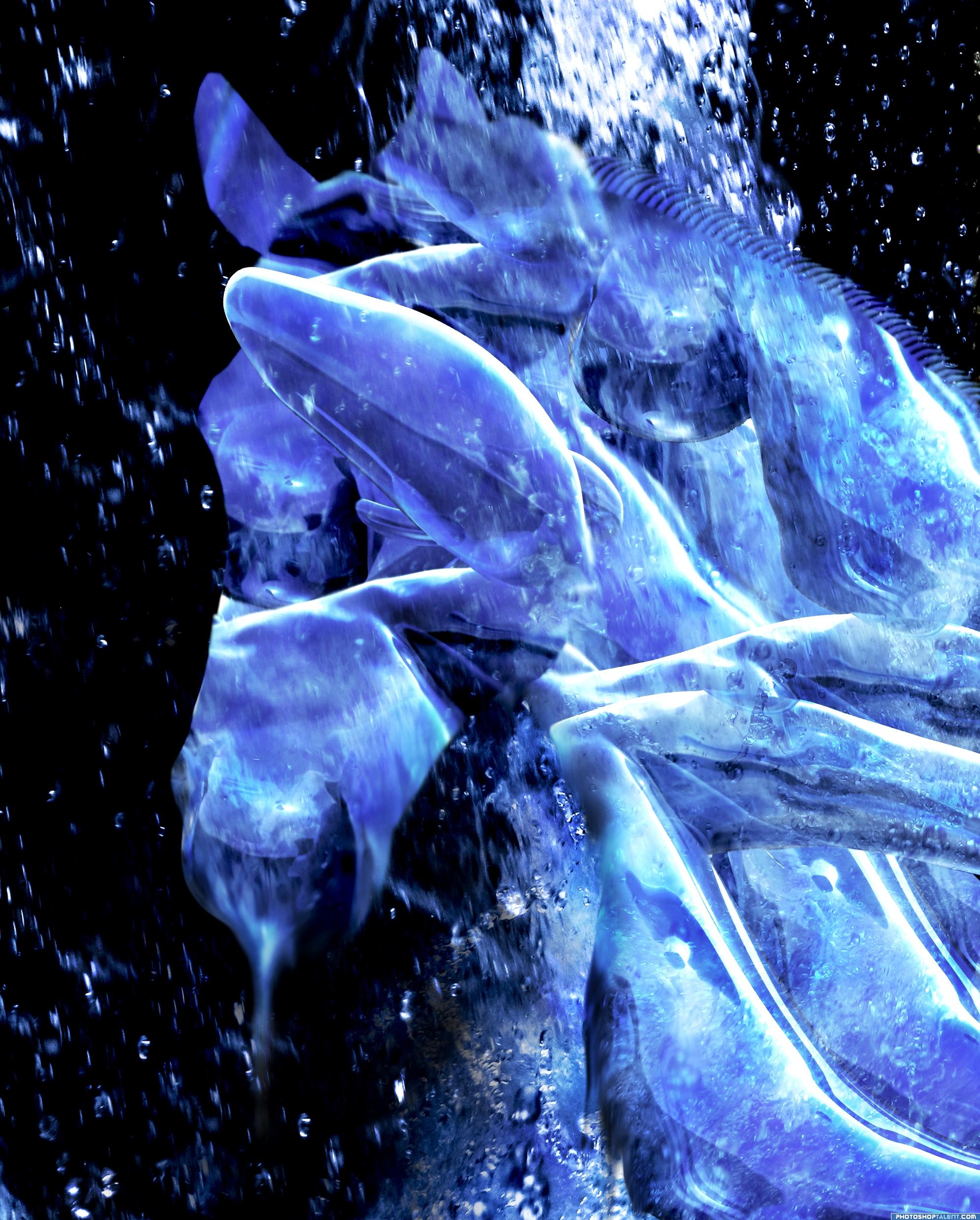
Thanks to sue_r_b and skumer
Check full resolution for better details ^^ (5 years and 3945 days ago)
Interesting image. I like the combination with the water, it mixes well together. Have to admit I didnt see directly a horse in it, but that wont make the image less nice. Overall well done! Good luck!
the horse is hiding.. .. more of a nonrepresentational then an abstract.. very soothing
i can s... no... eee...but yes i can see horse! bretty good abstract! and good job!  high!
high!
nice
well done, i can see horse easy ;p
good idea
How coems you cant see  Left part is the face, right the neck.
I stared 6 minuten now at this entry and it still is a mess of water, not a horse... A cool mess though!
Very abstract 0_0
whre is the horse
An interesting way of creating a horse! GL
nice
Howdie stranger!
If you want to rate this picture or participate in this contest, just:
LOGIN HERE or REGISTER FOR FREE
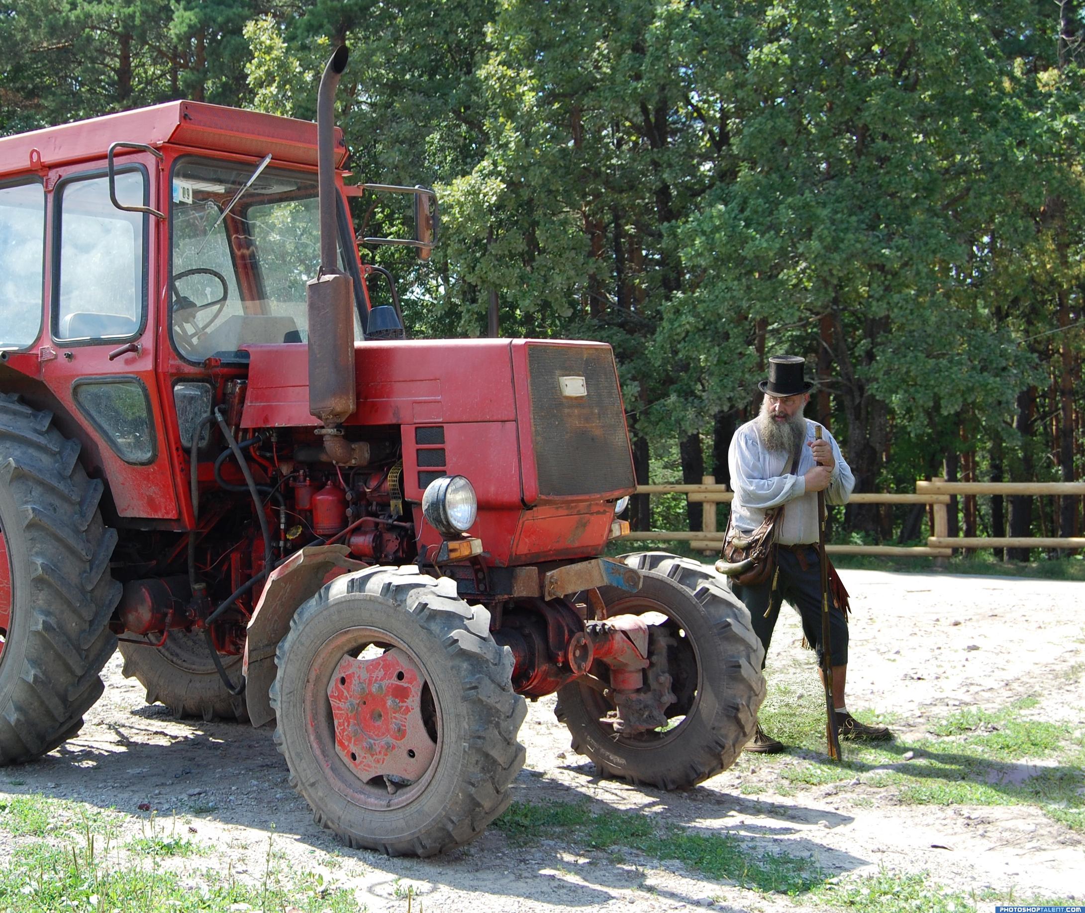
The pioneer is my photo form a buckskinner's rendezvous. Tractor is thanks to >>>some bo via sxc.hu >>>http://www.sxc.hu/photo/1047341 (5 years and 3946 days ago)
it is so good that i just want to see a little more blur in some edges! you little document-faker!
Nice idea good luck!
hehehe Blending is superior and I think you've over stimulated FILLE... hehehe.. excellent work and right on target.. good luck
good job!!
I never know what the hell Fille is talking about or why he bothers, since most of his comments are nonsense, but author, this is a good idea...of course the old guy would be thinking that! 
good
I really like this one 
very good concept and very funny title
Right on theme. Great blend! GL
Congratulations for 1st
Congrats!
Congratulations.
Congrats!
Howdie stranger!
If you want to rate this picture or participate in this contest, just:
LOGIN HERE or REGISTER FOR FREE
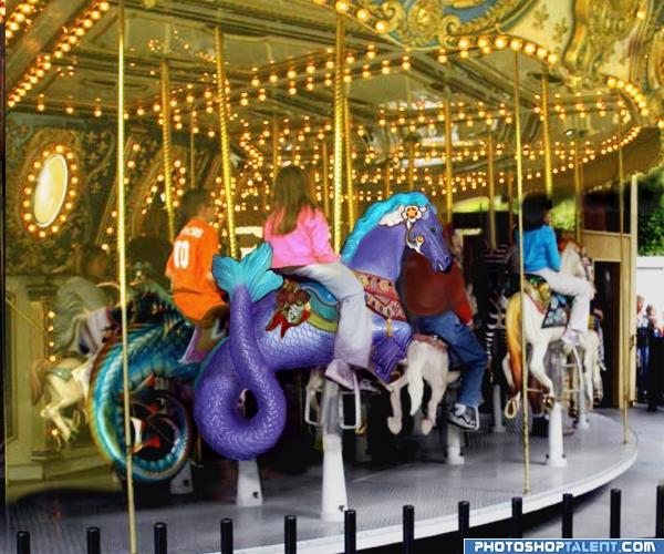
I used my own background photo - The Dollywood Carousel. After masking out one of the seahorses, the color and balance (Adjust) was used to change the color. White horse on carousel was erased, girl riding the horse was taken out of a copy of the background, then seahorse inserted where horse had been and girl put back on. Ornamentation from horse was masked out of another background copy and added to the seahorse. Lights on background were brought up using brightness/contrast (Adjust) SBS will follow (5 years and 3950 days ago)
YEAHHHHHHHHHHHH.. I was hoping someone would do this... good luck Author (You have an edge ghost near the tail,,, a very straight line, you might want to nix that) good luck
EDIT.. GREAT FIX.. good luck Author
It does not quite look like it is in the picture, nice work tho, good luck
Woa! that girls has the longest legs! Ever! Great image overall!
Thanks, Golem!!! You have good eyes! Hope this looks better.
Good idea -- well done
nice good luck i like it
well done the idea is brilliant goodluck
Nice idea good luck!
Howdie stranger!
If you want to rate this picture or participate in this contest, just:
LOGIN HERE or REGISTER FOR FREE
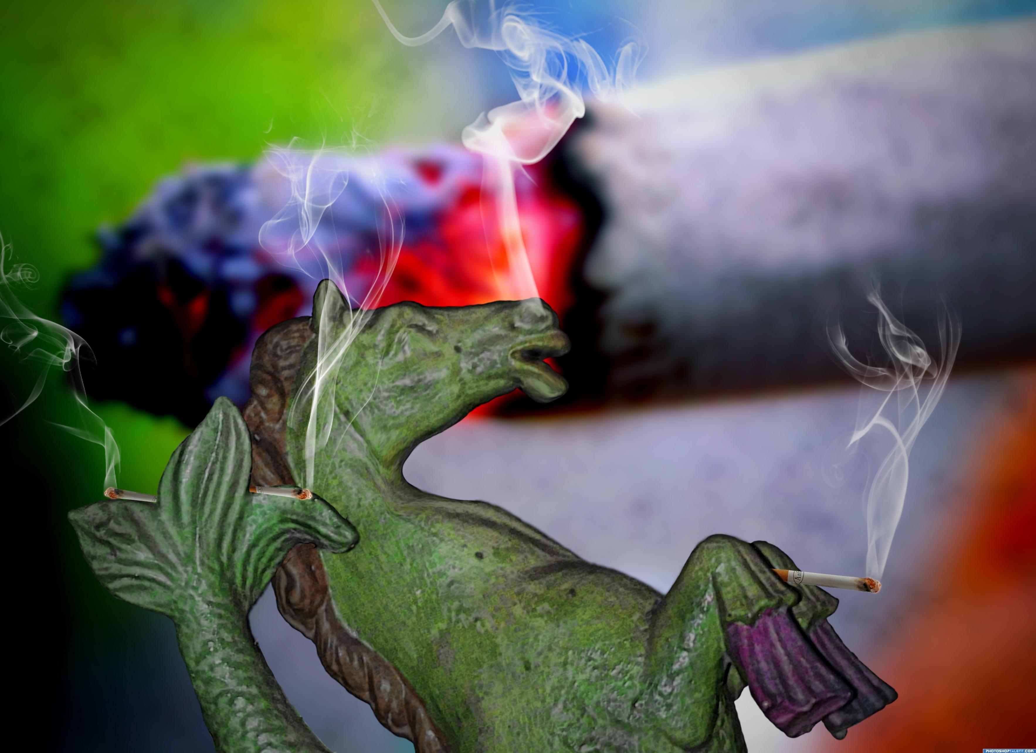
People stop smoking! The tobacco drop kills a horse... but not a seahorse though 8)
Had alot of fun doing it)
Special thanks to the photogrphers of cigarettes
SuperFantastic from Flickr and tijmen from stock.xchng
As for the image I've used some hue/saturation to change colors, some plastic surgery (liquify), find edges filter, clouds, vignette and smoke brushes!
Hope You enjoy it, comments are highly welcome) (5 years and 3952 days ago)
i like it when ppl use these contests to create public awareness. nice work with the smoke.. gl
did u now that if u smoke you die younger? LOL damn i smoke to oops my bad anyway good luck is a very nice idea!
Good luck
good luck
nice
oh crap.. now I want a cigarette.. hehehehe.. good luck author
Thats just creepy
looks like he's smoking other than a cigarette look at his eyes LOL
good job and good luck
Thanks guys! To Giallo that's because smoking kills LOL
good
Nah it's not true 
it's not the smoking that kills, its the price they tell you when you get to the counter lol... (reformed here, no smokes in over a year now
Howdie stranger!
If you want to rate this picture or participate in this contest, just:
LOGIN HERE or REGISTER FOR FREE
Photography and photoshop contests
We are a community of people with
a passion for photography, graphics and art in general.
Every day new photoshop
and photography contests are posted to compete in. We also have one weekly drawing contest
and one weekly 3D contest!
Participation is 100% free!
Just
register and get
started!
Good luck!
© 2015 Pxleyes.com. All rights reserved.


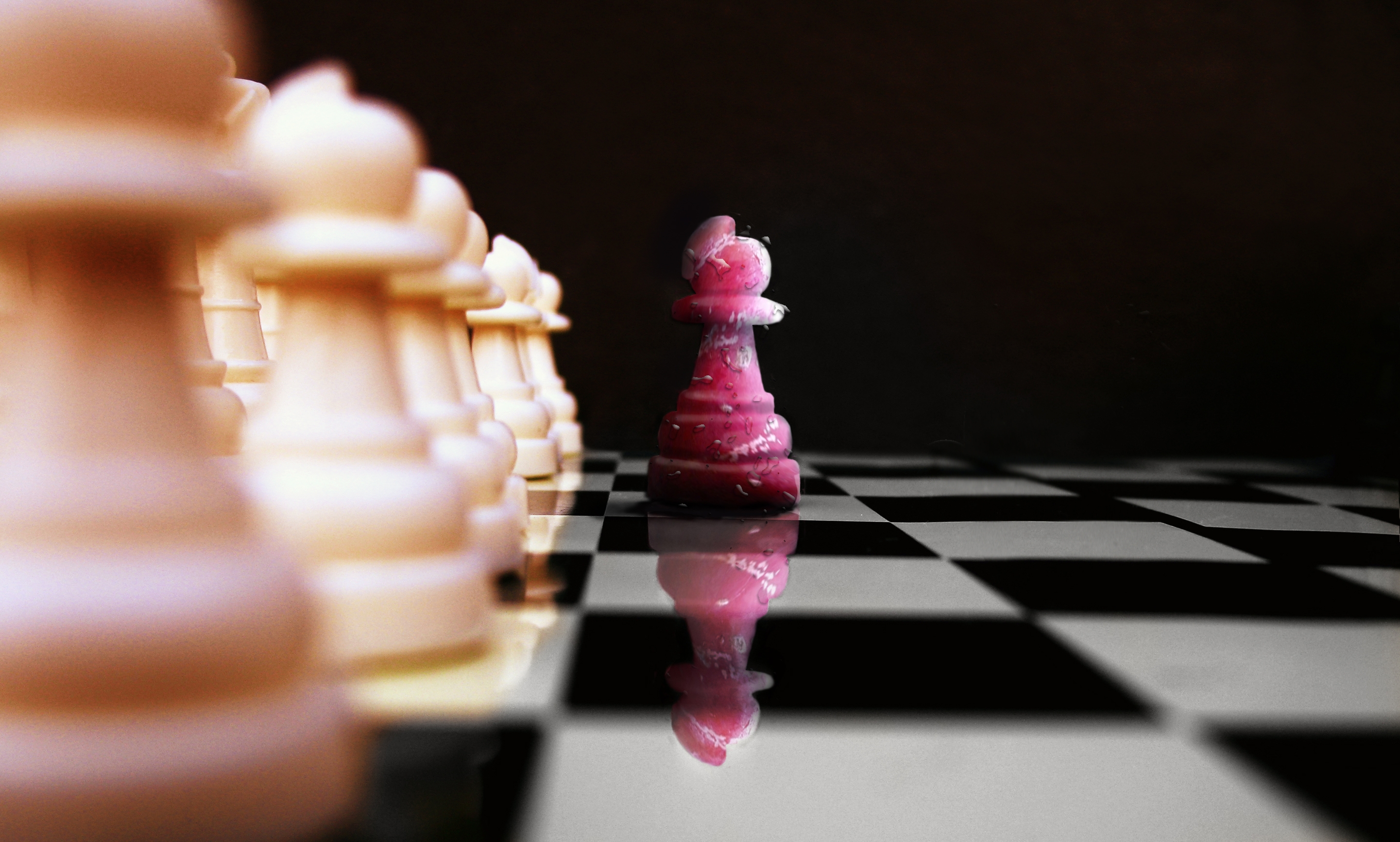
ditch in chessboard! good reflection
  good luck!
good work
creative! gl, author
The reflection of the drips on the cherry piece is different to what is actually on it. I think it would be better if you applied the drip thing to each piece individually as well, thewn you won't have them floating in mid air in between the pieces. You will also be able to apply some perspective to them as well, making them smaller as they go further back into the distance. Hope this helps.
Always like chess art.
i made pawnn this way that its reflection made it differ too
Nice idea - but your chess board squares dont line up? ]i see its in the source also - but I would slide it to suit. It may not be accurate - but will not draw the attention away from your figure] Also the water droplets on the row of pawns does not blur with the depth of field.
Not bad, but I'd make the reflection more transparent. For example, use a layer mask for the reflection and then in the mask make a gradient (white above, more grey till maybe even black down) to let it fade out more. Or play with the blending modes. Good luck!
Great job. i really like how the blurry effect is but it's not on the reflection on the one peice that line is blurry but the red peice is crisp... i think that's is the only minor thing that is messing with me! Still Wonderful idea, and Wonderfully put together!
i newer think acherry pawn!!! good lick author
nice work
Good image nice sense of depth well done..
nice job
Howdie stranger!
If you want to rate this picture or participate in this contest, just:
LOGIN HERE or REGISTER FOR FREE