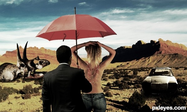
(5 years and 3417 days ago)
- 1: Desert
- 2: Girl
- 3: Dino Skull
- 4: Car Wrack

Special thanks to the sources photo (5 years and 3426 days ago)
Great creation!
Excellent.
Simple and elegant interpretation of the theme. Bravo, excellent work.
Thanks all....
Nice work..well done.
Great work author...gl
Cool colors, nice theme...Congrats 
Howdie stranger!
If you want to rate this picture or participate in this contest, just:
LOGIN HERE or REGISTER FOR FREE
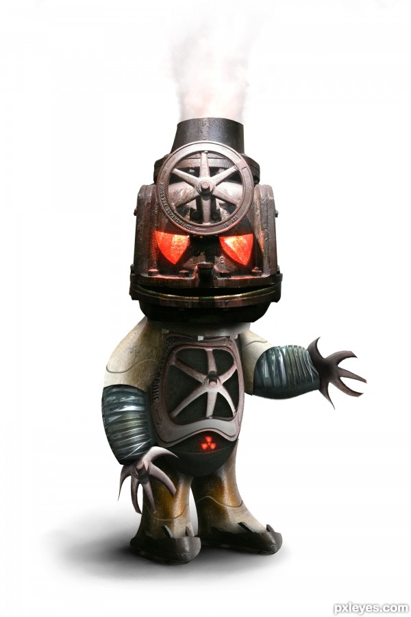
(5 years and 3467 days ago)
Nice... its a good image it's just a shame you didn't manage to define certain edges or give depth to certain parts... I know there isn't much time to change it but it's still a good effort... goodluck!?!... 
ABOUT FRICKIN TIME.. I was waiting for a robot guy 
VERY VERY CUTE!!!!!!!!!!!!!!!!!
he's cute and dangerous
wow... incredible!!..
imho u shud claw-in the right hand ..think so !!
nevertheless its jus awesome
gl auth 
That is beautiful, well done.....gl.
ValveVaTron!!!
Hot robo 
Awesome! GL!
Now thats a reaL HOT HEADED ROBOT...I LOVE IT...WISH I HAD ONE...GUD LUCK AUTHOR
Gongrats on first place!
congrats for 1st place.....
Gongrats on first place
it's just a shame you didn't manage to define certain edges or give depth to certain parts
BWHAAAA HAAAAAAA HAAAAAAAA HAAAAAA (sorry.. I just couldn't resist) congrats
Congrats! 
Congratulations for 1st place
congrats on ur win
Congrats :]
Congrats, well done
Congratulations! 
Congrats!!
Congrats Chad, another awesome robot 
Howdie stranger!
If you want to rate this picture or participate in this contest, just:
LOGIN HERE or REGISTER FOR FREE
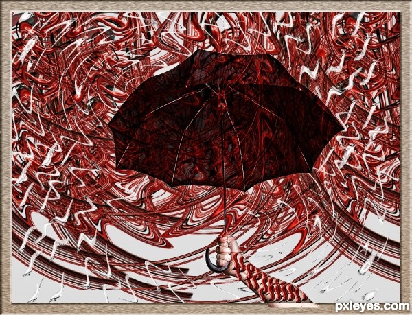
let ur imagination run wild (5 years and 3500 days ago)
:/
Very psychodelic! 
So cool
Interesting use of source. But could have been less busy i think. GL.
you're getting better with every entry author!
Howdie stranger!
If you want to rate this picture or participate in this contest, just:
LOGIN HERE or REGISTER FOR FREE
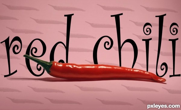
Took the photo into photoshop. used the magic wand tool around the chili and duplacted it. Then made the chili into a brush and stamped it around the page and lowered their opacity. added a font in between the two layer of the chili. lastly i add a red gradient in the backround and lowred its opacity. (5 years and 3502 days ago)
A bit too simple IMO.
very simple, but is ok.
Maybe try make something more difficult, have a look at other entries 
All the tools you used are great to start with & practice makes perfect, try having a go at some tutorials. You`ll be amazed at what you can do!
Howdie stranger!
If you want to rate this picture or participate in this contest, just:
LOGIN HERE or REGISTER FOR FREE
You have light sources coming from both sides of your image, which would work from a surrrealistic standpoint, but the woman is then illuminated from beneath, which is just to visually inconsistent for a successful image.
Howdie stranger!
If you want to rate this picture or participate in this contest, just:
LOGIN HERE or REGISTER FOR FREE