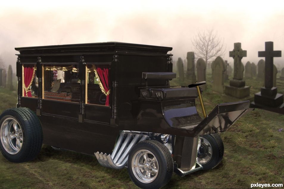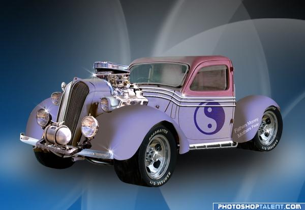
I think George Barris himself would be proud of this one!
Image for the hearse is used by permission (see below). In accordance with their wishes, I have provided a link to their main account here. Link shown in sources is the actual image used.
Permission:
----------
crestmultimeadia said the following:
You have my permission. You can link back to here if you like.
----------
******* said the following:
Hi,
I'd like to use the image of a hearse you have posted under your stock account at http://www.deviantart.com/art/Hearse-102837266 as part of a manipulation in a photoshop contest located at http://www.pxleyes.com/photoshop-contest/21766/custom-cars.html To qualify, as per the site rules, I will need to post specific permission from you as part of my description. I was hoping to get that from you. This is a non-commercial use and I will of course be happy to link back to your image, stock account, or this account, whichever your prefer. Thanks! (5 years and 1567 days ago)


This is really cool!!! Do you think the light on the tires and window is too bright for the light in the graveyard (blending issue)? Masking and assembling is awesome. Really neat idea Good luck
I do...and I looked at every way I know how to try and remedy it and couldn't get a result I liked...I've played with the levels, looked at selected color, tried desaturating it and turning down the brightness...none of it yielded a result that I felt better about than what I have now. The highlights on the tires are so hot that you can't really blend them out without making the blacks so dark you lose all detail.I will keep playing with it, but I wanted to get something out there since I was short on time for the contest.
You might want to use the burn Brush set on a super softness and gently brush the bright areas on a separate layer that you can later blend into the bright layer. That sometimes works. I find if I work on a separate layer and go a tad overboard with the reduced brightening, then placing it over the original and reducing it's opacity that sometimes works. You really did a great job on this creation... you can also brighten the background, but that would defeat the theme of the creation. Good luck and great job
There...damn you driven! You always push me to be better than my laziness wants!
Damn Me? Oh dear, get in line...hehehe.. great improvement, the glare is gone as well as the sun stroke on the tires the back ground now matches the foreground and is very believable... congrats
  I'm not as crazy as most think of me LOL
Nicely put together, author. The only nitpicks I see are on the far left edge of the top vertical where it's not masked out completely. Also, what you see through the windows is not the graveyard... ah, the details. Driven's suggestion of separate (gray) layer for dodge/burn is good. Also, slightly blur the edges to set it into the background - he taught me that ages ago! Good job, though.
Congrats,
Congrats!
Howdie stranger!
If you want to rate this picture or participate in this contest, just:
LOGIN HERE or REGISTER FOR FREE