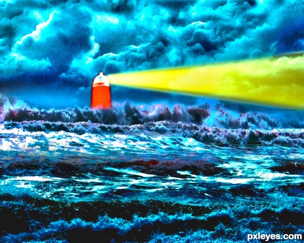
I recently read about how to shoot HDR by camera. I tried to create a HDR (high dynamic range) image. Please comment. (5 years and 3460 days ago)
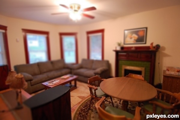
Thanks to Eric Kilby at flickr.com for the picture of the living room. (5 years and 3467 days ago)
This worked surprisingly well considering the image.. really good work 
they do look like toys.. the complexity of the photo is causing the deconstruct.. but overly .. great job
What ponti says, nice result for sure. SBS is also more than worth watching. Good luck!
Wow, a doll house! 
without top part this could really look like small model shop author...love the final product...well done and best of luck
Howdie stranger!
If you want to rate this picture or participate in this contest, just:
LOGIN HERE or REGISTER FOR FREE
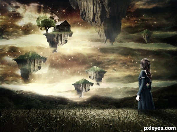
thanks to:
night-fate-stock & faestock @deviantart.com.
Rokatesh for Shiprock. (5 years and 3489 days ago)
Stop it....please, please, please...just stop it! Aaaarrrggghhhh!
Edit: Author, my comment has little to do with you personally except that you've obviously seen a lot of flying island pics, and "slightly desaturated child on a slightly desaturated background" pics and others with "A tree growing out of something to make it look vaguely surrealistic" pics, and so here you are with your version of this stuff. I expect you'll want to have people think you're a genius, instead of just another unimaginative imitator. Others have done the same in other ways, and seem to get good votes in spite of being obvious imitators. Now you've made yet another derivative work. I expect more from this site. I hope others do as well. I hope I can expect more from you in future.
At least you could have gotten your light source right on all the flying islands.
Umm, well I really like the image you created. Its familiar yes, but in a good way. It reminds me of paintings by Boris Vallejeo, sorry spelled that wrong I'm sure. Anyway, I'm no expert but I think you did a nice job.
oh, well,..well,.... you created a stunning work here even though your idea is not really fresh, and to me ( and maybe many other too ) the idea of flying islands or floating objects are always the ones that are so tempting to create,....GL
> CMYK,.....yes ,...I expect something more that I can learn from this site and I've got many so far.....and oh well,...why is it not you giving us and the author the fresh new work as the example of the " expectation" you hope for.....? 
Nice image. CMYK46, i agree with you, we do see a lot of this kind of stuff and it does get a bit 'boring' (to say the least). But this is a nice image and it is in the Dream Art catergory so it fits and it works well. 
Well done author & GL 
Edit: I do agree (language barrier) with CMYK about that last part: "At least you could have gotten your light source right on all the flying islands."
I think it's really conflicting, since light is coming from behind the islands - as I can figure from the shadow cast of the girl.
Tell you what. You can make some cubes in a 3d program ( even google sketch up which is free), add a light source and take the render as reference.
Or you can just swich all island to the same position and change their shapes so thei won't look the same.
Errr you really need to fix these lights >.< and by the way her hand is completed white o.o
Thanks everyone for giving your time for comments. For some people this art is unimaginative. But I want to say..I always try to create that is in my imagination.
Thanks to all for your positive and negative comments.
Specially Mr.Dekwid for your support.
I'll avoid controversial discussions, author, but if I may, I would suggest using your clone stamp to alter elements of your picture that are repeated such as sky/cloud/star patterns and rock strata. IMO, it really adds to a piece's realism when objects can be"randomized" and given identity as unique entities. With a little practice, you can achieve good results that way, and relatively quickly. There are some light issues as mentioned, but I do like your mood and composition. Happy chopping!
Author I like this chop. Very creative .gl
Original or not, I like this one... art is freedom anyways...
I guess its one of those things, alot think it, but dont say it... gotta agree I`ve started voting lower on the unoriginal entries..not based on the execution but on concept. Its really not your fault author, I guess some of us are just a little bored of this style.
Ive always wanted to make an image like this but feel it has been done numerous times and it would stop me from standing out in a contest (when I find time to enter one).
I do like your image though 
We are all learning and when we see an image we like, we tend to try and remake it ourselves, but that is how we learn 
Goodluck author.
May be a common idea but it isn't bad. You did a good job with your sources and should be proud of it 
WOW a lot comments about the style...First thing that i will do is to comment on your entry author...This is very nice work with cool mood and colors...love the mystic sky and u also did great job with the grass field...Now about other things...I totally agreed with the to much repetition in entry's...Lately we had tons of rain in entry's, before that surrealism was dominant and before that who knows what...But the floating islands, we have them all the time...grrrrrrr....I am trying to be objective and to vote on how the entry is made, but i don't know how long i will stay objective...I will give u general advice author, don't fall in the trap of good score entry's...u will see here some authors that always have nice final score at the end, but if u look at their portfolios u will notice tons of similar entry's...and u don't need that...its ok to create some entry's that reminds on some thing that u did before, but there is limit to there...And finally sorry for my comment that turns into the novel but other guys gives me the inspiration...Best of luck
Love this magic world 
Howdie stranger!
If you want to rate this picture or participate in this contest, just:
LOGIN HERE or REGISTER FOR FREE
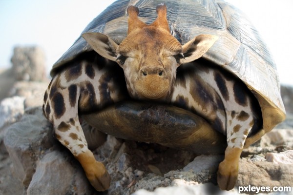
Thanks Grigoriev Vitalii,Timothy Lubcke,Bill.
(5 years and 3509 days ago)
I love the look on the giraffe's face LOL..Nice Job..Best of Luck
I never would have guessed...
ha ha cute
OMG THIS IS FUNNY!!! Looks very comfy! 
I mean that in a nice way.... it's a very cute pic! 
Very believable, excellent in every way........JB
so cool image...gl
Howdie stranger!
If you want to rate this picture or participate in this contest, just:
LOGIN HERE or REGISTER FOR FREE
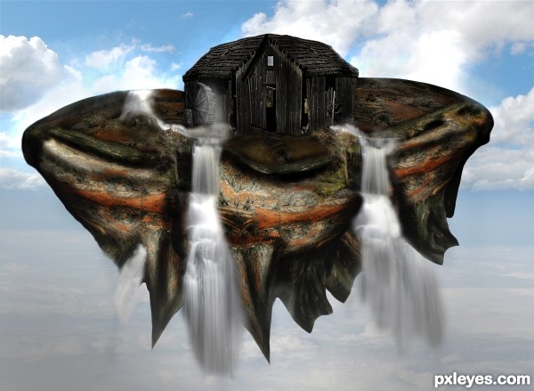
Thanks to wjs7652 for the use of the waterwheel
The floating land I used the given source photo land in the back and applied many layers together to make the floating land for the old wheelhouse to sit on. (5 years and 3527 days ago)
I like the floating island with the old shed in the middle.... the waterfalls look cool too....good luck....
Howdie stranger!
If you want to rate this picture or participate in this contest, just:
LOGIN HERE or REGISTER FOR FREE
The brickpattern can barelly be seen, if you decide to make it more visible warp it to fit the form.
Use some reference to help you with the entry:
http://www.grandmas-attic.com/images/a2331.jpg
I wish I had seen this image earlier. Thanks for the suggestion greymval.
You can get inspired from it, but not use it or reproduce it, since it's copyrighted.
I posted it so that you can see the proportions, mood, lighting & how an entry should look.
The lighthouse is your MAIN so it would be better to be more detailed and occupy more space, for starters.
You can search for lighthouses on sxc, you should find plenty of shapes and environments to enspire you there.
You can edit your entry if you want to improve it My stuff-My contest entries.
There you have it: the 3 "you can"s. :P
I respect the effect you were trying to achieve, but rather see step five as the finished entry. I would just create a new layer, fill it with black, set the blend mode to color dodge, and then with a soft white 5% opacity brush paint where you want light. Painting over brighter areas with more brush strokes. Then I would create a new layer fill it with a brown color and set the layer blend mode to color and set the opacity of the layer around 25%. This will give you a more dramatic scene. good luck!
Thanks. I will try that and reply about outcome.
very good dark contrast the waves is just incredible. good work
Howdie stranger!
If you want to rate this picture or participate in this contest, just:
LOGIN HERE or REGISTER FOR FREE