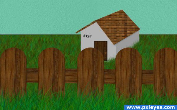
All source used. (5 years and 3932 days ago)
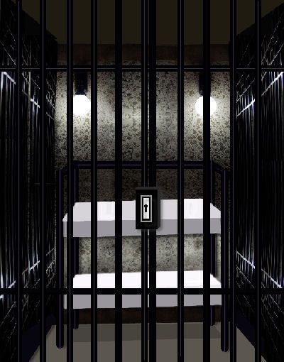
replacement orig. (5 years and 3932 days ago)
The front edge of the mattresses would be in shadow, otherwise nice job...
Thanks I have shadow on top on wall and sadow on floor plus leg post and bottom of bars hope I got right
You still need to add shadow to the front plane of the mattresses...the tops would be lighter, the fronts darker...
thanks CMYK46 I hope this is what you ment
This was a good idea. I laughed. Maybe a little more shadowing or burning on the lock though.
Thanks I changed it a little hope it works
The lock and beds still look 2-dimentional
Howdie stranger!
If you want to rate this picture or participate in this contest, just:
LOGIN HERE or REGISTER FOR FREE
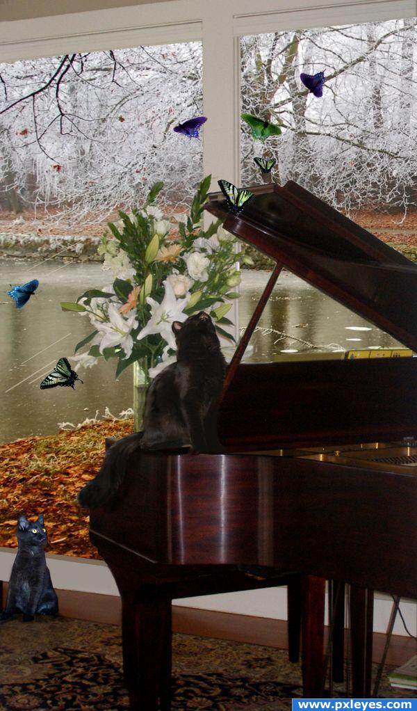
What would be more fun for furry friends than being in a house full of butterflies. That would drive my cat crazy!!!!! Thanks to CYMK46 for the butterfly photo. The piano and cat photos are my own. (5 years and 3946 days ago)
Well done maybe you should give a little more color to the room 
Howdie stranger!
If you want to rate this picture or participate in this contest, just:
LOGIN HERE or REGISTER FOR FREE
(5 years and 3947 days ago)
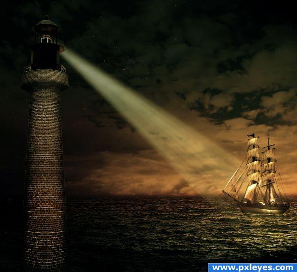
Nice one  Try to blur the ship, it's in the distance and the water is blurred. Besides that a tip: use a small soft blurbrush (max 50%) and trace the edges of your blends, it's a 5 minutes job but it will make everything blend in. But nice mood and nice colors
You're missing the brick texture source on the lighthouse. This is a good concept...you should remove the white edges on top of the light house, dim the beam just a bit, and add the missing link.
Thanks for the tips I will make some changes!! and thanks CMYK46 for reminding me about missing source
I hope you like the changes!!
I like the mood. Good job
Yes author I like the changes 
The colours are great!  I like the whole composition and the feel of it. Very good job! Good luck
Good image.
Great mood!
Congratulations for 3rd too
And also congrats for your third place!
Congrats!
Woow!! Thanks, now I'm in level 10 and I can participate in all contests!! that gives me more options,I hope to earn myself every day!!
Congrats!
Howdie stranger!
If you want to rate this picture or participate in this contest, just:
LOGIN HERE or REGISTER FOR FREE
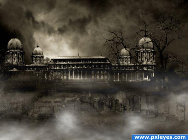
For the mist I used this tutorial.
http://www.redbubble.com/people/alisonjohnston/journal/906885-making-fog-mist-in-photoshop (5 years and 3952 days ago)
I like dark scenaries :3 maybe this one is a bit too dark and details are difficult to see but it has great colors..
nice
Nice and spooky theme, great manipulation.
Nice blending, but would love if you had saved a high resolution version. Great mood!
Creepy... AMAZING! :bigtumb:
Good work, but I preferred it in step 9, looks more centered 
Foreground perspective is off...
spooky
Howdie stranger!
If you want to rate this picture or participate in this contest, just:
LOGIN HERE or REGISTER FOR FREE
The perspective of the house seems a bit strange, and the fence itself looks a tad too thick.. but good idea. I like the use of the original background for the sky.
the shingles on the roof (patchwork filter?) don't follow the direction of the roof and it throws off the perspective; you should use a marquee to select that part of the image and make the shingles meet the slant of the roof; then cut the roof back to its original shape.
If you were going for something like a frame off an episode of "Southpark", I'd say you nailed it but it looks a lot like cardboard cutouts. Looks too simple.
cute
very cute illustration.. good luck!!!
heeee... sorry , "little house" where we live means.. TOILET. maybe next time you may like to use grid lines etc in photoshop or whatever program you use as they may help you get perspective and structure of your image visually correct. I like the image overall and i like the use of source. GL
nice
Howdie stranger!
If you want to rate this picture or participate in this contest, just:
LOGIN HERE or REGISTER FOR FREE