(5 years and 3648 days ago)
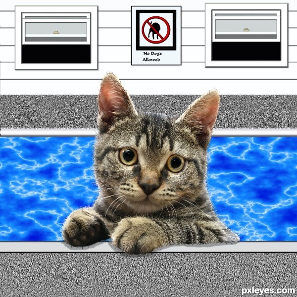
water source by Mura's Meister plug in can be down loaded from source link (5 years and 3660 days ago)
Howdie stranger!
If you want to rate this picture or participate in this contest, just:
LOGIN HERE or REGISTER FOR FREE
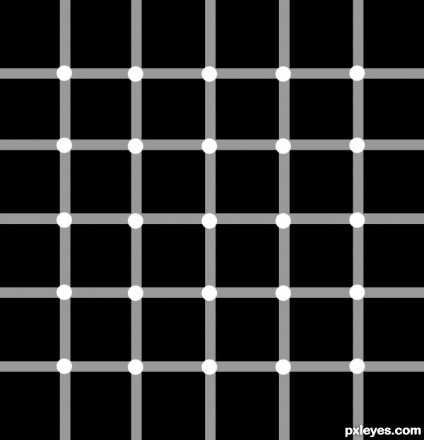
Simple to chop - but a great Optical Illusion imo!
How many black dots do you see? (5 years and 3700 days ago)
superchop.....
EDIT: The idea is not your own.. you have to mention the reference...
http://www.google.co.in/imgres?imgurl=http://2.bp.blogspot.com/_rOVSEI0eaOM/Rs8W3DJogRI/AAAAAAAAAIk/OE0pC2EivuY/s400/black%2Bdot.JPG&imgrefurl=http://splendidwallpapers.blogspot.com/2007/08/optical-illusion-black-dots.html&usg=__iFl3cUYEj_hrkAFmGa8Fz_BpxHE=&h=307&w=400&sz=18&hl=en&start=6&um=1&itbs=1&tbnid=6cqwI6yvozJXdM:&tbnh=95&tbnw=124&prev=/images%3Fq%3Doptical%2Billusion%2Bblack%2Bdots%26um%3D1%26hl%3Den%26safe%3Dactive%26tbs%3Disch:1
sence a hint of sarcasm...

Are you !@#ing kidding me!!!!?!???!!! Of course the idea is not my own!!!!!!!!!!!!!!!!!!!!!! Almost none of the illusions here are the authors own idea. As for your link to reference - you can find this image at hundreds of different locations on the net. Would you like me to refference all of them????? Find something better to do with your time...
Hey, author... he just tried to advice you... you don't need to answer that way! As you said, you can find the same image on different sites. So, you can quote the one you used for reference, that's it... 
It's a nice work, with no doubt.
nice idea
well author you better read this..
What's a reference?
A reference is a photo (no artwork like drawings or paintings) which you use to create an entry. They can either be yours (if so you'll have to post it in the SBS) or a copyright free photo from sites like SXC and FLICKR (if so, you'll have to post a link).
How to use a reference?
A reference may be used to look and study how an object / animal / person and so on is constructed. To study the proportions, the materials (f.i. hair, cloth), to see how materials behave (f.i. how water flows and shines). In short, you may use a reference to look and study.
How not to use a reference?
You may not include a reference in any way in your entry as being a part of that entry (visible or not visble in the final entry). You can not use a reference to set certain features / elements like f.i. eyes, ears, nose and so on in your drawing, neither can you use a reference to trace the whole or a part of the original reference.
What references are allowed?
You are allowed to use non-copyrighted photos. It is not allowed to use copyrighted photos, artwork and so on.
What if you use a reference?
It's not a shame to use a reference, but if you do you, must post this reference, either as a link or, if the photo is yours, you must post this photo uncut in the SBS.
And author, I did not want to insult you... but your entry is an exact copy of that reference image.... and how can we vote for that... I am sorry if it hurts........ 
EDIT: I just wanted to tell you that you can post a link to the reference from an allowed site.
hereisanoop, all in this theme here are not original ideas and links are not to originals too. also you are not original with this post..  cheers!
awesome 
You know I see where you are coming from but at the same time, this illusion is like an exact copy:
http://www.instructables.com/image/F1H3JF6FRJGP9ZH/Optical-Illusion-Mysterious-Black-Dots.jpg
Honestly, probably not the best illusion to duplicate. At least some of the others came up with their own original idea and take on the illusion.
exact copy, thumbs up for Jawshoewhah I didn't understand what is fille trying to say..........
WOW THE LITTLE DOTS CHANGE... TRIPPYYYY I LOVE THIS ONE!!!
Howdie stranger!
If you want to rate this picture or participate in this contest, just:
LOGIN HERE or REGISTER FOR FREE
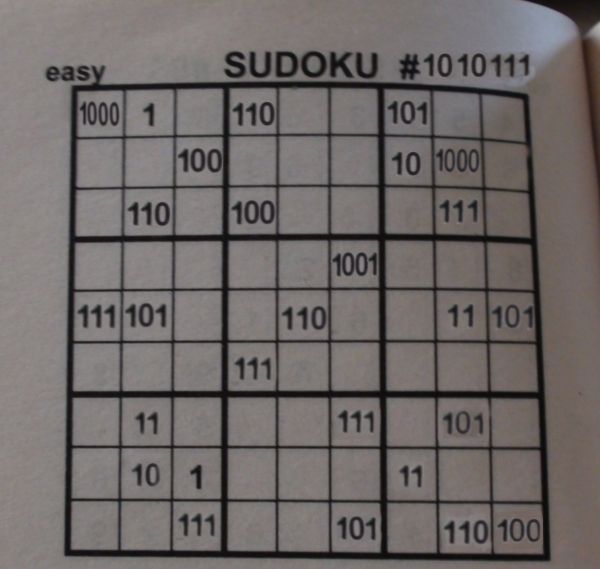
a sodoku puzzle from a book. i got the 0 from the page number. i can't put another pic of the original but i can tell the numbers.
8, 1, 6, 5 on first row
4, 2, 8 on second row
6, 4, 7 on third row
9 on fourthrow
7, 9, 6, 3, 5, on fifth row
7 on sixthrow
3, 7, 5 on seventh row
2, 1, 3 on eighth
7, 5, 6, 4 on last row (5 years and 3747 days ago)
I suck at regular sudoku - this must would kill me....aaahhh....very clever  GL
GL
you need to work on some numbers there.. they got white color in '0's and some show a background.. use stamp tool to clear the old numbers and write the new ones and then play with blending modes to make them look natural... then it'll look good..
and yes.. this would be the toughest sudoku of all times.. 
I love sudoku, but I don't know about this one... 
The number after # needs more warping, and I agree with Iquraishi about white color behind the changed numbers.
Clever idea, I would have never thought about that. I like this one, but I agree with the background of the numbers, maybe if you had cut out the numbers and then used color selection to get rid of the white it would look better. And with the 111 at the top of the page, underneath you can tell where you covered up the numbers, maybe try using the clone stamp and going in a straight line from the top of the page down over the numbers to give it a better blend. But like I said, love the concept and I do like this entry 
Howdie stranger!
If you want to rate this picture or participate in this contest, just:
LOGIN HERE or REGISTER FOR FREE
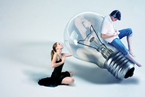
This is very concept-y, so hope you can see the story... the guy's doesn't have time anymore for his love anymore...
I'm very greatfull for the artists who let me used their stock! (5 years and 3787 days ago)
Sad...
the source 1..."If you use this stock, please credit me and show me the finished piece. For offsite use, you need to ask me first."
genuine2009: I did ask the artist first.
omg that
Reality might be shocking!! It's well blended in and nicely done IMO. 
I do not know if you asked ... i guess you did that!!!
The girl needs a shadow that matches the bulb shadow...
Great work....and a good concept....
Howdie stranger!
If you want to rate this picture or participate in this contest, just:
LOGIN HERE or REGISTER FOR FREE
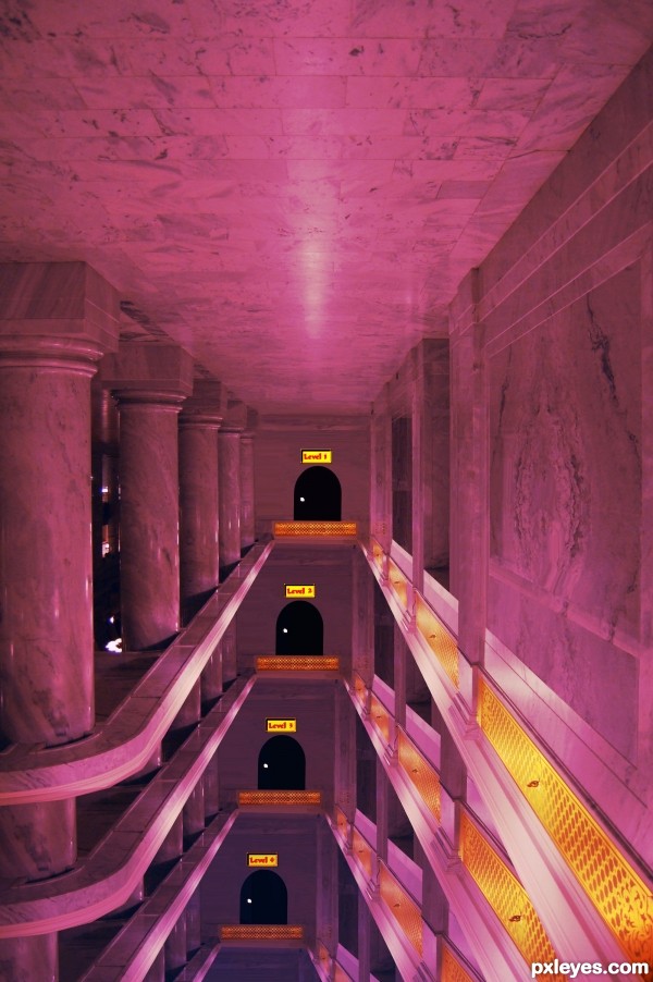
Perspective is reversed.
Thanks I hope this is what you ment?
It's better.
Howdie stranger!
If you want to rate this picture or participate in this contest, just:
LOGIN HERE or REGISTER FOR FREE