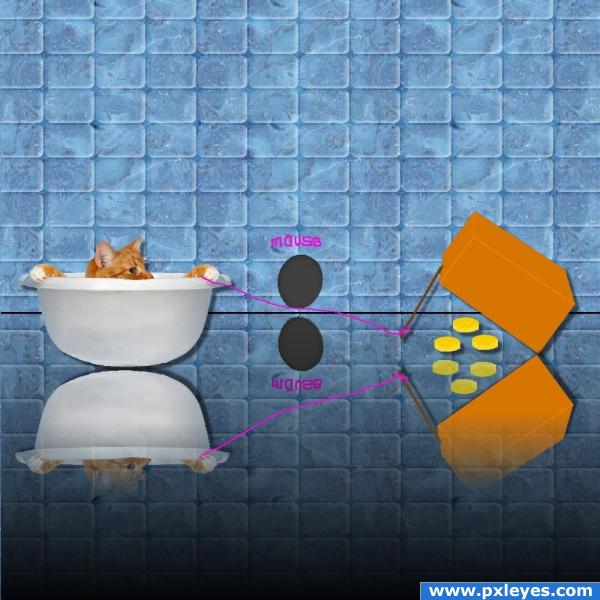
replace original (5 years and 3905 days ago)
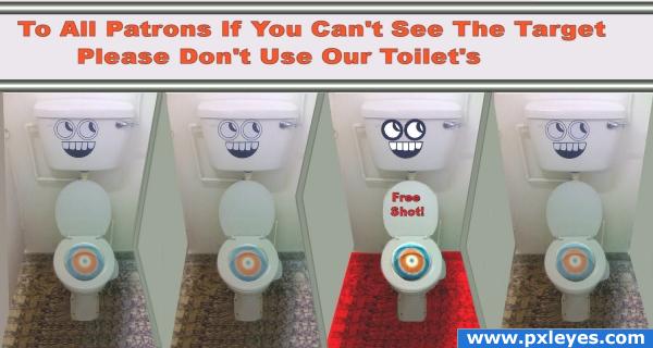
replacement (5 years and 3908 days ago)
I LOVE THIS LOL GREAT IDEA!!!
haha...good one....
LOL Good idea!
a gentle brushing of the dodge tool might be helpful to brighten the overall image.. you got four of them so you could experiment on one to make the piece less dark..hehehe.. very clever Idea 
Hey thanks all !....GolemAura is this near what you were talking about?....thanks
nice funny idea, but the perspective of the walls bothers me a bit, you would be seeing them from different angles
Ray Tedwell hows that? does that give a little better look to walls?... I had tried different ways of doing walls but because of the angle picture was taken looking down from front maybe this will help. Thanks for idea
Funny
Howdie stranger!
If you want to rate this picture or participate in this contest, just:
LOGIN HERE or REGISTER FOR FREE
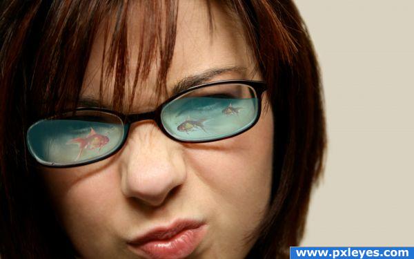
TO SEE IN HIGH RESOLUTION (5 years and 3953 days ago)
wow,so cute.i want one .a lil bubble will help to give the feel.give slight curves to the water near edges of frame to give a fluid feel.
Nice but howerver tilted maybe the glass, the water line should stay horizontal, not slanted as in this case...
Just looks like a reflection...but Arkncheese is right.
Nice!
Bit impossible but it's a lovely idea! Great job.
add bubbles...good work!!
The water overlaps the frame. You can see it in high res. Makes it look like a blue sticker. Mask it out to make it fit onto the glass better.
Howdie stranger!
If you want to rate this picture or participate in this contest, just:
LOGIN HERE or REGISTER FOR FREE
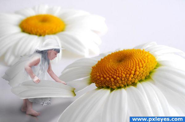
while playing with the flower. Accidentally the petal was broken. She is thinking what to do! (5 years and 3953 days ago)
Nice one
This is too adorable! Great idea!
too cute..i think u should change the contrast and level of the gal a lil .she looks dodged
The girls is looking very bright, but i love the image.. good luck 
I think you need to adjust some things, light come from left so the shadow shoul be different, there's a white edge on the petal ad the girl's lights are totally off.
the light on both pics are too diff.. other then that i really love the idea and composition
great quality work
pretty idea, but... in high resolution the girl looks very grainy, edges could use some work,also the lighting is wrong: light on the flowers is coming from right, light on the girl is coming from left. try to fix these and this will be a very nice image.
OH THIS IS SO CUTE! I am holding off on my vote to see if you take the other's advice.
great idea
Thank you guys for that helpfull comments. I have edited.
I think its a great idea and so cute! the only thing that bugs me is that shes got gray hair... which I now see is a black and white source image. I think if it were me I would give her some blond to go with the middle of the flowers... thats just an opinion though, you did a great job!
what a wonderful idea! The girl could use some more contrast or color and the light on it does not fit the daisy. Love it though, simply wonderful.
Howdie stranger!
If you want to rate this picture or participate in this contest, just:
LOGIN HERE or REGISTER FOR FREE
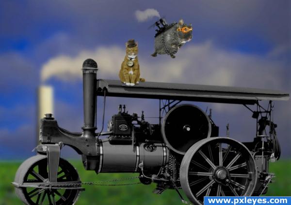
I really hope this is steampunk. I see a lot of discussion about it on this contest, which is good in a way, cause we all learn something. I just hope we'll remain friends...:-)
Anyway I hope you like this. Just some sources blended together.
For the gadget on the back of the rodent I used parts of the steam engine. (5 years and 3993 days ago)
Thats cool... It looks like it could work... 
Edit: @Oliviasarts :-P I know... Just kidding around...
Nice!
nice work...
super high marks.. and you are a nutball
YOU???.. not a nutball..your a whole bag of Pistachios
im not sure if the pespective on the wheels is right but the image rocks!
@ Arknecheeze.. of course it could work, it would have worked lol... look at photo on sxc, its a real steam engine of the past lol
The rodent is very good!! Work the train some more...Good Luck
Thanks for all the nice comments everyone... could someone please explain what's wrong with the steam engine? I just cut it out and resized it... didn't touch the perspective tool at all 
dont worry about it author, for those of us that check sources used, we can see that nothing is changed on it 
Thanks @OliviasArts 
Howdie stranger!
If you want to rate this picture or participate in this contest, just:
LOGIN HERE or REGISTER FOR FREE
Good idea, the cheese looks a bit under developed, but good job.
agree with ponti55 , but clever and funny shot
Could use a bit of realism, and a decent reflection for the cat bowl...lower it so it isn't floating.
Hey thanks! Is this any better?
The reflection needs to be touching the bowl and the reflection of the box should show the inside of the box. Also the cheese needs a reflection too. Clever idea though! Good luck
sparklen thanks forn suggestion I always have trouble with reflections I spent most of the afternoon trying to get info on it I still don't know if I got it right
nice
funny idea ) gl
) gl
Howdie stranger!
If you want to rate this picture or participate in this contest, just:
LOGIN HERE or REGISTER FOR FREE