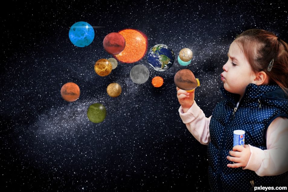
This giant is using planets as soap bubbles!! (5 years and 995 days ago)
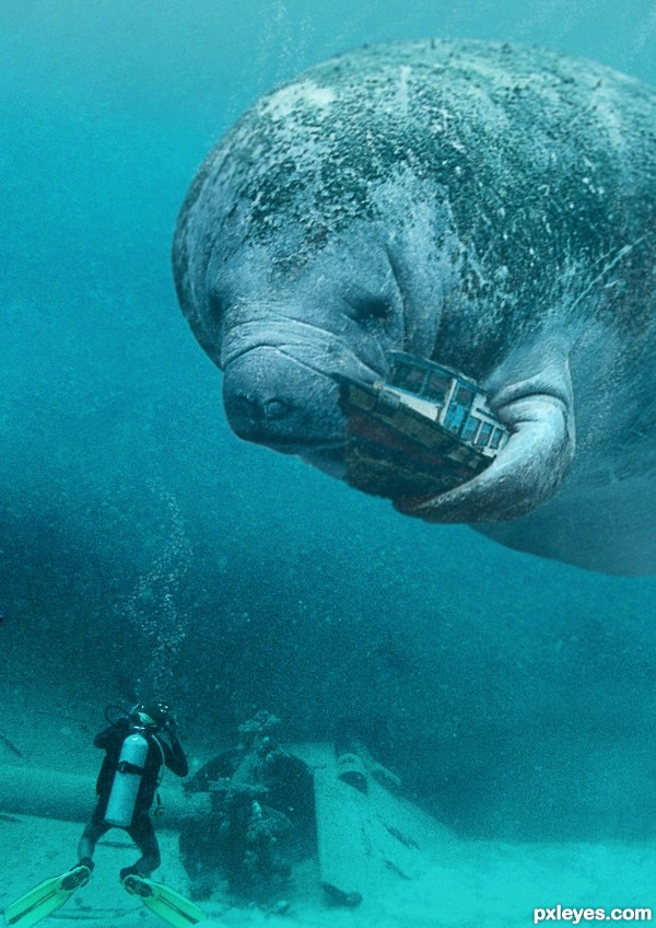
(5 years and 2572 days ago)
Effects are well done. WTG!
that sure is a BIG manatee
fantastic. very good..a cover for a book. bravo
Congrats!!
Thankyou!
Congrats for the nice composition!
Thanks!
Howdie stranger!
If you want to rate this picture or participate in this contest, just:
LOGIN HERE or REGISTER FOR FREE
(5 years and 3167 days ago)
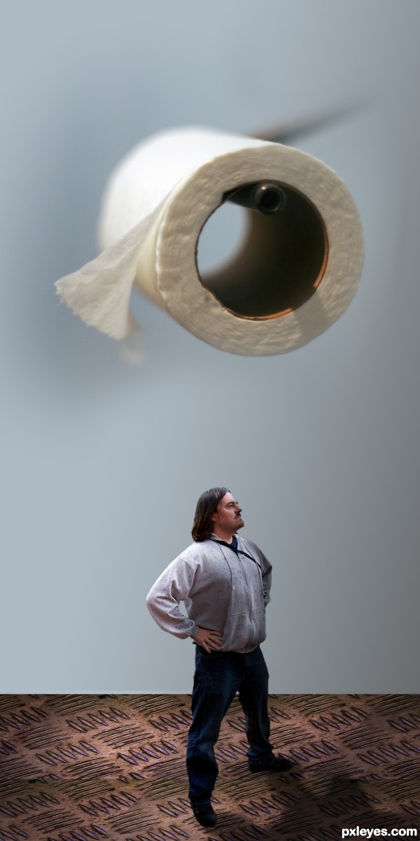
The focus of the various elements is not consistent, and the floor is at a different perspective angle to the man standing on it. This just looks hurried and thrown together.

Light source on paper is from top left, on the man from upper right.
While the concept is very funny, for a higher score you may want to run a very soft blur brush over the edges of the man, his will make him blend better (he's very roughed edge and the top of his head has the white edging (IMHO)
Select the FLOOR LAYER and use PERSPECTIVE on it, and you will find that it will blend better as well.. (took me some time to learn how to do that and I still have trouble) but you have enough pattern in the floor so it should be quite easy...
Gray Gaussian disks placed beneath his feet (at the floor perspective) will help ground him as well.. Good luck author (The humorous concept of this piece is very adorable)
EDIT: 100% Improvement author.. good luck


thanks everybody for the tips
Howdie stranger!
If you want to rate this picture or participate in this contest, just:
LOGIN HERE or REGISTER FOR FREE
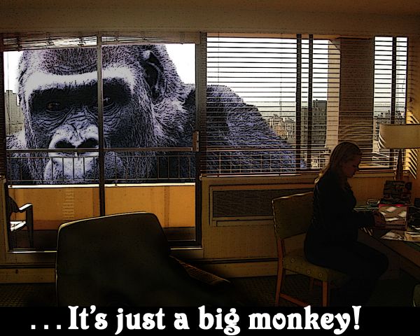
didn't add planes...its just too sad (5 years and 3693 days ago)
I agree with Nator, type doesn't work and detracts from the image. BTW on behalf of the great apes of the world, a gorilla is NOT a monkey.
nice, but did you use the photocopy filter or something like it on Kong ? I don't think he needed it, it gives him a newspaper cutout look. Nice masking around the railings mind
Really nice idea. The text and the filter on the gorilla spoil it a little.
Howdie stranger!
If you want to rate this picture or participate in this contest, just:
LOGIN HERE or REGISTER FOR FREE
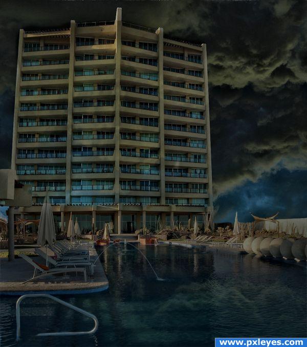
http://www.flickr.com/photos/peterjbaer/1227601183/sizes/l/ ---- Uploaded
by Peter Baer
I made a HDR effect to give more WOW (5 years and 3869 days ago)
very nice mood.
Very nice darkening and blending 
Nice work with the darkening and shadows
Great job with the HDR effect! It really adds a cool feel to the image. 
Suggestion: From looking at your high res, I think you need to do a little more work on the cloud reflection. First, they are a little too sharp, so you might try filtering them to get the desired distortion effect. Second, they are in front of the building's reflection, which obviously isn't the case when you look at the main image above. You should erase or mask out the clouds in front of the building. Good work and good luck, author!!
Howdie stranger!
If you want to rate this picture or participate in this contest, just:
LOGIN HERE or REGISTER FOR FREE
What a grrrrrrrreat idea. Your post is clear and crisp and well done. The light on the child makes her pop against the darkened universe and the colourful planets are the icing on the cake.
Howdie stranger!
If you want to rate this picture or participate in this contest, just:
LOGIN HERE or REGISTER FOR FREE