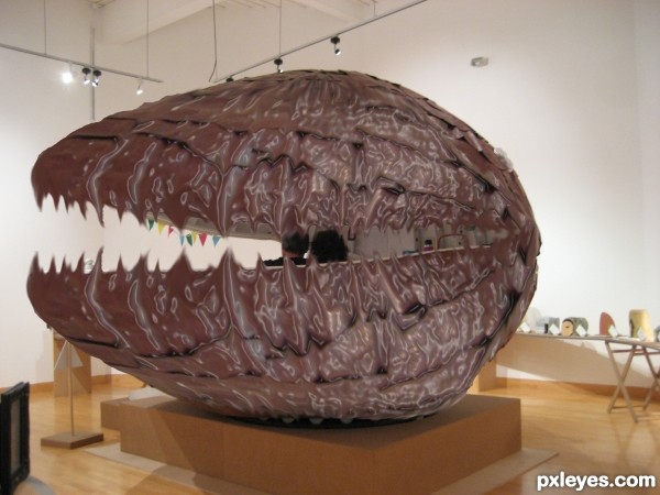
The revenge!
Exhibition of beach huts. This one was egg shaped, when I took this photo, there was a couple sitting in it. (5 years and 3572 days ago)
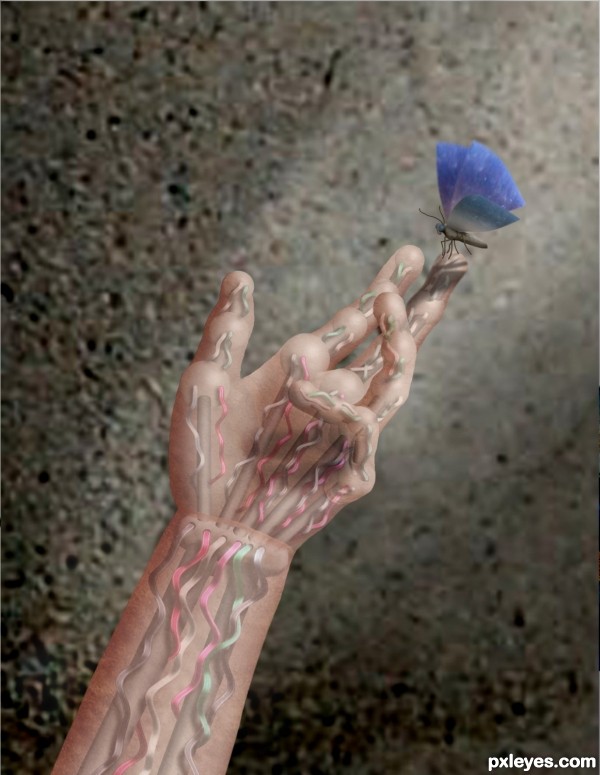
Thanks to lindowyn for the use of the hand stock.
Hmm. I tried the source link before publishing and it doesn't seem to be working properly. So, go to: http://lindowyn-stock.deviantart.com/gallery/ , scroll down to anatomy and its hand stock 5. (5 years and 3611 days ago)
purely awesome. 


WOO HOO... butt wiggle... tail wag cute puppy head tilt one floppy ear 
(wrist is a bit hinky but it doesn't distract from the greatness!!!)
EDIT: WRIST IS PERFECT NOW... EXCELLENT JOB AUTHOR... (Only bad part now is that I can't favorite again  ))))))
You completely CBR'd the source. (chopped beyond recognition) You didn't need the source to make this. Incorporating more of the source would greatly improve your score.
Yup, jawshoewhah, I did CBR it. But kind of interesting that I could "see" something like this in the given source, doncha think?
Um, no, but you got plenty of time to put more into it.
Seriously, I was seeing robots, vending machines, and maybe converted bus stops. How about even some futuristic space ship or maybe model the panels around beautiful naked mannequins as their outer skin. (OK that's enough free ideas. I just came up with those)
\Even though CBR'd entries are not against the rules, if you could make it out of anything, then the source is not even necessary. Just remember that when you can use the source in a clever way and I don't have to go to your SBS to view it, then you've used the source.
Very creative, Great work piece.
great job !! gl
Josh, I was seeing robots, too, obviously, but I wanted to do something different besides robot warriors or robot women or robot animals. And sometimes, less is more, so I didn't feel the need to make the entire robot. I couldn't have made this entry if your photo had been a close up of a flower, but there was all that lovely flat metal, the cement ground made a great skin because of the texture and the trash bin was perfect as a background. If you have to go to the SBS to see how I did it, well...maybe I made it well enough that someone will be able to learn about the methods I used and try it themselves sometime.
Bottom line, your imagination and mine are very dfferent. And for that, I guess we *both* can be thankful for small favors, yes? 
I agree too nice imagination is correct. Good luck Author 
very nice work author,work with the metal parts and the wires is fantastic...only thing that i don't like is the wrist...and when i say wrist i mean that inside parts are great but i dont get shape and the function of the skin-ish part...IMHO work would be better withot that outside part...any how i like this work and i wish u best of luck...
OK, I redid the wrist. Thanks, Slushy and erathion.
Sorry, I completely agree with Jawshoewhah. This is really CBR. All the source is is a bunch of textures. You could have done this with any picture! Of course CBR isn't illegal or something but this is, though very well done, a somewhat lazy idea. What if I just made the source really narrow, warped it and turned it into a whip and made it an Indiana Jones-themed entry?
EDIT: Sorry, author, I really, really love your other work...this one is just too CBR for me.
Lazy idea? pfftt. Nice comment senior.
Good job Author 
Gamemastertips, if you could take the source and *only* using that to make Indie cracking a whip, I...would...LOVE it. You could use the post to make his hat (and the whip, of course), the trash bin could be made into his leather jacket, the pants could be made out of the ceiling light or maybe the metal sides, if you dull it down some...it would be a *lot* of work, but I bet you could do it. 
Author, even if you would love it, I would hate it lol...sorry, I suppose that's just my taste and opinion. It's just...I cannot recognize a single part of the source if I hadn't looked in the SBS. Add just one small part...the ticket slot, the computer screen, anything that would make the source recognizable, and I wouldn't say it's CBR. But as it is...I apologize, but my opinion still stands.
EDIT: Thank you author.  I still very much love your work. And re: Cornelia, I'm not even a real fan of that style, but yes, it can be incredibly beautiful. But again, even in Cornelia's work, you can at least recognize parts of the source being used. Author, I'm afraid I can't. That's the only thing that makes me dislike it. Otherwise, I'm astounded at the work you did on the wires...you're still a great artist, of course.
Don't apologize, g. Your opinion is as valid as anyone else's. If that's how you feel, OK. No worries. As for me, I just try and make images that I think people will enjoy looking at, using whatever method evolves. (Honestly, I didn't start out to disguise the source. It just happened that way.) My main objective is an image I hope people will enjoy and that's fun to make. I fulfilled the second part. We'll have to see if I was successful with the first part. 
CBR????? Since when has that made a difference here? Wow! Some awesome pictures have been made that you cannot recognize the source anymore---look at CorneliaMladenova's work! She does awesome work!
I think you did a great job author!
Cornelia ALWAYS keeps the original source visible and recognizable in her entries. That's why she;s one of the best choppers on this site.
And IMO, it makes a big difference because if you don't use the source in a creative way, still making it recognizable, you didn't use it. I don't know why some people can't seen to understand that?
jawshoewhah "she;s one of the best choppers on this site." I totally agree with that--my favorite I think. "ALWAYS keeps the original source visible and recognizable" I disagree with that though.
Author, I don't care if it is CBR because it is very artistic and a beautiful chop! I'd put it on my wall 
Author: I think you did a wonderful job, even if your image is a CBR, it is still an idea taken from the source image. You should be proud of what you did. Good luck.
nice image, gl to you!!
Howdie stranger!
If you want to rate this picture or participate in this contest, just:
LOGIN HERE or REGISTER FOR FREE
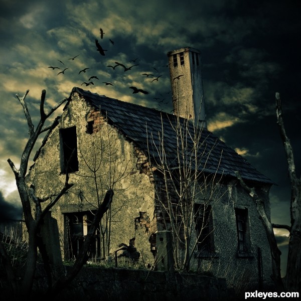
Took quite a lot of work till I arranged everything the way I had it in my mind but I'm pretty happy with the result.
___________________
Techniques:
A lot of masking, color adjustments, to get the main color effect i used a gradient map from black over dark-turquoise to a creamy yellow to white. (everything with adjustment layers) I used the "lightning effects" filter and the burn tool to illuminate the tree branches right, same for the house. desatureted, added a soft vignette, blended everything (its best to use masks, a non destructive way to erease parts) and did a lot more I cant really remember. (5 years and 3653 days ago)
Very nicely done. You may want to look at the bird source though, it appears to be copyright. Change that and you will have a very nice entry that will remain in the contest. It would be a pity to see it eliminated.
Thank you!
ow yea didnt notice that.. is it still a copyright abuse if I didnt actually use the picture but just made a selection of some of the birds and filled it with black? I dont quite know where copyright begins and ends.
/edit: Fixed it, it should be okay now.
awsomeeees
You still have an issue with those birds as that image requires to be purchased to be used. You need to search for a free stock image. Use the "Resources" tab at the top of the page to take you to allowable sources. This link will also help http://www.pxleyes.com/blog/2009/06/how-and-where-to-find-legal-source-images/
Nice work. Author you can also use this flying birds brushes for your work.
http://www.brusheezy.com/Brushes/1473-Bird-Photoshop-Brushes

I did it with the brushes now, its not easy to find free birds silhouettes.
Thank you all!
lighting and blending are very well done
great job
very very nice work...100% convincing creation...well done
Great I love it!
Thank you so much guys (:
Great job. The mood really sets it apart.
The mood makes the house looks even creepier, so good job!
2nd Place!!! Thank you all so much, you are awesome. (:
Congrats for your second place, Lukas!
Congratulations! 
Congratulations, for 2nd place 

congrats
Howdie stranger!
If you want to rate this picture or participate in this contest, just:
LOGIN HERE or REGISTER FOR FREE
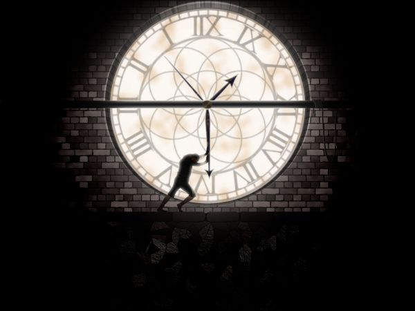
I used for this entry Photoshop and Eye Candy plugin for textures. The clock is made by myself. Thanks for view and comments. (5 years and 3777 days ago)
nice idea,gl.
Coooool... 
Nice idea...create some ladders for poor guy to reach whole clock...
How can I post a photo in this contest???
Albiss, you are level 1, and this contest is for level +8. You can get more information in "Rules & guidelines"
Thank you nayway I had a good foto for this competition.  ))))))
love it so much, good idea, you made a nice clock
Good idea....Nice work....
Very nice entry, has a "story" and is well done, the only thing I don't get is the cropping... a little more space at the top would balance this out.
Thanks everybody!!. Annabat, you are right, I hope to get time to improve this. 
Would like to see more of the process, but I like the piece.
Would have been more effective to use real textures, but good idea...
From the title I thought there would be a guy in a hampster wheel, I like your lighting and such. Good luck.
Nice representation of man's struggle against time!! Well Done! GL
Like the use of a silhouette in this image
Howdie stranger!
If you want to rate this picture or participate in this contest, just:
LOGIN HERE or REGISTER FOR FREE
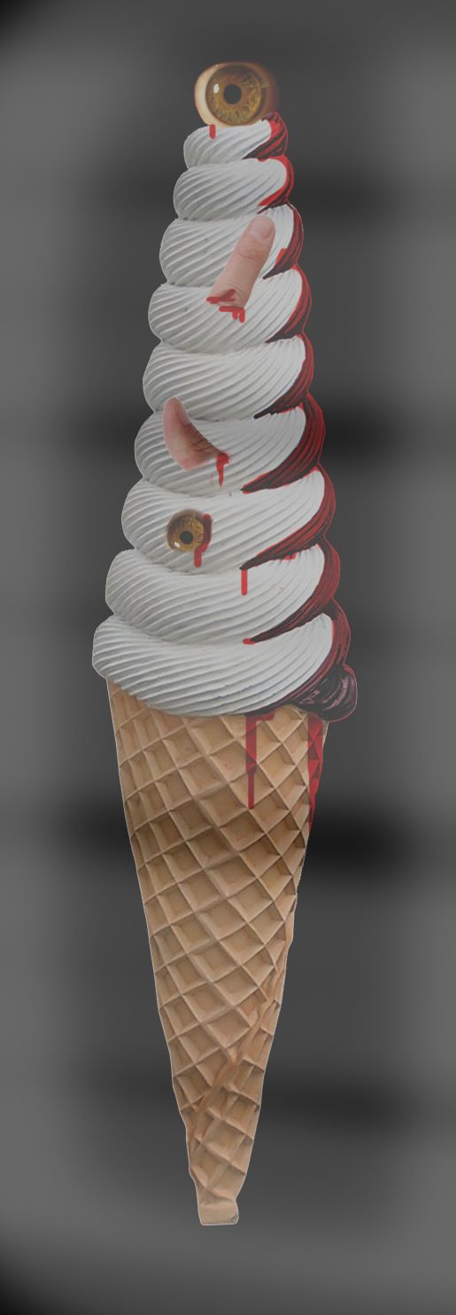
(5 years and 3790 days ago)
this actually made me gag LOL!! GOod idea but you should blend in the fingers a bit more to make it look like they are actually sticking out of the ice cream..
Good job with the eyes,with fingers not so much.Try to blend fingers better...Maybe some other background would fit better...in any case good luck author
lol, maybe add some contrast to this, seems kinda dull ...GL
Don't the rules restrict voilence and gore? There are kids here...
Not very realistic, sorry. Were you trying to make fog or something because it doesn't make it look very good.
eww? D:
Howdie stranger!
If you want to rate this picture or participate in this contest, just:
LOGIN HERE or REGISTER FOR FREE
Interesting, but teeth edges are blurry with the lower chocolate teeth seeming to defy gravity. Also, the humans being eaten are a bit hard to discern -- and in any event that all seems unlikely given the background.
good
Howdie stranger!
If you want to rate this picture or participate in this contest, just:
LOGIN HERE or REGISTER FOR FREE