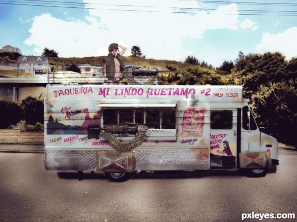
Just canned food and no beauty proctucs. The good food would be gold and the pretty girls too. (5 years and 2636 days ago)
- 1: source1
- 2: source2
- 3: source3
- 4: source4
- 5: David MacKenzie

(5 years and 2684 days ago)
Howdie stranger!
If you want to rate this picture or participate in this contest, just:
LOGIN HERE or REGISTER FOR FREE

I gave it a little change. For this, I used cloning, duplication, and image blur for the arms. I made the sky with a brush that I have installed earlier. Then I made a sort of wall with the title on it to hide the box. Thats it. (5 years and 3135 days ago)
I have edited my entry. Now you can view it in hi-res.
It looked better without the skull, which adds nothing to the image.
The additional nipples also look like overkill.
You also have way too much dead space on the sides.
It was a good image as it was. Now it's trying too hard...
Ok maybe I forced a bit. I'll remove it. Thanks MossyB. Anyway, I'm a beginner after all. thanks again.
My entry was removed temporarily because I forgot to upload my SBS... lol. Now I'm back.
Cheers..!!
Howdie stranger!
If you want to rate this picture or participate in this contest, just:
LOGIN HERE or REGISTER FOR FREE
(5 years and 3428 days ago)
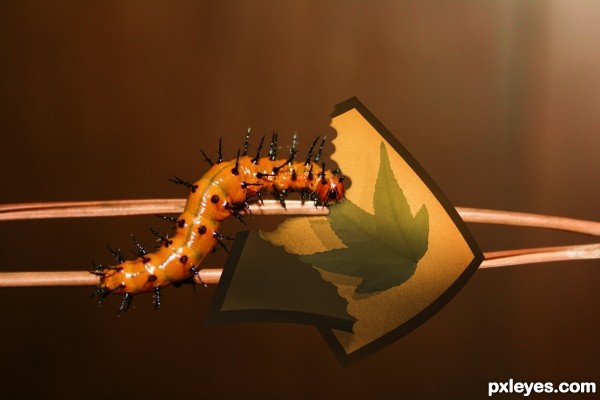
I understand the eaten portion of the (let's call it a flag) but the part that seems to be falling off is larger than the part the caterpillar seems to have eaten. I don't get that, but it's an interesting idea.
My english is not so good, so i hope that you will understand.
Catepillar is hungry so she eats pictures of leaf (she don't have nothing else to eat), she try to eat the way to the part of a pictures where is a leaf.
Falling part is empty (don't have leaf) so that catepillar didn't eat that part
Maybe you need to move the falling part so it is not infront of the part with the leaf on... maybe as though its going out of frame?
Now is to late for thet but anyway thanks for the tip
Howdie stranger!
If you want to rate this picture or participate in this contest, just:
LOGIN HERE or REGISTER FOR FREE

(5 years and 3821 days ago)
nice work I think the leaves need a little shading work
nice
cool
great
very nice 
Howdie stranger!
If you want to rate this picture or participate in this contest, just:
LOGIN HERE or REGISTER FOR FREE
Congrats!!
Howdie stranger!
If you want to rate this picture or participate in this contest, just:
LOGIN HERE or REGISTER FOR FREE