(5 years and 2617 days ago)
(5 years and 2647 days ago)
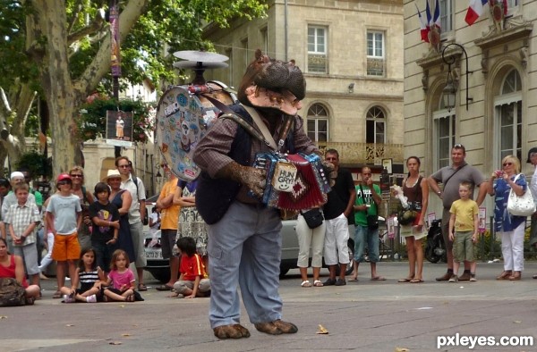
Pretty funny, I like the hands  . Good luck!
Very nice!
Nice one!
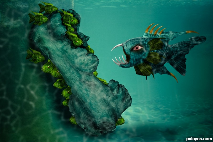
Love the lighting and the inclusion of 'hands & feet'! Well done!!
Congrats!!
Thanks!
Howdie stranger!
If you want to rate this picture or participate in this contest, just:
LOGIN HERE or REGISTER FOR FREE
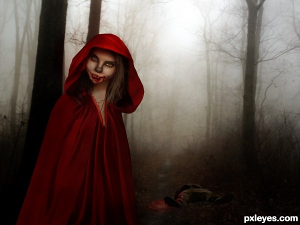
Red didn't take kindly to strangers following her. She would always make them pay for their sneaky actions.
Thanks to the wonderful artists of Deviant art for their stock.
I used two of my own images for textures. (5 years and 2824 days ago)
Congrats again, nicely done!!
Howdie stranger!
If you want to rate this picture or participate in this contest, just:
LOGIN HERE or REGISTER FOR FREE
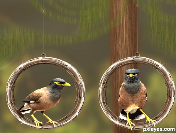
Used only the source image and Ps filters and effects.
Modified. (5 years and 2842 days ago)
Where's the Sling Shot? hehehe.. inventive (need to fix the wing tip on the profile bird (NITPICK) ) good job and good luck
Thanks 
The birds need to be slightly repositioned on the rings, their feet are too far in front, making them look pasted in front of, rather than on the rings. Also, the "sparkle" brush highlights are bit too obvious, reducing the opacity slightly will make them seem more natural.
Thanks for valuable comments, I will do the modification soon 
Nicely done. Add some shadows where the birds sit on the rings, Agree with Mossy on the sparkly brush.... GL
Thanks for your comments 
I agree with all the above...also, what material are the rings made from? The sparkle brushes indicate metal, but they have a wood like construction. The edges of the birds could have been softer, making them blend better and look natural in the setting.
Just a few minor things that might help.  good luck
Howdie stranger!
If you want to rate this picture or participate in this contest, just:
LOGIN HERE or REGISTER FOR FREE
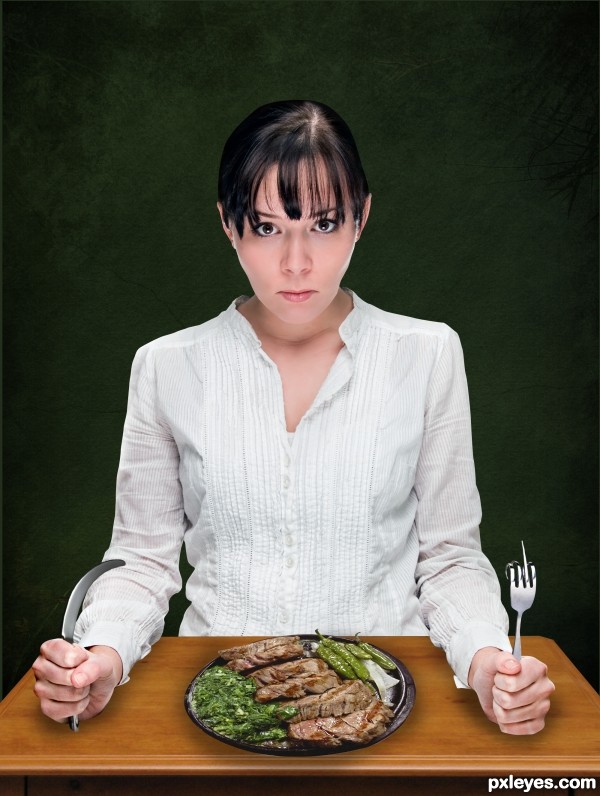
Thanks and credits go to:
Ryasaurus for the model
Alexkalina for the knife
Designkryt for the Nightstand
sulfurix for the steak
darkrose42-stock for the texture (5 years and 3020 days ago)
Love it...good luck, author! 
(And just for fun, since the title suggested it: http://www.fun-with-words.com/word_gry_angry_hungry.html )
Thank you! I will visit that site for sure, since I am not English I'm sure I will learn a lot, thanks!
Fun with an extremely informative SBS. I like that you modified her expression. I think it could be a bit more exaggerated, however (arched eyebrows, more sneer?). The drooping-knife element seemed weak, but then it occurred to me that an extremely pointy knife with perhaps an almost cartoony glint at the point would better fit your theme and balance the aggressiveness of the fork. The hand and forearm cutouts could use more feathering of the edges. The forearm shadows should get stronger the more under the forearm they are. Same for the food's shadow. But the more fundamental problem with the food is why would it make the diner angry? The notion of 'hungy' in your title suggests a large plate with a very small (but elegant as a commentary on the pretentiousness of fine-dining chefs [despite the lack of a white tablecloth on your table]?) portion might be more appropriate.
Wow! DanLundberg, thank you very much for your suggestions!
I'm self-taughted with photoshop and not always I have somebody to tell me how to improve, I really appreciate it!!
About your question: is not the dinner amount what makes her angry or hungry, in fact my mother tongue is not English so that is maybe the missunderstanding... I just wanted to make clear that the fork plus the knive are the responsibles of the girl being hungry (and so if she is hungry that makes her angry) and there is nothing to do with the amount of food.
Very fun and well done...Thanks for the great SBS.
Thanks for all your comments!
excellent work good luck  (you can easily thicken the plate by making a copy below it and lowering it with nudge to give the plate a tad bit more thickness) but that's just me, fun chop and very good job
My expression would be serious too if I had to eat all that meat, lol. Nice work.
Howdie stranger!
If you want to rate this picture or participate in this contest, just:
LOGIN HERE or REGISTER FOR FREE
Not sure why you added the extra light dappling at the end? I mean it's not necessarily superfluous but I might have toned it back a bit.
I added it because I think it adds to the look, simply put.
The expression of the fishes are great... GL
Thanks!
nice one!
Thanks!
The little guys are so scared that forgot to breath, there are no bubbles... nice image though! Good luck!
Thanks!
Great work. GL
Thanks!
Howdie stranger!
If you want to rate this picture or participate in this contest, just:
LOGIN HERE or REGISTER FOR FREE