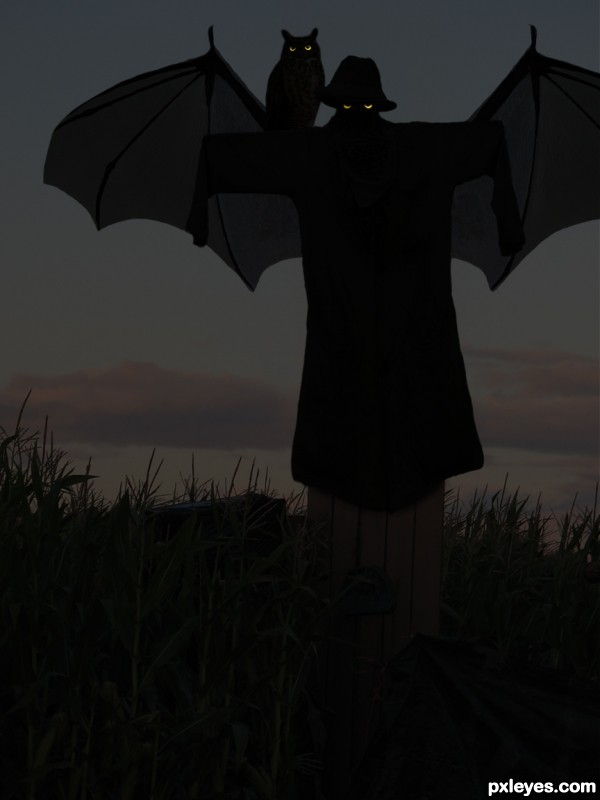
Inspired on the movie "Jeepers Creepers".
Thanks to:
- jppi @ Morguefile;
- brendan.lally....away and Zeusandhera @ Flickr.
(5 years and 3522 days ago)
- 1: corn field
- 2: owl
- 3: bat
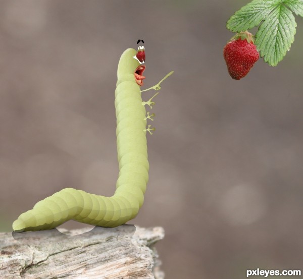
Hungry worm (5 years and 3589 days ago)
I think you've done a great job on the caterpillar, but the eyes really let this down for me, they just don't match the rest of the image imo. I'd also add more legs. Overall a nice job though.
Funny stuff! 
I just think you have to work on shadow, it's a bit sharp; and mouth and tongue need a better chop/masking... 
Funny 
I agree about the eyes...mouth are just perfect...good luck author
Thanks for suggestions and support. I updated the image and I hope it looks a bit better. 
hehe amazing  gl author
love the expression
Funny 
cool
Howdie stranger!
If you want to rate this picture or participate in this contest, just:
LOGIN HERE or REGISTER FOR FREE
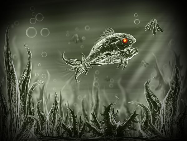
Inspire by my favourite artist Jaskier work http://www.pxleyes.com/photoshop-picture/4bb576c7d092d/Crystal-Fish.html. This entry is the result of learning and observing his style and doing some "trial and error" efforts. (5 years and 3614 days ago)
the colors are a lil boring and some parts of the fish and plants look a bit lq cuz of the warp and liquefy, but not bad, good luck
Nator, I am inspire by many artists here and will also try to learn their style too, although I can't create amazing art like them but atleast will try my best. 
There's no problem to be inspired by someone! Give you all support! 
very nice
cool
Nator, I like to try many different styles and love to learn new things in photoshop. Please don't take it in another way, I created this entry just for learning and fun. 
you should post it as the reference, or inspiration maybe. it is remarkably similar to the entry in the other contest that Nator cited
Ok guys, description updated. 
Great...good luck
nice one!
not bad at all . Great effort Author 
Congrats! 
Howdie stranger!
If you want to rate this picture or participate in this contest, just:
LOGIN HERE or REGISTER FOR FREE
(5 years and 3747 days ago)
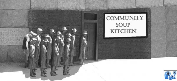
I hope you dont mind a little feedback for improvement-remember it is just my opinion: explore the shadows on the extra people you have created. maybe shadows on the ground- use light source and shadow from building as reference. also explore the shadows around the feet. On the UP SIDE this is a nice entry and meets the theme very well. A TIP: How to create shadows: create a brush from your people. using TRANSFORM & Warp to position shadow on ground... you may like to check with other commenters to see if my opinion is on track. GL
I completely agree with Scratzilla.
No I'm glad for feedback Thanks I Tried to adjust it I'm not sure if its better or not?
these changes are HEAPS better author. GOOD Luck with the SON N LAW 
it's really too bright
Howdie stranger!
If you want to rate this picture or participate in this contest, just:
LOGIN HERE or REGISTER FOR FREE
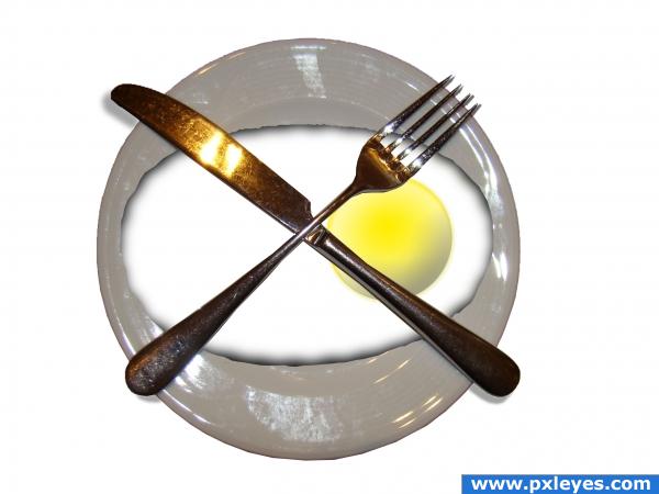
I'd love to see the chicken that laid this egg. (5 years and 3754 days ago)
Isn't the yolk supposed to be round?  You should work on shadow under the cutlery too...
I've changed the shape of the yolk and added shadows to the cutlery.
goose eggie. just like we have at home - one egg feeds all.nice idea
nice idea 
Howdie stranger!
If you want to rate this picture or participate in this contest, just:
LOGIN HERE or REGISTER FOR FREE
What's with links 4-10?
Strange... I didn't upload them, only 3 links...
Well, I reuploaded it and it seems the problem was solved! Thanks, Bob!
Howdie stranger!
If you want to rate this picture or participate in this contest, just:
LOGIN HERE or REGISTER FOR FREE