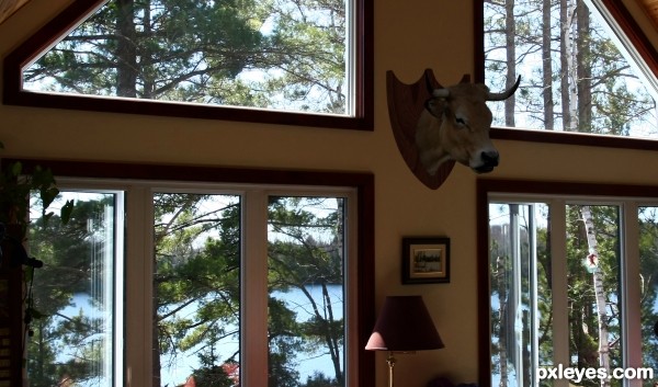
(5 years and 2856 days ago)
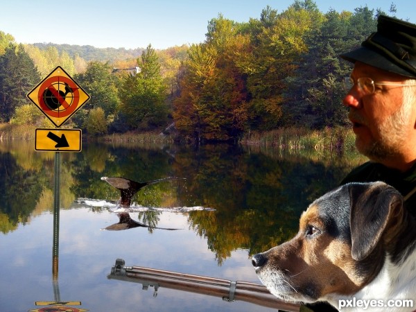
http://www.stupidlaws.com/it-is-illegal-to-hunt-whales/
I used the pen tool to create paths around most of the images, then made a selection from paths and applies a mask. From there I deleted the paths and edited the masks to clean up the edges. For the dog fur edges, I created a brush and painted in or out various areas of the dogs fur to try to get a more natural look to the masked cutout.
I used a custom symbol for the "NO" sign and the "Target Site" symbol, then created a custom symbol for the whale.
The original sign had a bicycle on it, I used a combination of content aware fill and smudge tool to remove the bicycle from the sign. To make the signs reflection, I duplicated the sign layers and merged them then grabbed the top center handle of the resulting layer and dragged it down to the bottom of the image. I reduced the opacity a little and added a slight ocean ripple from photoshops filters. To make the mans glasses opaque, I used different levels of dark to medium grey to brush away most of the shy that was i what would be the transparency of the glasses extending past his face.
Minor additional adjustments were made to all edges, and the Whale in the water was created much the same wy as the sign and it's reflection mentioned above. Hope you like it. :) (5 years and 3114 days ago)
Please fix source links.
Link to the images.
Quick comments you can fix here, and important ones too:
1- Lighting direction shall be same for all the elements in the image, especially the dog's face.
2- The reflection of the sign pole and the wale's tale shall not be in perspective, it looks like a shadow more than a reflection; the reflection and the origin shall have the same size.
3- You need to add some ripples and disturbance to the water surface.
Eek! Second page.
Sorry, I deleted my other posts by accident, screen didn't refresh. I fixed the Source Links, and I agree with the light direction, but thin the length of reflection depends on the angle and closeness of the object. I guess I'm done editing on this one with what time is left. Thanks for your help just the same.
Can an SBS be in Written form only, or with arrows pointing to different parts of your final posted image describing what you did to achieve the results? Anyone?
Howdie stranger!
If you want to rate this picture or participate in this contest, just:
LOGIN HERE or REGISTER FOR FREE
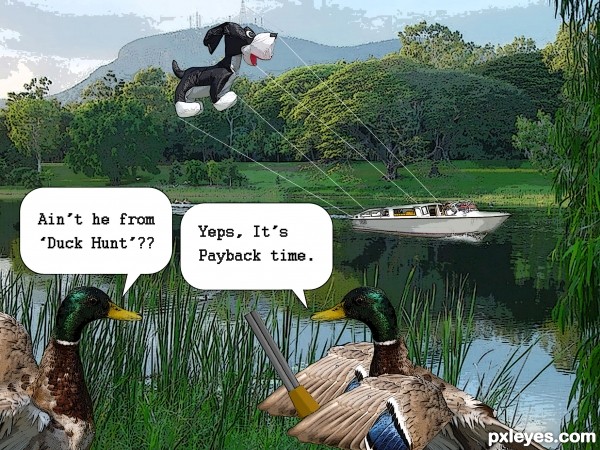
Hope you'l like it...... tried givin it a comic strip look..... (5 years and 3346 days ago)
thin the strings author... you got something great here.. only need a tad bit of improvement... (google MACY's DAY PARADE BALLOONS to get an idea of the thinness needed to create the proper idea)
Great idea ... can only get better 
Thanx Drivenslush.... just made the changes hope it looks better now..... thanx for the Google reference....
nice work
hahahahahahaha...super cool...best of luck author
LMAO OMG this is FANTASTIC!! I am STILL laughing....Wonderful work  Best of Luck
very funny good luck!
Thanx every1 for all the comments \m/....... the laughter it self is a lotta encouragement
Yeps! Good idea, nice effect. 
it is really good work and funny idea
thanx.....
Howdie stranger!
If you want to rate this picture or participate in this contest, just:
LOGIN HERE or REGISTER FOR FREE

Hello everyone! This is a tribute to one of the most beautiful birds and more aggressive on the planet, the intention is to set the hawk as if it is hunting you! Something that would not be too difficult considering they carry the goats from the mountains with ease;)
Hope you like!
(See SBS and High Resolution before vote) (5 years and 3377 days ago)
awesome! good job!
very nice job
i like the attention to all the details and specially the feathers
nice SBS
Really nice sketch and good build upon.
You should have merged some steps together, 44 is a lot! :O
Howdie stranger!
If you want to rate this picture or participate in this contest, just:
LOGIN HERE or REGISTER FOR FREE
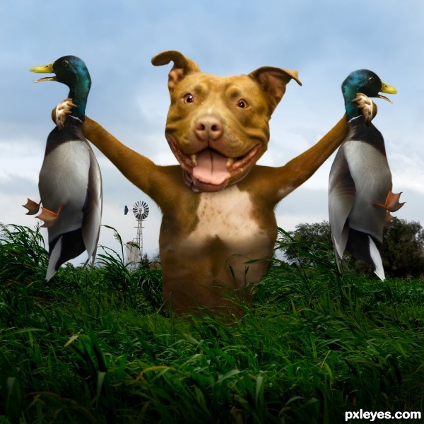
(5 years and 3429 days ago)
Great job & inspiration 
AWESOME!!!!!!!!!!!! and RIGHT ON TARGET!!!!!!!!!!!! WOOOO HOOOOOO!!
i think you were going for Duck Hunt
LOL!! Thanks RickLaMesa, I didn't notice that!
nice composition gl
Fantastic idea and great execution...gl author
A beaut!!! This works even outside of this contest!
For me as a dog lover this looks amazing !!!!!!! Beside that , still looks perfect 
A classic! GL! 
Congrats for your second place, Chalty!
congratulations...
Congrats!!
congratulations...
Howdie stranger!
If you want to rate this picture or participate in this contest, just:
LOGIN HERE or REGISTER FOR FREE
LOL...good grins!
LOL funny!

One tiny peice of construtice critisim (the best kind, yay! :P) is that perhaps a light shadow casting upwards slighty to the left might make the mantle stick out less in a bad way and more so in a good way
I was thinking of that my self, I added a little light shadow to the left top. Barely noticeable, but looks good, thanks
Howdie stranger!
If you want to rate this picture or participate in this contest, just:
LOGIN HERE or REGISTER FOR FREE