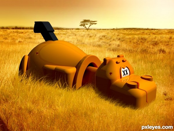
Honestly, never thought I would be imagining a shot dead Hungry Hungry Hippo!
Grass source image sourced using creative commons filter and credited in sbs.
(5 years and 2985 days ago)
- 1: Grass

(5 years and 3600 days ago)
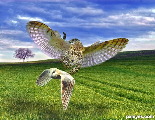
Good sense of drama in your image.  You need a source link for the leopard.
source link posted
Now that I've seen the leopard source, kudos for removing all that grass from the figure. Higher vote from me now. My only nitpick is about the composition: if they could be moved to the right a bit it would work better IMHO. Good luck! 
LEAVE THAT OWL ALONE!!! (excellent work)

Very beautiful entry
hoot!! nice chop Author
Kind of agrees about moving to the right but that's just IMO. This is cool too. Well blended. GL!
I appreciate it jaws but It's as far right as I want it.
Very nice blending and the work on the leopard source is well done
I think the composition is fine the way it is, good luck! 
Howdie stranger!
If you want to rate this picture or participate in this contest, just:
LOGIN HERE or REGISTER FOR FREE
Beautiful work author...nice mix of 2d and 3d...well done
Nice 3D work in this photoshop contest, author. Several of your sbs steps are impossible to read, tho. Try using a color with more contrast to the background, and larger type.
really fun... except hippos live in rivers, not on the savannah
this is freaking great. i really cannot find a thing wrong with it.
Kyricom, that's why he's hungry, hungry,
and dead.
I know it's hard to find any suitable Hungry Hippo photographs. Excellent creative use of resources at your hand. Overall a nice looking piece of work. I used to like playing this game with my children, many moons ago.
I really like your idea and the image itself is really well done. Just a few suggestions for you...perhaps if you could dodge some of the newly added blades of foliage in front of the hippo to vary the luminosity...giving some highlights etc. This would help keep them looking the same and sorta flat. Also...there's a visible hard line edge of the hippo's neck that can be seen...maybe cover that up or brush it out. If you could also possibly remove the real soft fringe around the front of hippo...it's a bit distracting and doesn't really need to be there. Sorry to nitpick...trying to help.
Thank's all for the comments, I had a lot of fun making this entry! pixelkid regrettably I missed the opportunity to re-submit with some of your suggested changes before competition close, I agree especially that some finer attention to detail on the grass, matching the 3d presence of the rendered figure would have drastically improved the image, a suggestion I will certainly keep in mind for next time. Thanks guys, p.s ichappell hopefully no one shows this hungry hippo to their kids!!
Howdie stranger!
If you want to rate this picture or participate in this contest, just:
LOGIN HERE or REGISTER FOR FREE