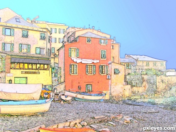
final result (5 years and 2857 days ago)
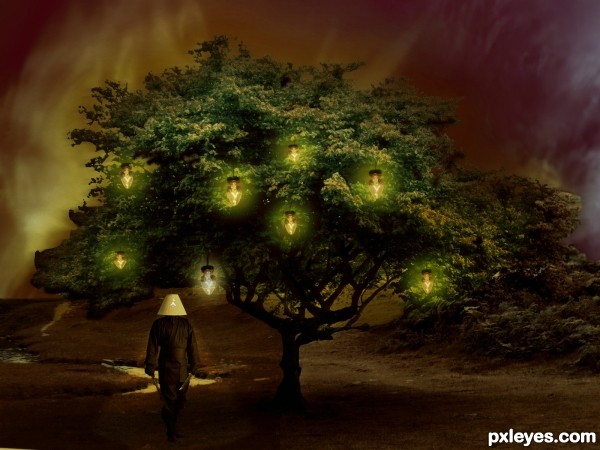
(5 years and 2946 days ago)
Howdie stranger!
If you want to rate this picture or participate in this contest, just:
LOGIN HERE or REGISTER FOR FREE
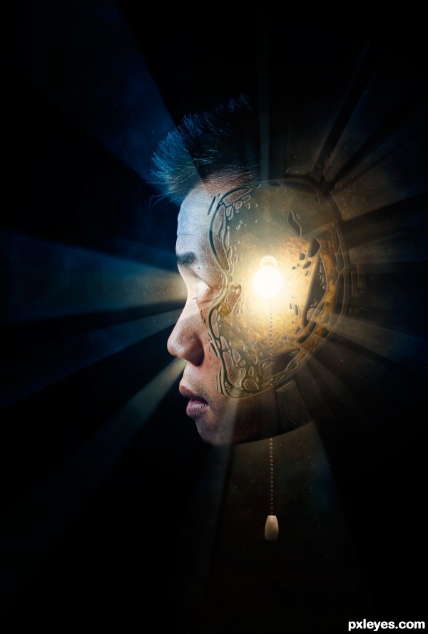
All I new when I started was that I wanted to do a profile of someone's head with a light bulb in it. This is where I ended up :) (5 years and 3111 days ago)
I think it would have looked better if the lamp would have been straight down from the "ceiling"
Nice work with the lighting effects.
Yeah I agree Eladine, I was actually trying to find a light that was hanging straight down, but then came across this source and really liked the texture and everything so I decided to go with it 
Fine art work.. luv it.. 
Thanks I certainly appreciate hearing that! 
Congrats 
Howdie stranger!
If you want to rate this picture or participate in this contest, just:
LOGIN HERE or REGISTER FOR FREE
(5 years and 3251 days ago)
very bad idea lol
gl author
great!
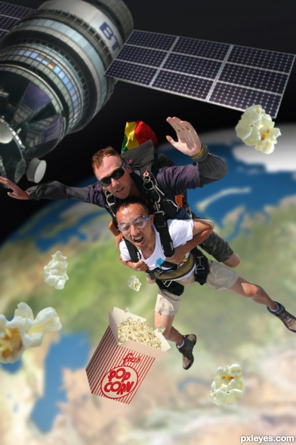
Those guys are very bright for being in space. Also the satelight is smaller than them so it looks as if they are jumping upwards. On top of that the popcorn is bigger than their heads.
I want to know why respect the proportion if the hole composition is not real? My opinion ofcourse.
Thanks everyone for the comments. First off sunlight still travels through space, it just doesn't reflect off anything. Thats why space is black, but also why the guys would be bright. A quick search for astronaut will prove this. As for the proportions, this isn't real. Space has no gravity and without a space suit these guys would die instantly from the pressure. My thought anyways is that when they jumped from the satellite they didn't fall, they just floated away.
I LIKE IT.. silly.. But I still LIKE IT!! hehehe.. good luck author
gl author great concept.!!
gl author great concept.!!
Great idea of precticing new extreme sport LOL 
Congrats !!! 
congrats..
Congrats!!
congrats!
Nice Congrats
Howdie stranger!
If you want to rate this picture or participate in this contest, just:
LOGIN HERE or REGISTER FOR FREE
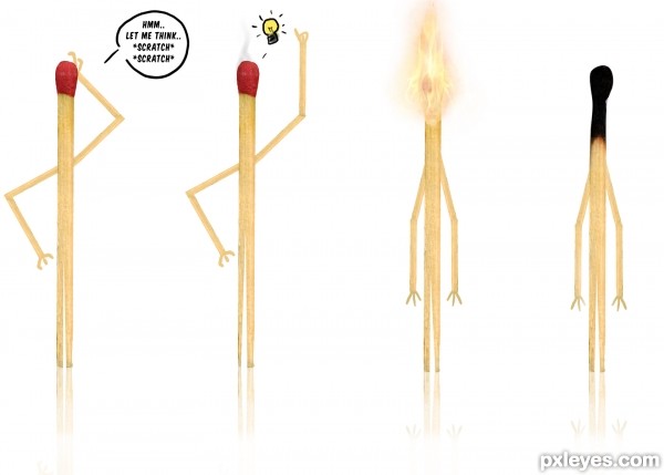
(5 years and 3496 days ago)
Amusing. If all four are supposed to be the same 'guy,' then they should all have the same legs. Also, the reflections are inconsistent as well.
hehehe,.....simple but meaningful,.....nice entry,......Just IMO : why didnt you make the burnt match is touching its burnt head to show that it got disappointed for being too much thinking.........
haha..............great idea
Hahahaa...soo fun!
LOL...very nice work author...extra points for humor
Thanks guys!
About the legs...
I wanted to give it a certain feel of movement xD
guess that didn't really came through thou.
ps; since I couldn't edit the entry anymore I'd like to mention this here, thank you
raventhird-stock (raventhird-stock.deviantart.com) and
taking-st0ck (taking-st0ck.deviantart.com) for the great stock they have provided
I really appreciate. 
Funny image but imo could be funnier if ie in image 3 you'd see the match being all surprised (arms up, legs jumping) or if dekwid's suggestion was used. Good luck!
This one really sparks the imagination ... sorry could not resist ... great concept.
Howdie stranger!
If you want to rate this picture or participate in this contest, just:
LOGIN HERE or REGISTER FOR FREE
I LOVE FILTER WORK!!! fun result!
i used only filter "other", translate
May use the brush history for more colour. thank for the comment !
Lovely.
thank
bravo..
Thank
Stunning result. Very professional looking. I would expect to see something like this in a travel magazine.
I have prepared so many tutorials on a site of Italian graphic: unfortunately my English is too bad! Why, even so there are Interest variations.
thanks for your comments, much appreciated
Nicely done, pretty and soothing colors.
Howdie stranger!
If you want to rate this picture or participate in this contest, just:
LOGIN HERE or REGISTER FOR FREE