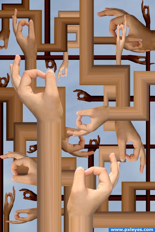
inspired by Salvador Dalis "persistence of time"
thanks to
Mihraystock at deviant art
and zbyszek80 at sxc.hu (5 years and 3052 days ago)

Only the source image was used. (5 years and 3818 days ago)
thats pretty trippy author ;p
Agree with Keiley22...Nice change though...unexpected. Picking a light source and putting some incidental shadows between arms would really accent this! 
looking gud
Fabulous idea....
very creative. i like the depth.nice job author
Very nice usage of the source image and adding the wood grain to creat arms was a wonderful addition. Great imagination. GL
very nice job 
Howdie stranger!
If you want to rate this picture or participate in this contest, just:
LOGIN HERE or REGISTER FOR FREE

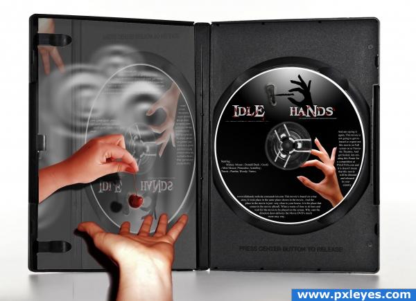
juST maDe a CoVEr for idle hands Movie., The movie is Like a Cherry that every hand is eager to get it :)
(5 years and 3911 days ago)
cool entry
Good idea indeed...but not very careful with the selections and edges....! Too bad! Best of luck!
Howdie stranger!
If you want to rate this picture or participate in this contest, just:
LOGIN HERE or REGISTER FOR FREE
Not bad. Might have more depth if the background values differed from the foreground.
nice idea and well done -- the edge of the watch could use a touch up -- maybe a bit of burr to remove the pixelation
ok, those are good suggestions i will probably edit this entry soon,
what i was most concerned about was context for the branch, any ideas on how to make it seem more natural?
Nice job, author. Notice how bright the wood branch is to the right of the 'clock'...maybe try and brighten the clock right next to that bright spot with a soft edge and follow through that highlight area.
UPDATE: i took most of the suggestions, changed the background color for some depth and added more lighting effects and edge blurs for added realism and consistency,

thanks for the help
Much better image now, IMO...good luck!
Nice work on the clock. It would be nice if the little pointer was not cut off, but extended a little above the rest.
Howdie stranger!
If you want to rate this picture or participate in this contest, just:
LOGIN HERE or REGISTER FOR FREE