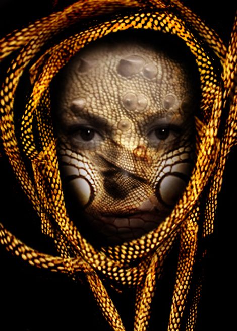
(5 years and 3777 days ago)
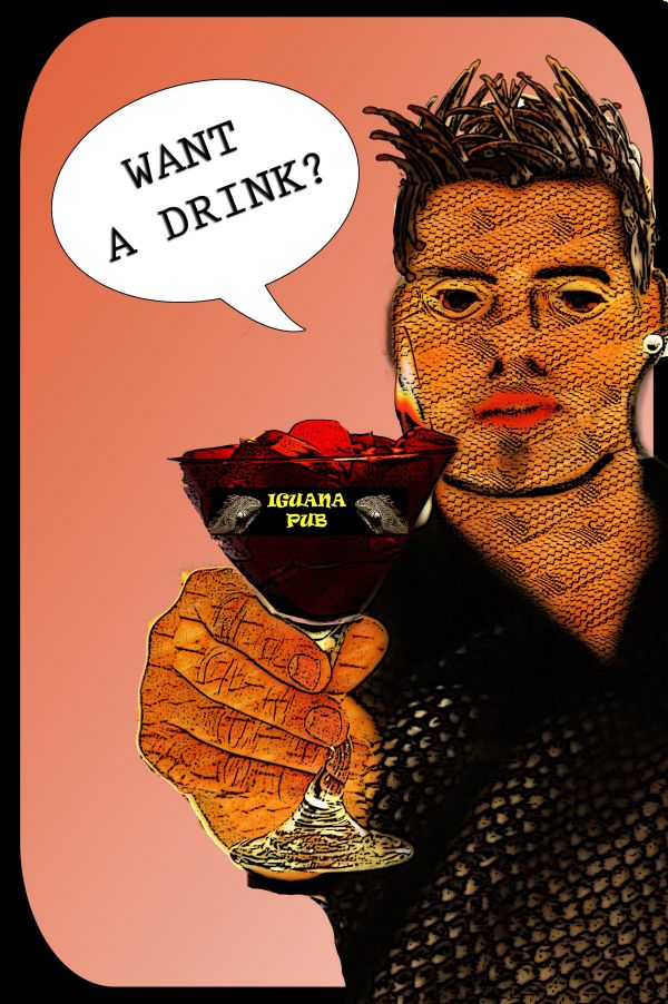
I used masks, blending options, many parts of iguana's body. (5 years and 3780 days ago)
Howdie stranger!
If you want to rate this picture or participate in this contest, just:
LOGIN HERE or REGISTER FOR FREE
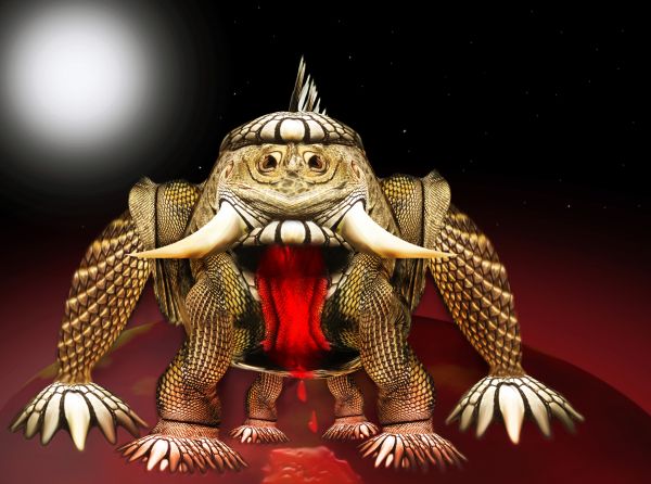
only source image and PS.
Edit: add planet and shadow and
white background changed to full black (5 years and 3780 days ago)
Good imagination, I like the head. The paws however look a bit flat and could do with some more masking. If you have time left, you can play a bit further with the liquify or warp tool to make the skin look more around the arms. If you make the claws a bit different from each other, they look less mirrored. Think if the monster needs a shadow (or another background) and also if the blood fits in the image. Good luck!
haha... how do you guys come up with this stuff.... love it 
Imagination... imagination... 
Thanks for your comments and I did some modification
wow...great creature...good luck
Howdie stranger!
If you want to rate this picture or participate in this contest, just:
LOGIN HERE or REGISTER FOR FREE
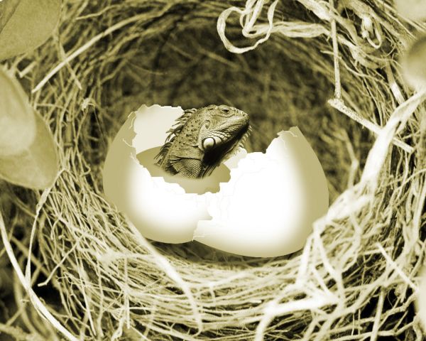
(5 years and 3781 days ago)
Great idea...very nice work and colors...but u dont need yolk...
good idea, with a few tweaks this has potential.
If you went in and added some spots or imperfections to the egg (like a spotted bird egg or something) which you could do with a speckle or spatter type brush I think your egg would blend better in the image. I might dark up the shadow under the iguana too. It's very cute though, I like it!
Howdie stranger!
If you want to rate this picture or participate in this contest, just:
LOGIN HERE or REGISTER FOR FREE
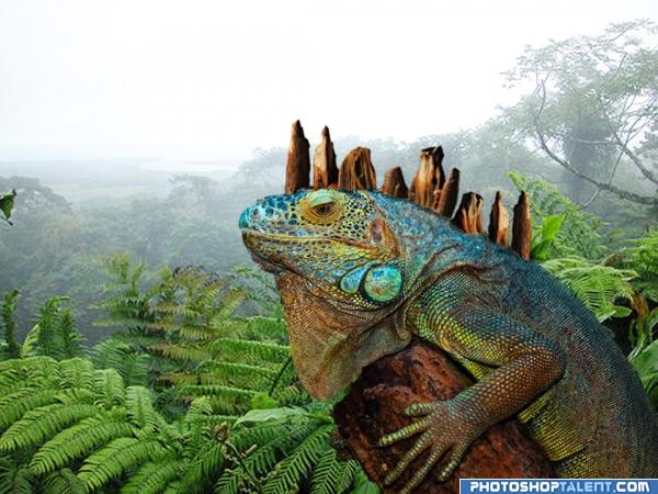
He was mutated from a lab test gone wrong.
(5 years and 4030 days ago)
hahaha.. you hid the source so well I couldn't find it and it was right in front of my face.. GREAT JOB.. (I looked in his body for about 5 minutes.. super duper job... it's so obvious.. that's why I couldn't find it LOL.. (Carpet cleaners coming tomorrow and the house is in chaos LOL.. gotta blame someoone) great job author
nice idea and good work but maybe if u change color of main source u couldn´t even see that don´t belong to iguana and the source was still there,u only show where was the source on step by step, and probaly this wood is also too mutch blur, it was what i felt. good luck
Love the colors! 
lol....
nice
Angles of the back thingies don't look right to me, and they're flipped so they have different light sources...
nice idea. 
Hahaha, good idea, the blending could be a bit more gradual but very clever!
CONGRAAATS!!!!!
Howdie stranger!
If you want to rate this picture or participate in this contest, just:
LOGIN HERE or REGISTER FOR FREE
cool, I particularly like the bit 'stretched over the nose
this is great! thanks!
Howdie stranger!
If you want to rate this picture or participate in this contest, just:
LOGIN HERE or REGISTER FOR FREE