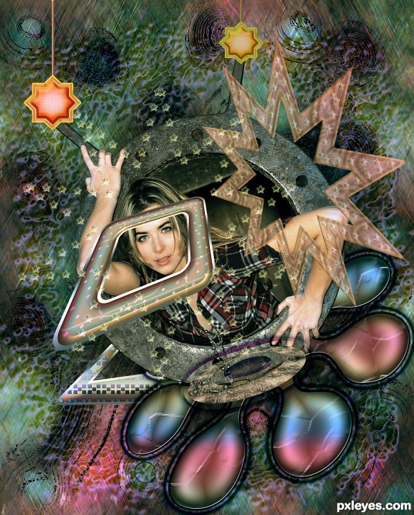
Used only the source given + Adobe Photoshop (5 years and 2613 days ago)
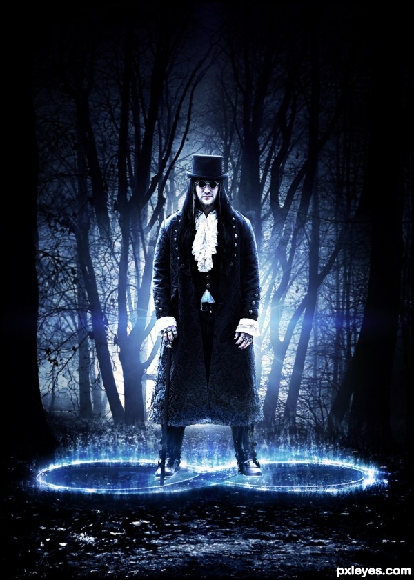
Special thanks to:http://tudorxrose.deviantart.com/
Well, I know that this round will be very difficult, I can see the 1st entry published, will not be easy! But we are here to participate! Good luck to all.
I made the number 8 as type, rasterize type and worked with lighting and Fibers filter (5 years and 2937 days ago)
SBS would help.
I'll make today CMYK, yesterday I was tired!
nice one i hop u well give as SBS!
I did a quick SBS, just to give you an idea of ​​how it was done.
But I think the lack of SBS should not interfere much in the concept of you, guys, sometimes it seems that the most important is the SBS than the final result (when the work have external souces) ... imo.
Thank you for your comments.
Thank you, Nator.
Just want to make clear that I am not complaining about having to make SBS, but sometimes the excess value that is given to it, above the result of an image.
I agree that when the case is works without external stocks, it is needed.
He looks mighty powerful =)
Kind of misterious and challenging. Good work author.
Howdie stranger!
If you want to rate this picture or participate in this contest, just:
LOGIN HERE or REGISTER FOR FREE
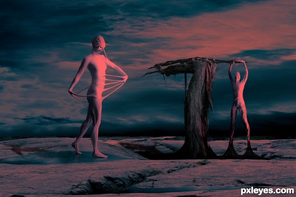
Figures by Marcus Ranum
(www.ranum.com)
Rest of the images are my own. See SBS. SBS is not as complete as I wanted, ran out of time. (5 years and 3439 days ago)
Really scaring  Nice color. Good job, autor!
Good creepiness, good color! 
That is so weird! (in a good way  ) How did you come up with the idea for your step 4? Pretty cool concept and interesting colors for this, author, nice surrealism!
Really good work! I especially love the contrast of textures. The smoothness of the creatures against the coarse tree and terrain...just great! 
good colors, good luck!
Thanks everyone.
Pearlie, step 4 just sort of happened. I had an idea of what I wanted for the finished piece but not that part. When I found the stock image it sort of lead me to that. More inspiration than idea  .
.
thye say all the true about your work ,it is very good work and good luck ,you take it
Great work, colours bring a softness to quite a creepy image, well done 
Great.
wonderful entry... Love the lighting effects.... 
Fantastic concept author....best of luck
Congrats on first place 
Congrats for your second place, Arca!
Thanks digital  ... but I am more than happy with 2nd (giggle) ...
congrats!
Congrats!!
Congrats for the second place.. 
Howdie stranger!
If you want to rate this picture or participate in this contest, just:
LOGIN HERE or REGISTER FOR FREE
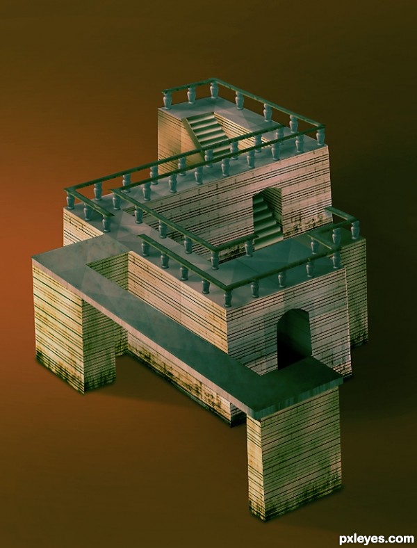
It is hard to see at first, but the top floor is also the bottom floors. I don't know if this description was clear enough. :|
Take a look at it yourself. You will notice it. (5 years and 3614 days ago)
out standing skill in constructing the house..... good luck
EDIT: It works.... great job....
Thank you 
Nice one! Good luck
Nice entry. . . . Beautiful building . . . . All the best to u . . . . 
Very good work!
WOW! very very nicely done... holding thumbs for you!
Yep, your mind gets crazy, because it's all on the same floor, but there are upstairs and downstairs... Very neat work, author! 
woo hoo.. chooga chooga
Amazing construction! 
brilliant... Construction & illusion both works well.. thanks to erikuri's comment or else i wud still wonder what about the illusion part... Great Job.. Gud luck.. 
nice job
Good.
very nice
Fantastic work author...good luck
Congratulations! 
Thank you 
Congratulations for 2nd
Congratulations! Very nice work...
congrats 
Congrats!, great construction 
Congrats for the 2nd place!
Congratz to 2nd!
Congratulations for 2nd place !!!!
congrats for the second place....
congrats... nice construction...
Congratulations!!!!! 
Howdie stranger!
If you want to rate this picture or participate in this contest, just:
LOGIN HERE or REGISTER FOR FREE
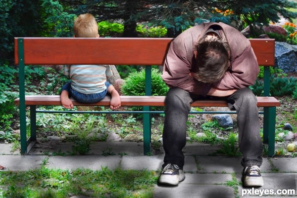
(5 years and 3615 days ago)

Hmmm, I don't think there is so much here... :O
took me a second.. but I got it.. EXCELLENT!!! (maybe darken under his feet just a bit to ground him but that really isn't necessary since you achieved the optical allusion.. sitting on the back of the bench.. LOLOLOL
GUYS GUYS!!!! the man is sitting on the front of the bench .. but the bench facing the other way.. perspective of the seat is doubled.. hehehe.. it was hard for me to see at first.. but it is quite clever... bravo author
The idea is certainly good, but I think it would even better if you could get one source for the man sitting on the bench (unfortunately the man source only contains a part of the bench), so the viewer will be less distracted about the fact that you pasted the man in the other bench image (for some reason it looks too pasted imo, maybe it's the way you added shadows). Good luck!
get it now  , gl
, gl 
Very creative! Maybe if the title referenced the bench instead of the man, initial confusion would be reduced. BTW I would expect his feet to touch the ground closer to the bench.
nice attempt ............. all the best to u ............... 
It took me a second to figure it out too. Nice 1! GL!
Lol, I got it at the first 2 seconds...
i like it but ,i didn't understand it
this is actually quite cool! although the shadows are way too strong
thanks for correction
I'll try to fix it ..
Very very nice work!
nice idea
Very good concept.
Howdie stranger!
If you want to rate this picture or participate in this contest, just:
LOGIN HERE or REGISTER FOR FREE
funky cool
Thank you very much
nice! psychedelia
Many thanks for the support
Howdie stranger!
If you want to rate this picture or participate in this contest, just:
LOGIN HERE or REGISTER FOR FREE