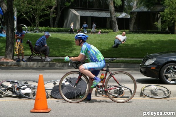
transform, flip, brigntness & contrast, hue & saturation (5 years and 3132 days ago)
- 1: source1
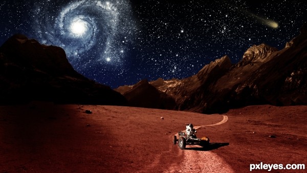
The planet Mars, crimson and bright, filling our telescopes with vague intimations of almost-familiar landforms.
Using NASA Imagery
http://www.nasa.gov/audience/formedia/features/MP_Photo_Guidelines.html
(5 years and 3282 days ago)
Link 1 doesn't work.
Thank you! It should work now.
Fixed now.
would be nice to see a SBS or hi-res
Author this is cool work with a lots of potential and just few tweaks are needed to become awesome...First thing, Nebula is closer to the left side of the mountains but they are in the dark, light them just and u gonna get more realistic and effective image...also u have to blur just a bit edges of the mountain between them and the sky because now is to sharp and look a bit copy/paste...U could tone down a bit brightness of the stars because now IMHO they are to bright and they create small distraction from the main part...Sorry for the nit picks and best of luck...
I love criticism of my work. It's the only way i can improve my work. 
Thank you. I'll let you know when I have made some changes.
I think your lighting is just fine the way it is. 
I think it looked better before you darkened the sky. The thin atmosphere of Mars would offer spectacular night skies.
i agree it looked much better before
Version 1 back!

Thank you! 
Howdie stranger!
If you want to rate this picture or participate in this contest, just:
LOGIN HERE or REGISTER FOR FREE
(5 years and 3302 days ago)
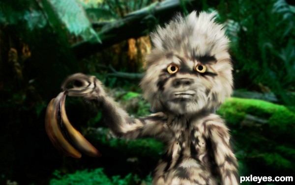
hahaha good one ....it's a bit over smudged but i still like it .. good luck 
very floofy and fuzzy  very good job
a tad smudgy but a nice image, best of luck 
Thanks for the comments everyone. Hi-res looks better. 
this is fun!!!
A screen overlay for more brightness would improve this nice & funny chop. Good thinking.
Thank you for the suggestion and the comments.
Different and cool...GL!

well, this made me laugh ..  very good author
Howdie stranger!
If you want to rate this picture or participate in this contest, just:
LOGIN HERE or REGISTER FOR FREE
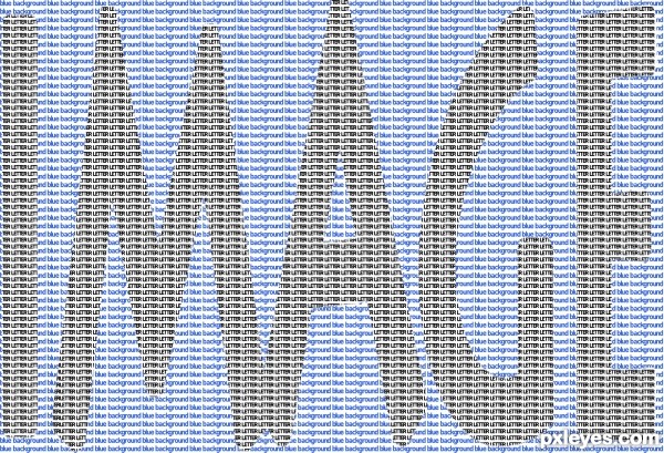
Just letters (5 years and 3341 days ago)
Nice and creative =)
simple,effective,intelligent....best of luck author
Thank you very much!
Howdie stranger!
If you want to rate this picture or participate in this contest, just:
LOGIN HERE or REGISTER FOR FREE
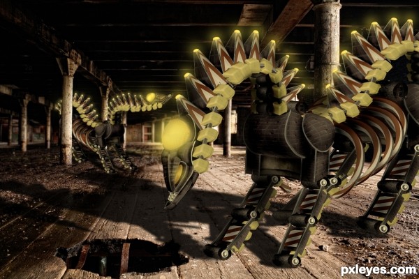
with the exception or the background image (thanks to light_arted on flicker) was constructed from elements and textures in the contest source image (5 years and 3368 days ago)
Good work here! I'd like to see brighter lights on the heads, but that's just me...GL author. 
I agree with CMYK on this one, I would like to see brighter lights (make a new layer fill it with black, set the blend mode to color dodge, use soft 5% opacity brush set to white or yellow to paint the lights). Also its rights legs perspective is a bit off. Overall nice entry, good luck!
Wow  Looks great!
Fantastic piece author...really really fantastic...well done
great work 
great work!
fantastic construction ...... 
Great construction! I often wonder what goes trough your mind (and others) when you see a red and white sign and say.. " Yes I see it, I am gonna make dragon like creatures"  I think it's so creative, well done author.. I hope one day I can think outside the box as well..
Hey...I thought you will be the winner of this week's contest! Your work is outstanding, it shows you put yourself into it. But still a third place is not bad. Being among the three best entries is an honor...guess what...you have to your side two of the most talented Photoshopers in Pxleyes. Cornelia and Anoop....Be PROUD! Congratulations!
Congrats for 3rd
Congratulatons 
Congrats!!
congratulations...
congrats..!
 this is awesome.
  congrats on your high marks and scoring third! will be great to see more entries from you
Congrats!!
Congrats, luv the composition here...
Howdie stranger!
If you want to rate this picture or participate in this contest, just:
LOGIN HERE or REGISTER FOR FREE
source is copyright author
Edit: sorry author my mistake, I was looking at the company copyright under the photo.
Nice Image but you may want to crop it to leave out the black faces on the left, best of luck
Thks for the comments Geex...i will take care of it in my future wrks..
But Geexman, this site is given in the Resource Photo stock..and no copyright is written there..
Thks for your comments Geexman...
Howdie stranger!
If you want to rate this picture or participate in this contest, just:
LOGIN HERE or REGISTER FOR FREE