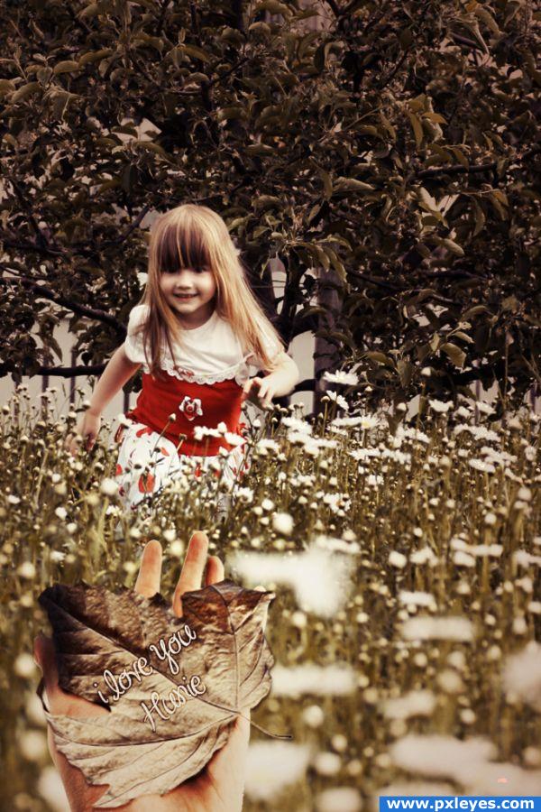
=hey guys...
m really disappoint tht no one is commenting or liking my work :(
even site owner Removed my entry where i showed all the sources...
nyways... (5 years and 3867 days ago)
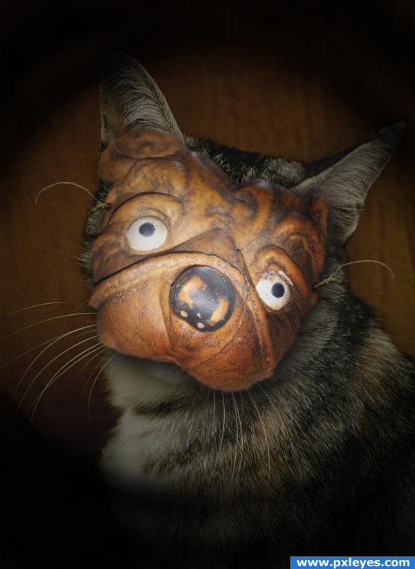
"Someone call Tyra Banks and tell her this is NOT what I signed up for!!!"
Thanks to criscris1 and ba1969 for the great images!! (5 years and 3878 days ago)
Nice image, maybe tone down your vignette a bit?
Really love this idea! Nice job with shadows too.
Howdie stranger!
If you want to rate this picture or participate in this contest, just:
LOGIN HERE or REGISTER FOR FREE
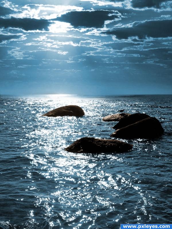
take a b&w image and turn in to colored picture. (5 years and 3890 days ago)
It looks a bit simple, try adding a blue tint to the rocks as well, to match the lighting.
the rocks are brown!!! dont blue!!
I love idea author, its simple and well gone.
good job looks authentic
I know the rocks are brown, but to fit in with the ambient light you should just give them a hint of blue, not fill them with one colour.
I like this because this is exactly how I was going to do it -didn't have time due to working.
Nice job and selection of color.
Howdie stranger!
If you want to rate this picture or participate in this contest, just:
LOGIN HERE or REGISTER FOR FREE
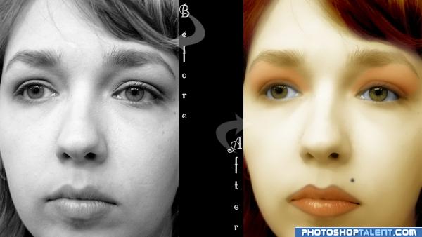
I want to start off by saying i don't know how to do make-up not one bit and this is my first time doing a serious color add to a black and white image. Please COMMENT AND RATE. details EXPLAINED in step by step. THANK YOU FROM S.G.D. (5 years and 3953 days ago)
very sweet.. I love the addition of the beauty mark.. good luck on this author.. 
Ok is a very interesting chop and idea i think that the after photo is a little bit too good like no skin texture at all anyway good luck!
I totally like the way you colored it,high rate for me
Yep this is good
gr8 work author.......
good, becoming a Thailand girl
good
very nice
nice 
nice look, the colors look a bit weird though, but good job for adding colors to a black-white picture
Howdie stranger!
If you want to rate this picture or participate in this contest, just:
LOGIN HERE or REGISTER FOR FREE
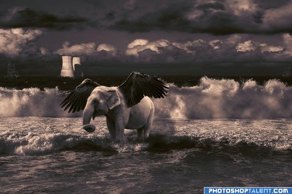
All sources are from a tutorial from Photoshop Top Secret. They do not have any URLs.
The sources are:
-elephant
-wings
-oil towers
-the other towers
Again, they do not have URLs. (5 years and 3967 days ago)
Sorry for the double entry.
even though this is a fantasy image, it looks weird to have power cables, chimneys, trees in the middle of the ocean. i think u could remove these and insert some other feature that could be seen on ocean, maybe a pirate ship or something like that.. gl 
Yes, nice idea! I'll try! 
a very high level of pollution 

 cool! good luck!
Nice idea good luck!
Im pretty sure you can't use the images from photoshop top secret dvds. They are only there for us to learn personally, not to actually show. I would go and check it out though otherwise your entry might get removed 
I see that you were never made to show the uncut versions of the images you used from the photoshop top secret disk.. hmmm one has to wonder.
Nice work, good luck 
some people they just copy and paste
What do you mean "pixel"? I made this on my own. It is true that I created it after a tutorial, but I did not copy and paste anything.
i learnt a lot from monciardini's photoshop top secret DVD. It teaches us, photoshop amateur, a lot. And I believe you also have right to show what you have learnt from there. Your entry may look similar to the lesson, it's okay, it doesn't matter. Everything has process, next you'll find your own style.
great management of fantasy...........awesome work......
very different
Even if the images do not have URLs, rules say you have to show the uncut images (by screen capture) from the DVD or source. Any proof you can find that you are authorized to use the images is good. My question is why you changed the waves and shading (between steps 6 & 7) - original (step 6 and earlier) gave nice texture and contrast that's lost in final. There's also something about the light on the wings. Not as noticable in color, but the dark version looks like light is behind wings, when true source is upper left.
I'm a big fan of tutorials myself but no offense...you couldn't have found your own images to create this? Just my opinion...Good Luck
good. the wings are too dark, and use light & shade for wings also.
Howdie stranger!
If you want to rate this picture or participate in this contest, just:
LOGIN HERE or REGISTER FOR FREE
Which would you prefer, a negative comment, or no comment?
probably no comments as it seems minimal use of source. I would suggest using the source, duplicating and manipulating to make the tree in the background..goodluck anyways, and don't be upset about the no comments, some people don't get any at all.
"Hunie" ? Is that the name of the girl, or do you mean Honey/Hunnie ? And try to make the hand larger. GL
I really like the colors in this.To be frank I like when the source is clearly visible than to look the sbs where the source is used.
Howdie stranger!
If you want to rate this picture or participate in this contest, just:
LOGIN HERE or REGISTER FOR FREE