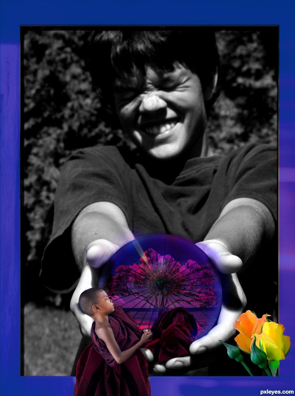
This is my "I am back!" -entry for the PXLeyes. I was away for a LONG time, and now I felt like refreshing my "art"-hobby.
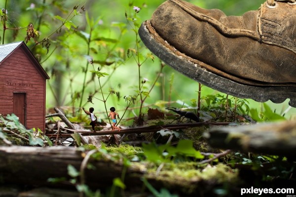
This one took mostly a lot of work by hand and standard brushes, to add texture for the "ball" made from the sunshade, and blending in the extra garment for the monk boy's cloth. Also hours of work with the shadows, as most had to be add by hand, trying to walk the thin line between realistic and "looks better this way!" I tried to blend the invisible barrier of depth with imaginary design.
It's good to be back, warmest greetings to everyone who still remembers me (after voting, that is :s ) (5 years and 1268 days ago)


 , oh shoot man I'm gonna cry...



Howdie stranger!
If you want to rate this picture or participate in this contest, just:
LOGIN HERE or REGISTER FOR FREE