Please see hi-res image and SBS. Even if you're a brain-numb knucklehead who usually doesn't take these things into consideration, I encourage you to engage the thought process for a change and actually consider the work that goes into the image you vote for. And if you've actually gone to the trouble to read this, IT'S NOT JUST ABOUT THIS IMAGE, it's about thinking before you vote on any image. Like for instance: composition, lighting, rendering skill, technical skill, color, originality of concept, etc. I could go on, but these are the basics that go into a good image. So...please engage the thought process before you vote on any image in any contest. It might even be good to start a forum thread about what you look for in an entry, and how it effects your vote. Thanks for listening, and please don't vote for this entry if you have no clue what you're voting for. :) (5 years and 2782 days ago)


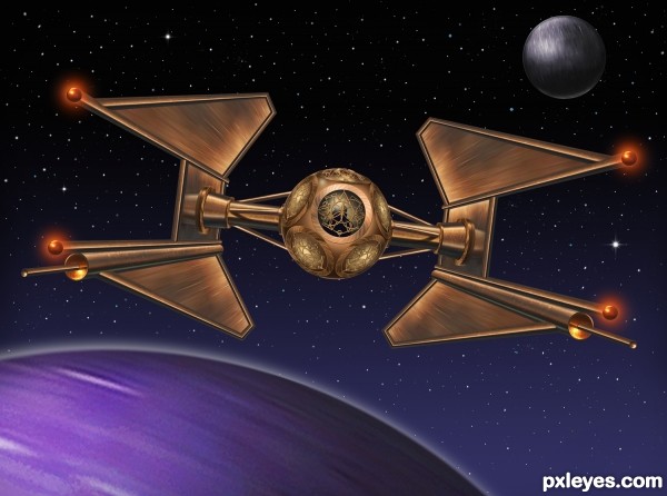
 . I think the small planet on the right can be blurred a bit (if it's a planet, but if it's just a small orbit near the ship, it's okie) and if I can see the reflection of the globe on the wings, that will be even more fantastic. Wish you the best luck


tried to figure out where/how the lens iris source was used. stumped! nice submission!
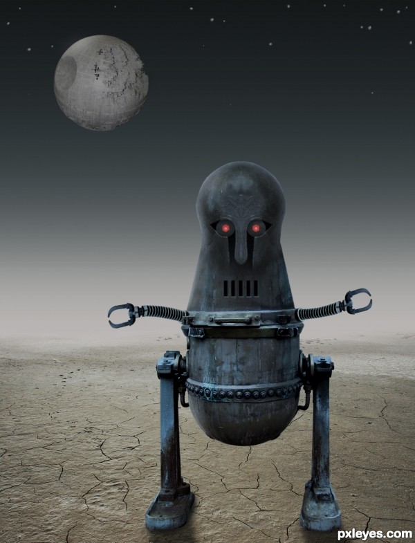
Thanks! Look at the eyes in hi-res!
got it - should have seen step 7. THANKS!
nice
nice, but feels like the legs are not on the ground, make shadow little dark
Thank you for your excellent instruction on shadows. I think I will leave them as they are. They seem just fine to me.
This robot seems so abandoned in that desert... Makes me think why did they drop it there. It was because he's old and rusty and serves no one? (IMHO I would have left the original color of the rusted brass).
Maybe you're thinking "Oh! Come on...!!" But I do like images that tell a story.
Good work author!!
Cool, I especially like what you did with the top to make the head.
Very well crafted work! You make good points in your description, it's only right to evaluate each entry just as you would want your's to be. That may seem like the cliche golden rule thing but it's true none the less.
I like your entries.... You put some work on them, using all the necessary elements to make your images look nice.... as for people looking into the artistic elements of an entry....I do not think, many of them do it...but it is good to remind them to pay attention to details before voting. I have seen entries with better quality and with lot of details, going down to the last places, while one with some filter adjustments or coloring, go to the first 7...which is not right....but...it is just preferences. Good luck in this particular one..... look at some entries this week....yours have quality.
Congrats for your third place, Bob!
Congrats, Bob!
Congrats Bob!!
Howdie stranger!
If you want to rate this picture or participate in this contest, just:
LOGIN HERE or REGISTER FOR FREE