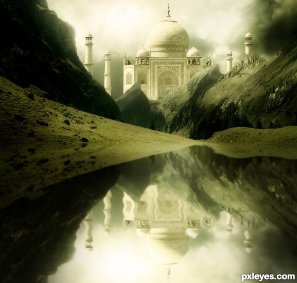
Thanks to this tutorial @ http://www.phototutorial.info/?p=33 for helping me to made water reflection. (5 years and 3358 days ago)

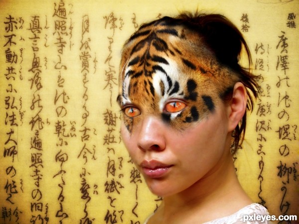
The results of when one species meets another. Sure a better title and discription is out there was just having a mind blank. (5 years and 3513 days ago)
Great idea, but the blending needs to be more subtle! 
Edit: On second look (And author, good entries always merit a second look) maybe the eyes could be a touch more red or green to separate them from the background. GL>
CMYK46 thanks for the comment this was my first attempt at a blending like this. I will play with it and see if i am able to improve on the blend.
PS: The title alone is a definite plus...good luck, author...waiting to see the revision. 
Haha I tryed to do something like this and failed miserably >.< So congrats! xD
Thanks Becca i tried and failed at first too was actually trying to create a similar effect for one of the other competitions got so frustated with it i gave up. Keep plugging away i guess the motto is.
good job im liking her eyes. i dont get the title india is in asia right
Bompy i believe ur right it is but as i said was drawing a blank on the title thats the best i could think of. If i have any enlightening moments i will update it.
the writing in the background makes me think of an old spell wrote down like some kind of ancient magic is happening
Good blend !
India it's already in Asia, but i guess you meant like India meets Japan or "my mom & the tiger" (lol).
To put more of India in this picture you could make the Kanji's fade into Hindi writing.
here's a source, if you care:
http://www.sxc.hu/photo/413003
Good luck!
Howdie stranger!
If you want to rate this picture or participate in this contest, just:
LOGIN HERE or REGISTER FOR FREE

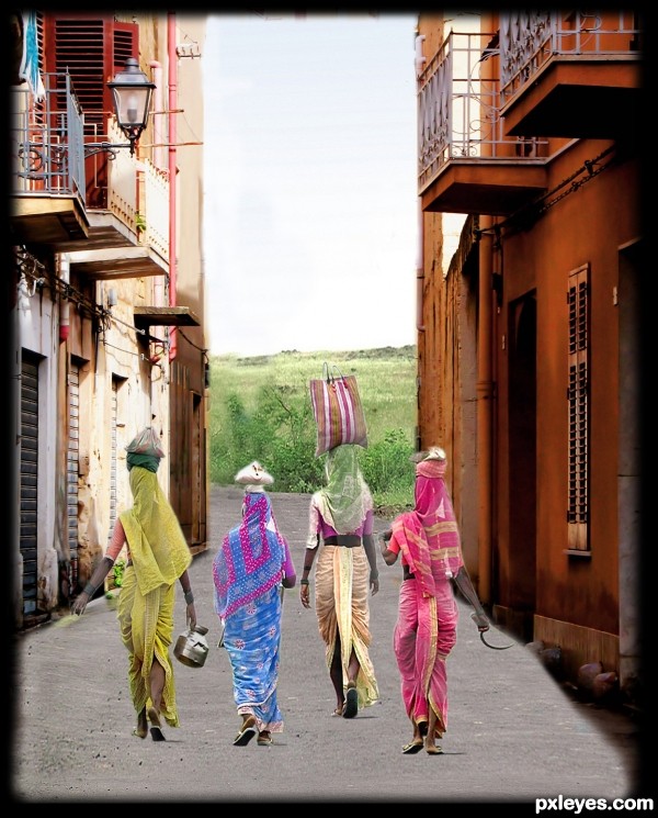
Layer mask, selection tools, clone stamp tool.I mage adjustment with hue, saturation. (5 years and 3743 days ago)
It seems like you a litte to much fade when cropping.For some reason the women seems to small comparing to the background. I would also move the woman with green scarf so she has houses as background, cause the scarf are confusing to the bushes.
Otherwise - nice idea
From a distance this looks like a good overall feel. When in full view you can tell more focus needs to be put on masking.
thanks all...will keep in mind for next.....
Hmm... there's a lot of road in front of them 'til India... from Sicily, there's a sea to swim first! 
You had to mask better the right side of the road, specially beside the orange house base. Don't forget it next time! 
Howdie stranger!
If you want to rate this picture or participate in this contest, just:
LOGIN HERE or REGISTER FOR FREE
I love the Taj Mahal it's one of the most beautiful structures ever created. I like the color of your image. I do feel the reflection is a bit too uniform and rippled, might look better if it were a little less so since the water itself is so placid IMHO.
This is a beautiful shot. Agree with spaceranger about the reflection. It would also be really effective if you lowered the opacity of the reflection too. It would give this a more subtle, realistic look to the whole image. Nice job!!

EDIT: Looks
edit: Changes has been done. Thanks you spaceranger & pixelkid for your opinions.
I like the changes, much more subtle and has a nice tranquil feeling.
Well done. IMO the reflections of cliffs and Taj should be bumped up towards the waters edge more, as you would not see that much of the reflection. Maybe a tad ripple in water near bends in structure. Love the depth and lighting! GL Author!
beautiful!
Beautiful scene author...Very moody and mystical....best of luck
Thanks sgc, Androla and erathion for your appreciations.
Howdie stranger!
If you want to rate this picture or participate in this contest, just:
LOGIN HERE or REGISTER FOR FREE