Thanks to Riv. (5 years and 3549 days ago)
- 1: Leaf

no out side source used... (5 years and 3797 days ago)
Nice idea! I'm not sure, smoke is in front of the image?
thanks... i tried giving depth using smoke... its put in 2 opacities to create the effct all over...
Way to stretch the imagination. GL author.
Howdie stranger!
If you want to rate this picture or participate in this contest, just:
LOGIN HERE or REGISTER FOR FREE

I would love to hear comments or your advice.
:) (5 years and 3928 days ago)
looking good 
hi res is very nice 
Very nice hollywood film scene look! Great idea and i really like the lighting and reflections. Good luck!
really cool
I think adding some noise or texture to the middle subject would help and possibly soften or blur the back of the insect. Color is great. Great job, otherwise! 
EDIT: looks great!
nice insect........................
nice
Good image.
Spooky... Like an "Aliens" scene... Good work
Congrats!
Congrats! Well Done! Way to go, Nator!!! Beaut!!!!
Congratulations for 3rd
Congrats for your third place, Nator!
congrats
Congrats!
congrats!!
Congraaaats ON 3RD

Congrats!!
Howdie stranger!
If you want to rate this picture or participate in this contest, just:
LOGIN HERE or REGISTER FOR FREE

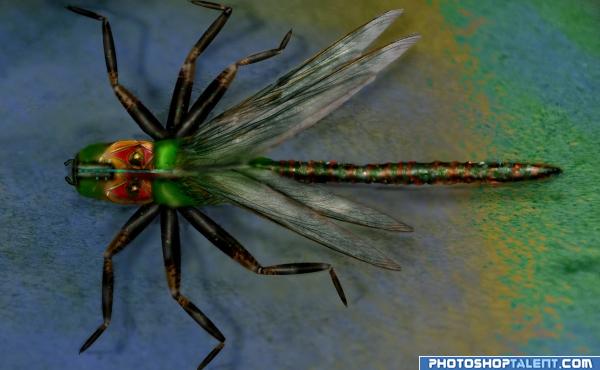
Took a picture of a dragonfly on my front porch the other day, this gave me the idea...
I used the wings and the cement for the background of the picture in the sbs (5 years and 3945 days ago)
High MARKS for using your own image.. that is just AWESOME.. Nicely finished piece.. good luck
neat image!!
good job -- overall look is very nice
good work
very nice
Great piece of manipulation !!
Very nice, good work 
 very nice author good luck
very nice 
This is fantastic! Good luck!
great!! 
Thanks everyone for the great compliments
good
Creative and original work
Very nice! I would like to know what technique you used for taking the legs from 2-D to 3-D because it was very effective & left off the sbs..
pingenvy> to answer your question on the legs, I cut a section of one of the folds at the top of the mask, shaped it and dodged / burn until I got the results.
Howdie stranger!
If you want to rate this picture or participate in this contest, just:
LOGIN HERE or REGISTER FOR FREE
Nice Job !!
Fantastic work ! Waiting for sbs
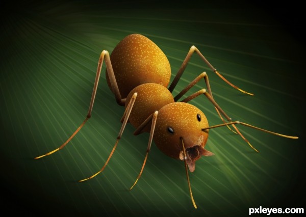
Looks good...maybe add eyes & antennae?
man, really nice work BUT u should have put it on on a leaf or something close to this, instead of a black background.
Thanks for the comments. I've updated the image with eyes and antennae.
Great job author, GL.
shadow needs a little work
For an ant, the antennae are indeed below the eye level, not above. But the shape and length should be changed a bit as well as the direction, so they don't look so weird. But it's very nice work. The eyes too are added with a bit hastily, you could check out some actual photos and try to blend them a bit better.
Good work, author.
Great! I hadn't thought in this possibility...
i salute for your creativity author
it is very nice work ,good luck
very nice idea ill give you 100 votes GL
thanks to all!!
this is fantastic creation of the provided pic,.....this is the demonstration of DO MORE TALK LESS work.....you must be 1 of the great master of PS here...
very very nice ! good luck
creative work..., nice lighting on the ant... My Only suggestion is to place the ant over a leaf or something else...and the shadow of the ant is a looking a little strange now.... That's all .... This is going to be my favorite..., good luck to you...
Very good effort. Well done!
Updated with leaf - Thanks for the suggestions
very very nice idea and great work...best of luck author
Great idea and very well done

leaf really adds an extra quality. Great work!
perfectly done with the leaf......feeling like riding on it ......hehehehahaha
Awesome six legged guy
Congratulations!
Congrats! for 3rd
Congrats
Congratulation...
congrats!
Congrats!!
Howdie stranger!
If you want to rate this picture or participate in this contest, just:
LOGIN HERE or REGISTER FOR FREE