All photos besides the main source are taken by me. (5 years and 3501 days ago)
Photography and photoshop contests
We are a community of people with
a passion for photography, graphics and art in general.
Every day new photoshop
and photography contests are posted to compete in. We also have one weekly drawing contest
and one weekly 3D contest!
Participation is 100% free!
Just
register and get
started!
Good luck!
© 2015 Pxleyes.com. All rights reserved.

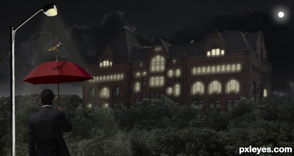
If you want to make it like night time you should select some windows and make it glow like the light is on in that room. There are some tutorials online about night time.
You could also introduce a lighting pole that would bring out the guy with the umbrella, so that we can see him in contrast with the rest of the image. Just have to be carefull where you place it.
Thanks graymval, I gave a shot. Any better?
IMO it's still too dark even in high res...I'm going to wait to vote and check back....Best of Luck
Well you got the idea author, but you could make those lights yellow, and placed randomly, not just on the top windows. Also add a glow to them , double click on layer = layer style, click outer glow, adjust setting in that pannel.
Same thing for the light pole + you might have to make a new layer on top and use a yellow brush to drag light lines from the lamp and then make them transparent, screen or overlay and blur.
I strongly suggest to search some tutorials out there, in case my explanations are not helpfull enough.
Added some more windows & glow. Also added a moon. Better I hope. : )
First of all author, you should be proud for giving yourself a prety hard mission for a beginner.
Although not perfect, i consider this an improvement and I hope the voters will appreciate your efforts & patience. Be sure I do.
The most critical adjustments that i consider you should do at this stage:
1.Make those edges clean! Light pole,umbrella man, left side forest & left side building need adjustments.
Check this tutorial here and use Pen tool to repair them :
http://www.youtube.com/watch?v=AGVsn-X2GxI
2. When you put the light at a window near the edge of the building you must put light on the side of the building as well, it's logical. Rooms on corners are usually square, and have windows on two sides so when the light is up it should be seen on both sides.
Keep it up, you're doing good.
Thanks graymval, you have been a great help. I will try to fix these items, it tuff work.
Gave it one more try, added a light beam on light pole, and cleaned it all up a bit. Hope you guys like this one better.
good work, but i think the glow is still too unrealistic
Just too dark in overall gamma. Cannot clearly make out the castle, while the foliage is a bit too light.
Howdie stranger!
If you want to rate this picture or participate in this contest, just:
LOGIN HERE or REGISTER FOR FREE